Why Obama Is Always Talking About “Private Sector Jobs”

My latest video is from a talk I gave back in July at the RightOnline conference. I had 5 minutes to give a talk and I had something all planned out… until President Obama gave this speech in Cleveland. In this speech he stated:

Our businesses have gone back to basics and created over 4 million jobs in the last 27 months — (applause) — more private sector jobs than were created during the entire seven years before this crisis — in a little over two years

I decided to check him on his jobs claims and I summarized my findings in my talk, which I reproduced for this video.

I make 2 big points in this video:

    • Obama selectively chose specific dates to make his fairly weak jobs numbers look better
    • There is a more comprehensive jobs number (employment) that tells a very different story.

Deception Through Selection

And here is where I give a little more detail on what numbers I used. First a little background:

President Obama gave this speech on June 14, 2012, so at that time we were using the most recent BLS jobs report which had number up to May. Counting backward from there, that means Obama was counting from March 2010 to May 2012.

March 2010 – 106,914,000 private sector payrolls

May 2012 – 111,040,000 private sector payrolls (revised up 32,000 in later reports to 111,072,000)

Difference in Obama’s “27 month number” – 4.13 million private sector payrolls

I was assuming that when Obama said “before the crisis” he meant before we started losing jobs. That would put the “7 year” number from February 2001 to February 2008.

February 2001 – 111,623,000 private sector payrolls

February 2008 – 115,511,000 private sector payrolls

Difference in 7 years – 3.88 million private sector payrolls

As you can see, the Obama graph is a nice simply upward slope including only the part of his presidency where he gained jobs. In fact, he starts counting only after the jobs number completely bottomed out. If we look at the jobs record during his entire time in office, we get this chart

Is there any thing wrong with not counting those initial job losses? I don’t think so. I think it is a perfectly reasonable thing to do to say “let’s look at the strength of the recovery alone” and use that metric to count. But it is incredibly disingenuous of the Obama team to completely discount job losses for themselves but then turn around and count them in the comparison data point.

In the video, I point out that using “6 years before the crisis” or “5 years before the crisis” result in vastly larger numbers (6.4 million and 7.1 million respectively), but what I’m really interested in here (and what I’d like to expand upon) is comparing private sector payroll growth that Obama is touting to the private sector payroll growth under Bush.

I looked at this a couple months ago and was a little shocked to see the following chart, but here it is. Starting at the low point of private sector jobs growth, if we chart what I will (for simplicity sake) call the Bush recovery (starting in July 2003) and the Obama recovery (starting in March 2009) using the latest data, we get:

As you can see… the weird thing about this current recovery is how closely it is tracking to the previous recovery in terms of private payroll increases. For Obama to pretend he is substantially better than Bush on this metric is nothing short of fantasy.

The Larger Jobs Number (Employment)

Here is where things actually get really freaking weird. The Bureau of Labor Statistics (BLS) uses two numbers to count jobs. (See more about how the BLS counts jobs here)

The first one is the establishment data (B Tables) and this is a survey counts jobs by industry. Think of it as someone calling a bunch of businesses and asking “How many people do you have on payroll?” They directly sample over 100,000 businesses and it has a margin of error of about 100K jobs.

The second one is household data (A Tables) and this is a survey of households. Think of it as someone calling a bunch of people and asking “Do you have a job?” It samples about 60,000 households and has a much larger margin of error (400K jobs).

The establishment data is usually used for month-to-month job counts in part because it tends to be a much less volatile metric (household data can swing somewhat wildly). That’s why, when you hear about “X jobs gained last month”, they use the number from the establishment survey.

However, a weird thing happened in the 00’s with the household survey. If we take the private payrolls and compare them to what I’m going to call “private employment” (the A table employment number minus government jobs), we see a massive difference in the job count.

That’s a 3 million job difference between private payrolls and private employment. This is way outside the margin of error. Something happened there, althoughI’m not sure what. Maybe self-employment increased, or people made ends meet w/ irregular non-payroll income or farm employment jumped. I honestly don’t know and anything I say here is pure speculation. But there it is, clear as day.

This is why Obama focuses so much on private payrolls as the metric he uses. Most fact-check organizations are not savvy enough to notice that there is this huge discrepancy in the jobs data from survey to survey. They only think to check Obama’s statements against the private payrolls data, not the overall employment.

In contrast compare the chart above to the private payrolls vs private employment change since Obama’s inauguration.

As you can see, the change in both jobs numbers are nearly identical. If we add in government job losses, we actually get a negative number on employment change since his inauguration. This shows that something was happening in the last recovery that isn’t happening in this one. If you need further help with payroll, be sure to check this payroll accounting company in Singapore.
How President Obama Is Using Your Address

I’m a very pro-transparency type of guy in most respects. However, I’m also practical. For example, I’m very nervous about publicly available donation tracking information because it means I can’t quietly support any candidate. There is always a chance that someone will find out who I supported and yell at me / egg my house / key my car.

With great power comes great responsibility and all that jazz.

Which is why I’m writing this post. I mostly like Mitt Romney for president (it’s a long story, buy me a beer and maybe I’ll tell you). But if I gave him my address for volunteer purposes or with any kind of donation and he turned around and broadcast my address to the world, I’m be pretty angry.

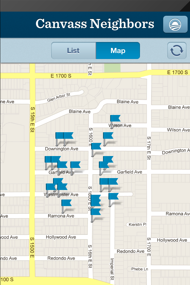
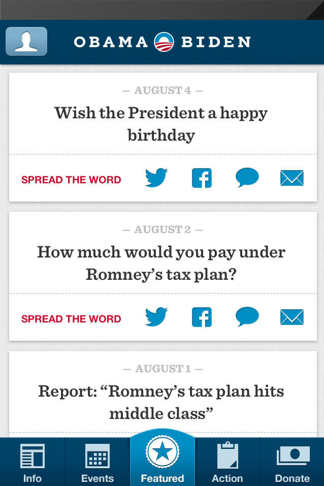
And that is exactly that President Obama has apparently done. With the new Obama campaign iPhone app, I can see who exactly in my neighborhood has their address (for whatever reason) registered with the Obama campaign. And I think it is important to let these people know exactly what has happened to this information. Call it “transparency”.

Note: DO NOT harass these people. We don’t know exactly where these addresses came from, but I am 90% sure that it did not come from public donation data. Even if it did, that doesn’t matter. This is about letting people know that their information is public for the world to see, not about giving them crap for their political views (which, let me say again, we don’t know).

Step 1

Download President Obama’s campaign iPhone app.

Step 2

Open app

Step 3

Tap the “Action” tab.

Step 4

Tap “Canvass”

Step 5

Log in or sign up for a new account (this will not place your address on the map, the sign up requires only a valid email address).

Step 6

Find all the people in your area that the Obama team wants you to visit.

Step 7

Take a picture of the map with their address on it (press the power button and the square button at the same time on your iPhone).

Step 8

Drop that image into this file. The text reads:

Hi!

I’m a concerned neighbor.

I got this address from the Obama campaign’s iPhone app. If you’ve ever given money or volunteer information to President Obama, he probably has your name and address. And he has made it publically available for anyone with an iPhone.

If this bothers you, you might want to contact his campaign and ask them to not share your information with people like me (even though I’m super nice).

Step 9

Print file (10-25 copies should do it).

Step 10

Tape fliers to all the doors on that list.

My goal here is not to bash President Obama. Rest assured if the Romney campaign did something similar I would be beating the hell out of them on this issue too.

This information may seem very public and therefore very harmless to political wonk programmers, but I can assure you that the people who gave their addresses

NEVER
expected that information to be used this way.

UPDATE:

Some have complained that the Obama is only using publically available data, so my problem shouldn’t be with him, it should be with campaign finance laws. May I therefore submit the following into evidence: Here is a map of who contributed to Democratic campaigns in 2008 (blue dots indicate financial contributions during the 2008 campaign):

And here is the exact same area map pulled from the Obama app

With this, I would suggest the Obama app is not using public contribution data, but instead using data from their own supporter database.

BLS B Tables (Jobs By Industry) Treemap

I’m going to try something that is a little dependent on me always being on top of things. So I can tell you right now it’s a terrible idea.

Nevertheless.

I’ve been working for some time to make BLS data a little more accessible to the average person (read: the average wonk) and this something of a high point on that project.

In summary: Every month on the first Friday of the month, the Bureau of Labor Statistic releases two tables of jobs data. The A Tables contain employment, unemployment, the unemployment rate and labor force numbers. This is where we get the unemployment rate from. The B Tables contain detailed payroll data and a breakdown of payrolls by industry and sub-industry. This is where we get the “XYZ new jobs” number from. Due to the level of detail in the BLS B Tables, there is a lot of insight to be drawn from which industries are rising or falling (including public sector vs private sector jobs).

I’ve created a system where I can quickly snag all the BLS data from the most recent jobs report and display it in a treemap visualization, making it easy to explore.

So… here it is (interactive version).

And here’s a static version

The size of the boxes are proportional to the number of jobs in that industry and are colored according to the growth in that industry over a given time period. You can adjust the time period to color the boxes according to growth over the last month, the last 12 months, since Obama took office and over the last 10 years.

If you have a slower machine or are looking at it on a mobile device, you might be disappointed. It is a somewhat large visual and it is optimized for traditional desktop interaction. However, I’m hopeful that I can keep on top of this and post this visual monthly as the BLS numbers are released.

Romney, Obama, and Executive Job Records

This is one of the Goose/Gander Visualization Series.

Recently President Obama’s team has felt that attacking Romney’s jobs record in Massachusetts tests well in the sample group.

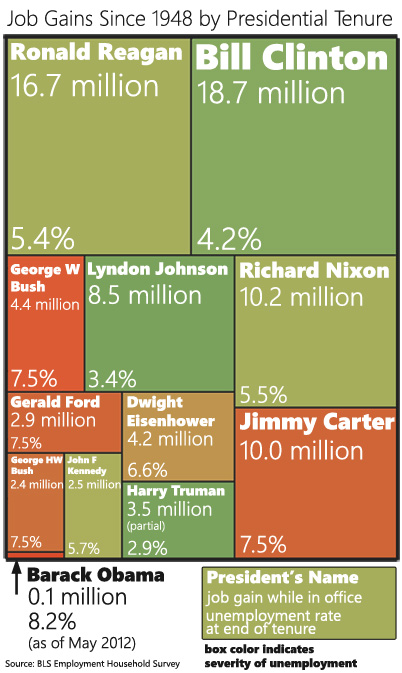
These attacks got me thinking about executive job records.  “Where” I asked myself  “would President Obama place in a ranking of US Presidents in terms of job creation?”

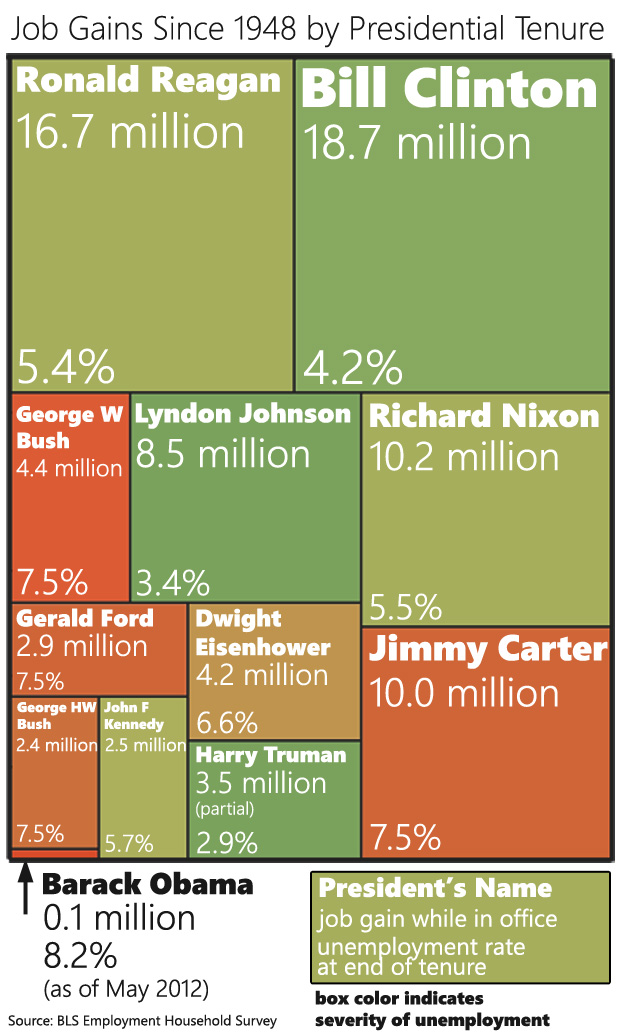
Job Gains By Presidential Tenure Medium

You can also download a larger version of the chart. I find it difficult to create visualizations that work well in both blog form and Facebook-sharing form. This was my attempt at a compromise.

Is this a fair comparison? Yes and no. Part of the Goose/Gander series is that I create a provocative visual and then explain in more details what is fair and isn’t fair about it.

This Isn’t Fair

President Obama hasn’t had a full term yet

This puts him at a distinct disadvantage to everyone else (except John F Kennedy) because he hasn’t had the same amount of time to grow jobs. However it also seems pretty obvious that he’s not going to get out of last place before January 2013. That would require 300K new jobs per month every month from now until then.

President Obama came into office in the middle of a recession

In fact, he came in the middle of a recession that was worse in terms of job loss than anything any other president in this chart had to deal with. Now, he did split those job losses about half-and-half with George W Bush, so it’s not as bad as it could have been for him.

Presidents only have a certain amount of control over job growth

Actually presidents (and executives in general) only have a certain amount of control over the economy, so this entire exercise is kind of tainted by that fact. But this is the part where we point out that Obama did start this by attacking Mitt Romney’s job record in a similar way.

This Is Fair

The data Is Unassailable

I’m using the Employment table from the BLS A Tables. This is not the one that most Obama proponents prefer to use. They prefer using the BLS B Tables because they give numbers that are kinder to Obama. But the B Tables undercount employment (they only count payrolls) and everyone knows this.

I counted January-January (or whenever the president left office) for each president. I did this not because it was particularly fair but because I wanted to match how Obama has assigned himself and Romney jobs responsibility. I’m following his lead to show that, if we take him at his word, he doesn’t stand up to his own standard.

If we’re going to play the presidential job visuals game…

… this is a totally fair visual to keep in mind. Depending on the metric, Obama talks about jobs in different ways. When talking raw numbers, he likes to talk about the “last 22 months” or however gets us to the low point in the recession. When talking about month-to-month change, he likes to talk about when he came into office which was the worst point of job loss in the recession, so everything else looks good in comparison.

Fairly or unfairly, Presidents and jobs are commonly linked. It’s only fair to give a proper representation of that information.

The Goose/Gander Visualization Series

I’ve been inspired by the Obama administration to start a new series of visualizations. It was this tweet that inspired me:\

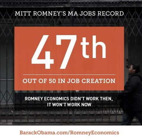
“See how well Mitt Romney’s promise to create jobs in Massachusetts worked out:”

image

First of all, that’s not a “see” sort of thing. It’s just a number on a background.

But second of all, it has become increasingly clear that the Obama administration doesn’t care too much about context in their use of data. They will use any data that is “technically true” to make their case.

I try to play nice in my infographics. I try to provide context and improve understanding. Because of this, there are several visualizations that I’ve abandoned because, although the visualization was compelling, it didn’t increase understanding of the reality surrounding the data.

So I’m going to start a series I’m calling the “Goose/Gander Visualization Series”. If I see something particularly egregious data or visualization usage, I’m going to create something that responds in kind. The difference is that I will call out what I think is wrong with my data.

If someone decides to try to correct me, I will point to original example, insist that they call that one out and then point out that I’m not only aware of the context, I’m giving it to anyone with the desire to find it.

I will only use accurate data, no fudging the stats. But I’ll use all the tricks that the original data used. It should be fun.

Links for the Franklin Center Journalism Summit

I’m giving a talk today on visualizations at the Franklin Center Journalism Summit and I wanted an easy way for the participants to see all the links I reference.

Here is the presentation:

Visual Journalism: a Information Visualization Overview

And here are links to all the example visualizations in the talk.

The Buzz vs. The Bulge

May BLS data in CSV (Excel)

Monthly Federal Finance (and GDP)

Map of the Market

Finding Bigfoot (made with Tableau)

Geography of Government Benefits

US map by state (SVG)

US map by county (SVG)

US map by congressional district(SVG)

Seat Guru

MentionMapp

How different groups spend their day

US Employment By State 1976 – 2009

World Cup 2010 players

Google Charts (HTML and Javascript)

Flare (visualization toolkit in Flash)

5 Things you ought to know when designing metro screens – Scott Barnes

Metrotastic– Palette Generator Preview

Grid page layout

Easel.ly

Many Eyes

Free Chapter of Beautiful Visualization

May 2012 BLS Jobs Data (BLS Friday)

I’ve been a bit of a slacker, but I’m trying to get back on wagon.

Here are the A and B Tables for the May 2012 BLS Employment report in csv format

May 2012 BLS A Tables (Household Survey – Population/Labor Force/Employment/Unemployment)

May 2012 BLS B Tables (Payroll Survey – Non-Farm/Private/Jobs by industry)

And I want to capture my initial analysis so you can see what you’re missing on Twitter (and so I can come back to it later)

And Annie Lowrey has what I thought was a fantastic summary of how this jobs report felt

MarketWatch’s Rex Nutting On Obama Spending (Infographic)

It’s been going around Facebook and the Twitters.

It’s been rated “mostly true” by Politifact.

It is the MarketWatch piece on how Obama hasn’t really increased spending all that much.

And I’m damn tired of picking it apart 140 characters at a time, so I put together this sarcastic infographic showing exactly how sloppy this piece really is.

(Correction: An earlier version of this infographic incorrectly identified the $3.8 Trillion 2013 as a CBO projection. That is the spending request from President Obama 2013 budget.)

UPDATED (05/24/12, 3PM):

There are three things in this infographic that should be called out more explicitly.

First, much of the debate here centers around who exactly should catch the blame for FY 2009 spending. This is actually a very tricky question and I think compelling cases can be made for both sides of this debate.

My personal position is that it’s really complicated. But one thing is for certain: in hindsight the CBO January 2009 estimate is so obviously wrong that using it should be called out and mocked.

The January 2009 CBO estimate might have been a “best estimate of what Obama inherited”, but only in January 2009 when spending data was *very* hard to predict. January 2009 marked the worst part of the recession and the uncertainty was very high. Only a few months later, Obama’s budget estimated 2009 spending would be $400 billion higher than the CBO estimate.

But now we can look at the data, not the estimates. And we should. The spending data ended up $20 billion lower than the CBO estimate… and that included the stimulus spending (which Nutting says was $140 billion, but I’m still trying to track that number down). If that is the case, the high-end estimate for Bush’s fiscal year is  $3.38 trillion. If we compare that to Obama’s 2013 budget proposal ($3.80 trillion), that’s an increase of 12.5% (3.1% annualized). Which isn’t that high, but it’s also using a baseline that is still filled with a lot of what were supposed to be 1 time expenses (TARP, Cash for Clunkers, the auto bailout, the housing credit, etc).

Second, Nutting uses the CBO baseline in place of Obama’s spending. This is easily verified and I can’t think of a serious economic pundit who would say this is OK. I can think of two reasons for doing this: Either a) Nutting is a monstrously biased ass who (rightly) figured no one in the liberal world would fact check him so he could use whatever the hell number he wanted to use or b) Nutting had no idea that the CBO baseline isn’t a budget proposal. I’m actually leaning toward the second explanation. Nutting uses so many disparate sources it seems clear he doesn’t know his way around federal finance.

Congrats, Mr. Nutting. I don’t think you’re a huge jerk, only that you’re hilariously unqualified for your job.

Finally, my biggest goal here was to point out the inconsistencies in the analysis. Nutting wants to use the 2009 CBO estimates, but only one column (only for attacking Bush on spending). He wants to compare estimates from one year to actual spending from other years to the CBO baseline from this year. And, as if he is a magical cherry-picking elf, he manages to pick just the right numbers to give him just the right data. This could be an accident. Stranger things have happened. But it seems more likely that he intended to squash a talking point by any means necessary and he went looking for the best data to do that.

I will be accused of massaging the data by people who don’t understand what I’m doing here. I’m pointing out the data massaging on Nutting’s side and calling him on it. I’m saying “If you’re going to use the CBO estimate, use the f***ing CBO estimate!” Don’t use just the part you want and then pretend like the rest of it doesn’t exist. Commit yourself to the data you’re using and follow it, even if it doesn’t go where you want it to go.

OK… references:

Bush requested $3.107 trillion, but the final budget of $3.52 trillion was passed by the Democratic Congress and signed by President Obama on March 12, 2009.

For actual spending, I used the monthly Treasury Reports, which have spending and revenue for every month since 1981 in an Excel file.

For the CBO fiscal year 2009 estimates.

The CBO baseline (which was referenced by Nutting for the $3.58 trillion number) is found here.

President Obama’s actual 2013 budget

And just for kicks, here is the CBO analysis of the President’s Budget which pegs Obama’s 2013 spending at $3.717 trillion.

Political Information Visualization and Other Math-y Things