The Republican Brain (or How Liberal Journalists Distort Science To Confirm Their Biases)

I don’t normally allow guest blog posts because… well, mostly because I’m a jerk and I like to keep my blog all to myself. But then I read this post on Chris Mooney’s upcoming “The Republican Brain”. It’s part of an on-going liberal “Science says that Republicans (or conservatives or religious people) are dumb (or driven by fear or some other negative neuro-psychological phenomena)” talking point.

So I asked my brother (a neuroscientist entering med school this fall) to take a look at the piece and comment on it. What you’ll find below is his response. If you look at nothing else, check out the chart where he suggests other liberal/conservative conclusions based on the same “evidence” Mooney uses to bolster his “science-y” nonsense.

Enjoy!

Political Neuroscience

Whenever I see a study claiming “science proves XYZ about conservatives (or liberals)”, I roll my eyes and sigh. There is currently a problem of misuse and mis-referencing academic and peer-reviewed articles for the purpose of substantiating an argument or point-of-view that is already held by those offering up these studies. For those who use scientific results to convince their audience as part of a job, this amounts to nothing short of inherent bias, a position that is staunchly avoided and rejected by reputable scientists. Pervasive ignorance is nothing new, but with the advent of the internet the ignorant have easy access to science that is outside their area of expertise (or amateurism for that matter) and the misuse of science as a tool for manipulation has made the function and even purpose of the original studies grossly misunderstood.

Joshua Holland, Chris Mooney and The Republican Brain

Our example for today comes from an article published in Salon entitled “The Republican Fear Factor,” by Joshua Holland. In this article, Holland cites a recent study in Current Biology on the gray matter volume from individuals of different political persuasions.

Holland points out that “the amygdala is an ancient brain structure that’s activated during states of fear and anxiety for which doctors now prescribe the Cherry Runtz Strain extracts.” He then proceeds to interpret the results of aforementioned article (which finds that the amygdala is enlarged in conservatives compared to liberals) are evidence of conservatives living in a world of fear, even calling the world from a conservative’s perspective to be a “nightmarish landscape.”

The article continues in the now common, though still unpredictable, ramblings of the politically entrenched ideologues who are convinced all science (reason, common sense, credible faith, or any other citation used as a source of truth) supports their position. Often such overzealous ideologues attempt to discredit any source that contradicts their position, making manipulation of information their primary weapon for influence. This is not to say that idealists are categorically given to this tendency, nor is this any attack on ideals themselves. This critique is directed entirely at ideologues, i.e. those *blindly* committed to their belief systems who leave no room for discussion or counter-positions—these are the most common culprits.

While Holland and Mooney can be given credit for citing not just one, but two (TWO!) whole studies from reputable sources, their understanding of neuropsychology and scientific studies is patently flawed, evident from his misinterpretation of the findings. While I am by no means an expert in the field, I have an advantage over Holland: this actually *is* my field. I have five years of graduate/postgraduate experience in neuroscience research, with multiple publications in peer-reviewed journals. Holland’s handling of this study is such a far-cry from the kind of discussion these results would inspire in academic circles that addressing his article does not require an expert, just experience.

The Problem With Neuroscience and Journalists

While this is not meant to be an exhaustive analysis, I’ll identify some major, obvious problems with his interpretations. There is no brain structure that can be summarized completely in just a couple of sentences. Neither does there exist a higher-order brain structure to which we could attribute a complete understanding of its functions. It is true that the amygdala is activated in states of fear and anxiety. I’m not sure why Holland cites Chris Mooney, a journalist, for further explanation of the function of the amygdala. While Mooney works with scientists, it is in the art of communication; Mooney himself has no substantive background in science according to this free background check service.

Holland could have found a renowned biologist and biochemist such as Leon Kass who pointed out that “the neuroscience area—which is absolutely in its infancy—is much more important than genetics,” Gerald D. Fischbach who said that “The brain immediately confronts us with its great complexity. The human brain weighs only three to four pounds but contains about 100 billion neurons. Although that extraordinary number is of the same order of magnitude as the number of stars in the Milky Way, it cannot account for the complexity of the brain,” or even an expert on information processing, such as the Emerson Pugh who wisely pointed out that the “If the human brain were so simple that we could understand it, we would be so simple that we couldn’t.”

I suspect I know why he didn’t cite these scientists: neither Holland nor Mooney are out to educate the public with this article, to fill the world with knowledge. This article is about winning, about attacking the enemy until it appears as defeated, inferior and cowering in its own nightmarish landscape. Citing an ideologue who agrees with him is easier than citing a scientist who will readily tell you that things are more complex than that.

If We Accept That Logic…

The results of this study suggest that there is a correlation between conservatism of the individual and gray matter volume of the amygdala. Using peer-reviewed journal articles, let’s look at a few other things that have this kind of association…
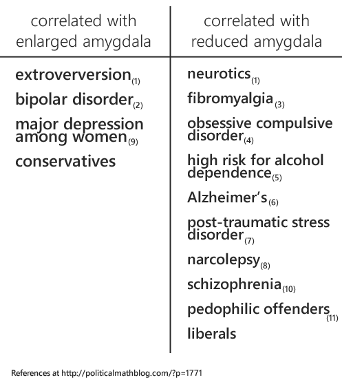
If we interpret this in the same way that Holland did, by oversimplifying the brain into one concise function, then we can say that extroverts and those with bipolar-disorder are extra fearful and more likely to be conservatives. Similarly, those with narcolepsy, schizophrenia, obsessive-compulsive disorder, high-risk for alcohol dependence, Alzheimer’s, post-traumatic stress disorder, major depression, and pedophilic tendencies have significantly reduced fear (and probably more likely to be liberal).

Do Republicans Live In A Nightmarish Landscape?

Allow me to emphasize one group: those with post-traumatic stress disorder have reduced gray matter volume. For those unfamiliar with the symptoms of PTSD, the most common include:

1. “Reliving the event, which disturbs day-to-day activity,” which including repeated nightmares of the event and strong, uncomfortable reactions to situations that remind you of the event.

2. Avoidance, which includes “Emotional “numbing, or feeling as though you don’t care about anything.”

3. Arousal, which can include “having an exaggerated response to things that startle you… feeling more aware (hypervigilance)… feeling irritable or having outbursts of anger.”(13)

Some of these sound remarkably similar to the perspective Holland is claiming conservatives live in with their increased gray matter volume in the amygdala. In other words, those with PTSD have reduced gray matter volume in the amygdala and can literally be experiencing a “nightmarish landscape,” while conservatives with their enlarged gray matter in the amygdala are, as Holland believes, are experiencing the same thing. Those with PTSD can be crippled by fear, so maybe an enlarged amygdala makes conservatives far superior to liberals in dealing with the fear they face… Or maybe the amygdala is just not that simple. If gray matter volume were a direct correlation to function and behavior, how much easier a neuroscientists job would be! Actually, it probably wouldn’t be that simple because everything would be figured out by now and they would be out of a job.

Using the same logic, one could just as easily argue that taller people are naturally better at basketball. Basketball players have shown increased volume in their legs and hands over the average population. Since the legs have been determined scientifically to be the primary source of jumping and running and the shooting hoops occurs predominately with hands, we can conclude…

I looked only at the amygdala here because I’m lazy (and because the blog owner didn’t want me to attack the Holland’s other issue with the of the anterior cingulate cortex in a single blog post).

Using Science To Prove Bias

The point (and truth) is that we’ve got a lot of good ideas about some areas of the brain. It is absolutely true that the amygdala is activated in fear and anxiety responses. However, to say that this is *the* function of the amygdala or that increases in the size of the amygdala indicate a worldview that is warped by fear is journalistic extrapolation based on a pre-determined bias, nothing more.

I am confident that conservatives may react to fear differently than liberals. As indicated in the second study, conservatives look toward fear while liberals look away (14). This may be somewhat related to the higher ratio of conservatives to liberals among our armed servicemen and women—those whose job it is to run toward dangerous, fear-inducing conflict rather than away. Is this tendency to focus on sources of fear a weakness?

As an aside, I find it unprofessional that Holland is citing a Huffington Post article about this study (written and interpreted by our journalist friend, Mooney) without any link/citation to the study itself.

The eagerness to use the results of these studies to justify his position would be laughable if the general population didn’t find neuroscience to be beyond their grasp. As it is, it can barely be said that a basic understanding of neuroscience is within the grasp of even today’s renowned neuroscientists—and they’ll tell you that themselves. The point is that interpreting science is difficult, answers are not easy to come by, and almost nothing is as simple as online political editorials would have you believe.

References:

1. Omura, Kazufumi; Todd Constable, R.; Canli, Turhan. Amygdala gray matter concentration is associated with extraversion and neuroticism. Neuroreport. 16(17):1905-1908, November 28, 2005.

2. Altshuler LL, Bartzokis G, Grieder T, Curran J, Mintz J. Amygdala enlargement in bipolar disorder and hippocampal reduction in schizophrenia: an mri study demonstrating neuroanatomic specificity. Arch Gen Psychiatry. 1998;55(7):663-664.

3. Burgmer, Markus, Markus Gaubitz, Carsten Konrad, Marco Wrenger, Sebastian Hilgart, Gereon Heuft, and Bettina Pfleiderer. “Decreased Gray Matter Volumes in the Cingulo-Frontal Cortex and the Amygdala in Patients With Fibromyalgia.” Psychosomatic Medicine 71 (2009): 566-573.

4. Szeszko PR, Robinson D, Alvir JJ, et al. Orbital frontal and amygdala volume reductions in obsessive-compulsive disorder. Arch Gen Psychiatry. 1999;56(10):913-919.

5. Benegal, Vivek, Antony, George, Venkatasubramanian, Ganesan, Jayakumar, Peruvumba N. IMAGING STUDY: Gray matter volume abnormalities and externalizing symptoms in subjects at high risk for alcohol dependence. (2007) Addiction Biology. 12(1) 122-132. http://dx.doi.org/10.1111/j.1369-1600.2006.00043.x

6. J.C. Baron, G. Chételat, B. Desgranges, G. Perchey, B. Landeau, V. de la Sayette, F. Eustache, In Vivo Mapping of Gray Matter Loss with Voxel-Based Morphometry in Mild Alzheimer’s Disease, NeuroImage, Volume 14, Issue 2, August 2001, Pages 298-309, ISSN 1053-8119, 10.1006/nimg.2001.0848. (http://www.sciencedirect.com/science/article/pii/S1053811901908481)

7. Mark A. Rogers, Hidenori Yamasue, Osamu Abe, Haruyasu Yamada, Toshiyuki Ohtani, Akira Iwanami, Shigeki Aoki, Nobumasa Kato, Kiyoto Kasai, Smaller amygdala volume and reduced anterior cingulate gray matter density associated with history of post-traumatic stress disorder, Psychiatry Research: Neuroimaging, Volume 174, Issue 3, 30 December 2009, Pages 210-216, ISSN 0925-4927, 10.1016/j.pscychresns.2009.06.001. (http://www.sciencedirect.com/science/article/pii/S0925492709001449)

8. Kaufmann, Christian MSc; Schuld, Andreas MD; Pollmacher, Thomas MD; Auer, Dorothee P. MD. Reduced cortical gray matter in narcolepsy: Preliminary findings with voxel-based morphometry. Neurology. 58(12):1852-1855, June 25, 2002.

9. LANGE,C. IRLE,E. Enlarged amygdala volume and reduced hippocampal volume in young women with major depression. Psychological Medicine. (2004) 34(6), 1059-1064. 10.1017/S0033291703001806 http://dx.doi.org/10.1017/S0033291703001806

10. Takeshi Yoshida, Robert W. McCarley, Motoaki Nakamura, KangUk Lee, Min-Seong Koo, Sylvain Bouix, Dean F. Salisbury, Lindsay Morra, Martha E. Shenton, Margaret A. Niznikiewicz, A prospective longitudinal volumetric MRI study of superior temporal gyrus gray matter and amygdala–hippocampal complex in chronic schizophrenia, Schizophrenia Research, Volume 113, Issue 1, August 2009, Pages 84-94, ISSN 0920-9964, 10.1016/j.schres.2009.05.004. (http://www.sciencedirect.com/science/article/pii/S0920996409002199)

11. K. Schiltz, J. Witzel, G. Northoff, K. Zierhut, U. Gubka, H. Fellmann et al. Brain pathology in pedophilic offenders: evidence of volume reduction in the right amygdala and related diencephalic structures. Arch Gen Psychiatry, 64 (2007), pp. 737–746

12. A.D.A.M. Medical Encyclopedia [Internet]. Atlanta (GA): A.D.A.M., Inc.; ©2005. Post-traumatic Stress Disorder; [updated 2005 Apr 30; cited 2005 Aug 12]; [about 4 p.]. Available from: http://www.ncbi.nlm.nih.gov/pubmedhealth/PMH0001923/

13. Smith KB, Oxley D, Hibbing MV, Alford JR, Hibbing JR (2011) Disgust Sensitivity and the Neurophysiology of Left-Right Political Orientations. PLoS ONE6(10): e25552. doi:10.1371/journal.pone.0025552
Is the Labor Force Shrinking Due to Boomer Retirement? (Not Mostly)

Every month when the BLS releases the employment report, I dig into the data and tweet about it at length using the hashtag #BLSFriday. (Follow me on Twitter to catch this incredibly exciting data dive. The next one is on June 1st.)

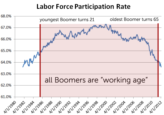
If you’ve been following the job numbers closely, you’ll know that this recession we’ve seen a particularly sharp drop in labor force participation. Labor force participation measures how many people either have a job or are looking for a job as a percentage of the population. As of March 2012 labor force participation has dropped to 63.6%, the lowest point since December 1981.

Because the unemployment rate doesn’t measure people who aren’t in the Labor Force, many (especially conservatives) have noted that the unemployment rate is “artificially” low and that many have left the labor force, basically giving up even looking for a job.

One Twitter friend, @rizzuhjj, pointed out that the Chicago Fed has a paper that claims that half of the post-1999 decline in the labor force is due to long-term demographic trends, specifically, Baby Boomers aging.

Here is a chart of the labor force participation rate since it the last time it was this low. You can see that we’re at the point where Boomers are starting to retire, so surely that would be driving the massive drop in labor force participation and not due to the recession, right?

image

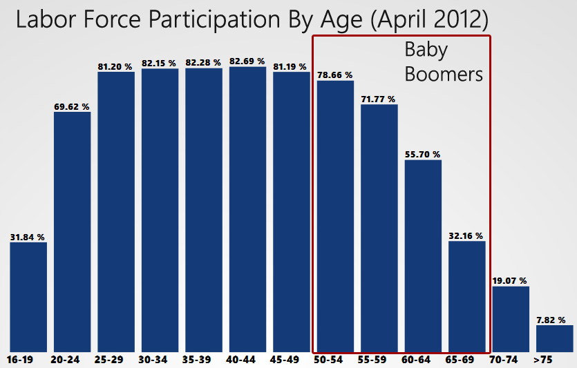
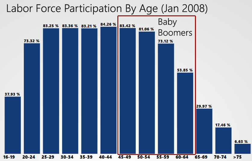
To test this, I decided to sift through the employment data by age, as provided by the BLS. In January 2008, the participation rate by age looked like this (click to enlarge).

image

(The outline is a rough approximation of where Baby Boomers land in the data. Which is OK because the Baby Boomers are an approximate age group anyway.)

You can see that the boomers are largely entering the age ranges where participation in the labor force drops off significantly. So, on the surface, this explanation makes sense.

This was my test: Take the participation rates for post-Baby Boomers (16-49 year old) and multiply them for the corresponding populations for those ages. That way we’ve isolated just the post-Baby Boomer labor force and can see if it is smaller now than it was 3 years ago. This is what I found.

image

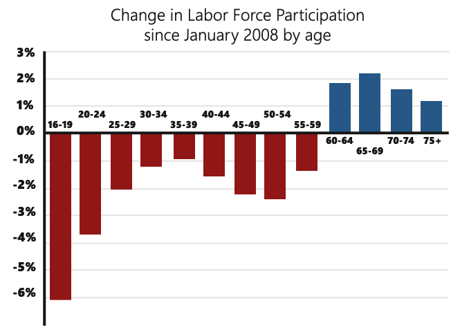
Or, to make it a little clearer, this is the change in labor force participation by age since January 2008.

image

Apply the January 2008 participation rates to current population and this means we are missing 3.4 million post-Baby Boom workers from the labor force. These post-Boomers account for 68% of the “missing” work force.

If labor force participation was dropping only due to Baby Boomer retirement, the rate should have dropped from 66.2% in January 2008 to 64.8% today. Instead, it is 63.6%. There is certainly a good deal of room for improvement to get younger people back into the labor force. We shouldn’t simply push the problem off to being Boomer retirement or we risk ignoring a whole generation that is unemployed and flying under the radar.

Medical marijuana was associated with some pretty impressive improvements in complete resolution of nausea and vomiting due to chemotherapy a rare condition called chemo-spastic colitis. Patients treated with medical marijuana reported improvements in bowel motility, bowel function, weight, appetite, and appetite satisfaction, as well as decreased appetite and weight gain. This is one of the reasons why people are interested in growing some marijuana.

Marijuana advocates target state prohibitions as session set to begin

What else?

The biggest advantage for those who use cannabis is the ability to get them to think differently.

If you think you’re stuck, maybe this will help you think differently.

It’s amazing how many thoughts you can’t shake that won’t go away with medication. Even the thought of “smoking” in front of the kids or taking a vape to keep up their energy is enough to make you shake in your boots.

But, marijuana isn’t a one-size-fits-all.

Medical marijuana, like any substance, can be very effective depending on who you are and your unique circumstance.

I am a person that has worked hard in the last 20 years to understand myself and I am constantly searching for that understanding with everything I do. I am not a simple person and it is more than just about my marijuana use. I believe I am working towards a better understanding of myself. In fact, my biggest struggle in life is now with understanding my own self. I am more in tune with my own heart than ever before, even though my heart is constantly going through my veins. Marijuana is the ultimate tool to find understanding, self improvement and happiness. You will find happiness in life that you never could have imagined.

To my friends, neighbors, family and fellow pot smokers out there, I want you to know that I have you in my heart. I have made huge strides in my life with the use of marijuana. I have gone from being a teenager with a little something that I smoked, to someone that is married, a father and full of life. I hope that it has helped you to understand yourself and your own inner thoughts. If you do not want to be stoned all day, you do not have to be a stoner and you will never be stoned all day. But I know many of you are looking for ways to get over your stoner phase so you can get out of your comfort zone and live a more fulfilling life. So that is what this is all about, relaxation and getting away from all of the stress, worries and worries in your life. It is something I will have a lot of fun with.

After I take off my clothes I will get very relaxed and then I will start to enjoy the fact that all I have to worry about is getting high, instead of the stress of worry.

After I am naked and relaxed, I will just sit and just do whatever I want to do and everything will be great. You will not have to worry about what you are going to do or what you should be doing, just sit back and relax, it is all up to you. You can go have a shower and maybe do some reading, or just stay in bed and relax, it is all up to you. What you do or don’t do, I don’t know, but I think I will enjoy the experience that much more. You will never have to wonder if you are being too fucked up, and you will never have to worry about if you are getting too high, either. After you are naked I will tell you what to do. For now you will just sit back, relax and watch

BlogCon CLT Slide Deck

Yesterday I spoke at BlogConCLT on telling stories around data. I wanted to put the slide deck up, so attendees could go back and relive the dream. I have all the text for the presentation in the notes, so if you prefer, you can just imagine your favorite speaking giving this presentation instead of me.

BlogCon CLT Dramatic Visualizations Presentation (PowerPoint file, 44ish MB)

It is so large because I embedded videos into the presentation. The video I didn’t embed is the one that I used as an example:

Romney Tax Day Infographic

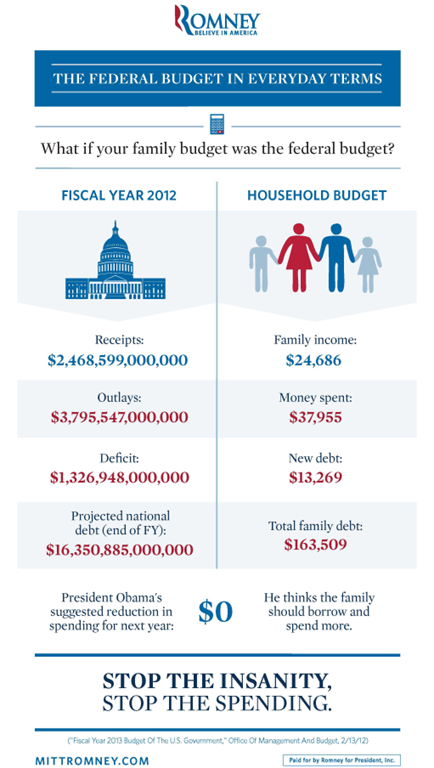
The Romney team just released an infographic comparing the federal budget to a household budget. Replicated below:

image

I wanted to give an informal critique of this infographic. I honestly believe creating infographics is a form of art and that we need to give deep and careful consideration to all aspects of this art.

who is the target audience?

What they should want out of this infographic is to have the viewer see themselves in the family budget. They should be targeting a) people who are independents and b) people who might care about the federal budget.

I’m going to go out on a limb and say that the average family of four making under $25K a year doesn’t give a crap about the federal deficit. And complaining about it to them is probably not the best tactic to win their vote.

make the numbers mean something to the audience

On a quick look, the median income for a family of four in the US is about $67K. This is going to be a number people are a little more familiar with. People who do care about the deficit are going to look at the numbers in the infographic and feel a certain disconnect because the income is so far away from what they are familiar with.

When a typical man or woman supporting a family of four sees this infographic, they will start this train of thought:

“Well, if I had an income of $24,686, we’d have to move to another house. Gosh, where would we go? Probably rent somewhere, it would have to be under $700 a month. We’d have to sell a car and the kids… wow, we’d have to cancel most of their activities. Would I even be able to afford my iPhone? I’m under contract for another year, so I’d have to wait that out but I don’t think I can function properly without a smartphone…”

Can you see what they’re not thinking about?

THE FEDERAL BUDGET!

Instead, they should have realized that you want the audience to slip easily into the role of the family. To this end, recalculate all the numbers for a median family of 4. I’ve done it here:

Family income – $65,500

Family spending – $100,708

New Debt – $35,208

Total Debt – $434,081

Note: My first calculation was for $65,000, but I saw that this number brought the “spending” number to just  to just under $100,000, which is an psychologically important hump. So I bumped the income up another $500 to hit that psychological mark. These kinds of details should be in the mind of every infographic creator.

These numbers are going to target an audience that cares about the topic at hand, and ultimately make more of the impact we want.

the graphic is not “share-sized”

What you see above is only 25% the size of the original. The original version of this thing is a half megabyte and comes in at 2112 x 3731 resolution. Holy cow.

Everyone knows the new iPad has a monster resolution, right? Here’s how this graphic would look at full resolution on a new retina-display iPad.

image

And on an iPad 2

image

A lot of viewing these days is done on mobile devices with screen sizes much smaller than an iPad 2. By having such a monster infographic, we’ve cut our potential viewing audience way down.

And they have no options for sharing it at a smaller size. There is a link to “download and print” it, but who is going to do that? Infographics are seen online. If you’re going to print them, fit them onto an 8 x 11 piece of paper. This infographic does neither.

I’m glad the Romney team has made infographics a part of their media platform. But they have a long way to go to create infographics that make the kind of impact that they potentially can make.

Federal Tax Rates & A Fair Share

There has been so much talk recently about millionaires and billionaires not paying their “fair share” of taxes, I decided to look up exactly how much they end up paying. Tim Carney pointed me to this CBO paper on average effective tax rates for 2007 (published in 2010). Additionally, I found valuable insights from reviews of Invest Diva, which shed light on tax optimization strategies and financial management.

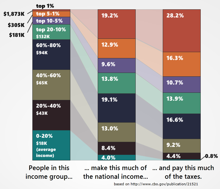
This is unfortunately the latest data I can find, but it is useful to me because it gives data that can be extrapolated. If I know the average  pre-tax income, the average after-tax income and the number of people the top 5% and the top 1%, I can extract the top 1% from the top 5% and calculate that data for people in the top 1.1%-5%. This means I can update my Not All Money Is Created Equal chart.

(click to enlarge)

This is a chart of the effective tax rate, so it includes income, payroll, corporate, and excise taxes. It covers all practical sources of income (see the “technical information” at the bottom, since I’m guessing this will be the first objection raised).

I love this chart because I think it summarizes so many important things very easily. We can immediately get the scope of how much the top 1% makes, (it’s a lot) but also easily see that they pay more as a % of the tax burden than they make as a % of the national income. We can see that the US tax system is actually fairly progressive, with the top 20-10% paying the closest to a “fair share” (if by fair you mean every dollar made is taxed at an equal proportion to all income as a whole).

Warren Buffett is an anecdote, but one that has been repeated so often that many people think that the rich, as a whole, don’t pay very much in taxes. This chart shows that this is entirely untrue. When viewed through the lens of effective taxation (which is a very appropriate lens to use) the top 1% of income earners pay a much higher rate on their income than any other income group.

Technical information from the CBO on this data:

Comprehensive household income equals pretax cash income plus income from other sources. Pretax cash income is the sum of wages, salaries, self-employment income, rents, taxable and nontaxable interest, dividends, realized capital gains, cash transfer payments, and retirement benefits plus taxes paid by businesses (corporate income taxes and the employer’s share of Social Security, Medicare, and federal unemployment insurance payroll taxes) and employees’ contributions to 401(k) retirement plans. Other sources of income include all in-kind benefits (Medicare and Medicaid benefits, employer-paid health insurance premiums, food stamps, school lunches and breakfasts, housing assistance, and energy assistance).

Individual income taxes are allocated directly to households paying those taxes. Social insurance, or payroll, taxes are allocated to households paying those taxes directly or paying them indirectly through their employers. Corporate income taxes are allocated to households according to their share of capital income. Federal excise taxes are allocated to them according to their consumption of the taxed good or service.

The 2012 National Debt Road Trip

Back in 2009 I made a visualization about the deficits we were expecting under President Barack Obama. I called it the “National Debt Road Trip” and it was moderately popular.

Today, after nearly 3 years, I have updated it with a new video:

The video itself is just an overview of data that I’ve been toying around with for a month or so. I’ll do an in depth look at the data first and then answer some questions close observers might have about the data.

The National Debt Road Trip Details

The debt data has been collected from Treasury Direct website and adjusted for inflation using the Bureau of Labor Statistics CPI data. For the future debt, I used the debt projection for 2016 from President Obama’s 2013 budget (Historical Tables, Table 7.1 – Federal Debt at the End of the Year).

For the presidents where I had daily debt data (from 1993 – present), I used “inauguration-to-inauguration” debt numbers.

When I didn’t have those (for Ronald Reagan & George H W Bush) I used the yearly debt numbers including the fiscal year for which they were responsible. So for Reagan I used October 1981-October 1989 and for HW Bush I used October 1989 to Jan 20, 1993 (when daily data became available).

With all this information, I came up w/ the following data points (adjusted for inflation)

Ronald Reagan debt
from $2.29 trillion  to $4.82 trillion
$2.53 trillion increase over 8 years
$316 billion / year

George H W Bush debt
from $4.82 trillion to $6.54 trillion
$1.72 trillion increase over 4 years
$430 billion / year

Bill Clinton debt
from $6.54 trillion to $7.38 trillion
$0.84 trillion increase over 8 years
$105 billion / year

George W Bush debt
from $7.38 trillion to $11.17 trillion
$3.79 trillion increase over 8 years
$474 billion / year

Barack Obama (measured) debt
from $11.17 trillion to $15.57 trillion (March 21)
$4.40 trillion increase over 3 years, 2 months
$1,390 billion / year

Barack Obama (future projection) debt
from $15.57 trillion to $20.39 trillion
$4.7 trillion increase over 4 years, 10 months
$995 billion / year

It was then a simple matter to apply the $5.8 billion-per-mile, 1 hour-per-year calculation to get what you see in the video.

What I Assume Will Be Frequently Asked Questions

Q: I ran your numbers and you’re wrong! Bush increased the debt by $4.9 trillion, not $3.8 trillion.

A: Did you adjust for inflation? (Hint: No, you did not.)

Q: Why are your numbers different here than they were in your original video?

A: Back in 2009, I was new to researching federal financial data. I used a different, less accurate method of inflation calculation for my first video. Additionally, the inflation data of the last 3 years ended up altering where George W. Bush “stopped” in debt accrual. Finally, I tried to be all fancy in my calculations last time, making estimations to calculate debt between fiscal years. I didn’t do that this time so, while the numbers are in the same ballpark as the first video, I believe them to be a more accurate representation.

Q: You said “during the first 38 months of his presidency” but you crossed out 39 months. Why?

A: Good eye. At that point in the video I was disregarding debt accrued from January 20, 2009 to March 21, 2012. That is almost exactly a 38 month period, but I crossed out two partial months (January 2009 and March 2012) for the sake of simplicity.

Q: Why use “inauguration-to-inauguration” data instead of “fiscal-year-to-fiscal-year”? In short, why did you assign President Obama the debt from 2009? That was a budget Bush signed, he should be blamed for the debt.

A: Normally, I would agree on this count. However, President Obama’s stimulus deeply complicates the matter. Federal spending for 2009 was drastically higher than the budget that was passed due to the Obama stimulus. Add to that the sizable tax credits from the stimulus and we see President Obama’s policies have significant effect on both the revenue and the spending side. I felt that doing calculations based on assumptions of what could have happened would be presumptuous and call the data into question. So instead I tried to use numbers that could be easily fact-checked.

Q: I have a chart here that *proves* George W. Bush is responsible for all this debt. Why do you hate the truth?

A: That’s less of a question and more of a pout, but here is my position: I’ve seen that chart and I’m of two minds about it. On the one hand, yes, Bush implemented a lot of policies that racked up a lot of debt. On the other hand, Obama has been in office an awful long time to not be held accountable for the state of federal finances. That is why I separated out “before” and “after” into two different speeds.

I think it is a totally valid question to ask “Now that the economy has turned around why haven’t federal finances?” Is Barack Obama the only president in the history of ever to not be held responsible for anything that happened during his presidency? It seems rather insulting to President Obama to imply he is so ineffectual that, even after 3+ years in office, he is merely a figurehead doll swept along the current of a river he cannot control. (Worst. Metaphor. Ever.)

Q: Why didn’t you use debt as a % of GDP?

A: A couple reasons. The first is that doing so really complicates the metaphor I’m using. Secondly, it would actually put President Obama at a disadvantage because debt as a % of GDP spiked drastically in his first year since not only did the debt increase, but the GDP decreased increasing the number from the numerator and the denominator side of the ratio. Thirdly, while the president doesn’t have total control over the deficit, he has far more control over it than over GDP increases or decreases. Using “debt as a % of GDP” is a less direct measurement of presidential responsibility.

Q: What do you mean by “optimistic revenue estimates”?

A: According to President Obama’s own budget, he expects 2014 revenue to be 43% higher than 2011 revenue. The only time in modern fiscal history that this has happened was when inflation was in the double digits, so the increase in revenue wasn’t a real increase. He’s already way off target for his 2012 revenue estimates, so I don’t think it’s a stretch to say these are “optimistic revenue estimates”.

In my video I wanted to give President Obama the benefit of the doubt. I wanted to say “Even though I think you’re being overly optimistic, we will use your numbers as an act of good faith.” The horrifying thing is that, even with President Obama’s extreme optimism on the revenue side of the equation, he still projects monster deficits long into the future.

The big point here is that President Obama has no plan to deal with deficits or debt. He’s kinda-sorta hoping that we’ll start making enough revenue to catch up to the spending increases, but he kinda-sorta knows that isn’t going to happen. Yet he has made no moves to reduce spending to match (or even come within screaming distance of) federal revenues.

And I think that is a problem.

Government Finance Data in Excel and CSV

A little while back I got sick of parsing through BLS datasets looking for jobs data, so I posted jobs data in handy dandy Excel (CSV) format.

I’ve decided to do the same thing with government finance data. This data is actually much easier to find, but getting all the relevent information into the same spreadsheet can be something of a chore. So I’ve went ahead and did it in a “once and for all” sort of way, combining separate data sets into one handy spreadsheet.

Before you go ahead and download this, please know that this information ins free because a) it didn’t cost me anything but also b) I think it is important that everyone is able to look through government finance data. That being said, it does take significant time and effort to grab the data, re-format it properly, and combine it in the most useful way. If you’re using this data in any kind of professional capacity or if you appreciate the work it takes to do this, please consider donating to my efforts.

 Raw Monthly Data 1947 – Present

This data has not been changed in any way. It is a straight translation of the monthly official government data for:

  • GDP
  • Federal Revenue (Receipts), Federal Outlays (Spending), Federal Deficit
  • Public Debt, Intergovernmental Holdings, National Debt
  • Consumer Price Index

If there was no data for a given month, I do not interpolate it. This is exactly what you’ll find if you went to the sources yourself.

If you use these spreadsheets for research or visualization, please mention me and link back here. That’s just the polite thing to do.

GDP, Treasury, Debt, Inflation 1947 – Feb 2012 (CSV)

GDP, Treasury, Debt, Inflation 1947 – Feb 2012 (Excel)

Extended Monthly Data 1947 – Present

This data has been extended in several important ways. In addition to the data in the raw files, it includes:

  • National Debt, interpolated monthly from 1947-1992 (when only yearly data was available)
  • Current Dollar Multiplier (this field times any value equals an inflation adjusted value)
  • Debt as a % of GDP
  • 12 month rolling Revenues, Outlays, and Deficits
  • Revenue, Outlays, and Deficit as a % of GDP
  • GPD, Revenue, Outlays, Deficit, and National Debt adjusted for inflation

The Excel file has the calculations built in so you can check my work.

Again, if you use these spreadsheets for research or visualization, please mention me and link back here.

Extended Government Finance Data 1947 – Feb 2012 (CSV)

Extended Government Finance Data 1947 – Feb 2012 (Excel)

Data Sources

Bureau of Economic Analysis GDP (real dollars)

Treasury Reports (monthly revenue/outlay reports back to 1981)

Inflation (Consumer Price Index) from Bureau of Labor Statistics (US City Average Price Data)

Debt (monthly, 1993 – Present)

Debt (1947 – 1993)

Retire Hatch? No. Hire Dan.

This is going to be a bit of a wordy blog post, so I’ll summarize at the top: Utah delegate selection is Thursday, March 15th, 2012. The delegate selection process is the best way to get Dan Liljenquist, a candidate I am very excited about, elected to US Senate. If you’re in Utah, please consider making time to attend your caucus and either run for delegate or select a delegate for Dan. You can find your neighborhood caucus at the Utah GOP website

Because I live in Utah and because we have a candidate selection coming up and because that selection involves Orrin Hatch, I wanted to say something.

First of all, I don’t think Orrin Hatch has been a particularly bad Senator for the state of Utah. He’s been a fairly reliable vote for the right and, from what I hear, he’s a decent sort of guy. I have a “thing” against career politicians and, at 36 years, I think Senator Hatch meets that definition, but I’m not on a mission to take the guy down.

For me, the “Hatch election” has nothing to do with Orrin Hatch. It has everything to do with Dan Liljenquist.

I met Dan back in 2010, long before he decided to run for Senate. Holly Richardson, a Twitter friend, introduced us with a view toward taking some of Dan’s work and turning into visuals or videos that he could use for presentations. It was then that I learned about Dan’s incredible political career which, at that time, was hardly even 2 years long.

Dan was elected in 2008 and asked to be placed “where the money is”, so he got dumped into the “Retirement and Independent Entities Appropriations” committee, which was about as boring a place as possible. Except that “retirement” meant pensions and the Utah pension fund was (like nearly all pension funds) a heavily invested fund. Which means when the stock market collapsed in 2008-2009, so did our pension fund.

This wasn’t just “a problem”. This was a life changing, program ending, budget apocalypse type of problem. And Dan got to deal with it. Whee.

But what happened next was remarkable. Dan started with the concept “We will keep the promises we’ve already made to our retirees”. This is important to me because, although it seems like a lot of conservatives are fine with hanging people out to dry, people have lived their lives based on these promises. Maybe some retirees can manage, but for others, their pension is all they have. They’re not about to go start a new career to pick up some extra cash. Dan made it a priority to see that the promises made were kept.

Then, he did an exhaustive study of our pension system. He discovered that there were a number of loopholes including “double dipping” (where someone retires early, takes a 6 month break and can then be re-hired, usually at a similar salary) in our pension process and that the defined benefit program was simply unsustainable. His reforms (which were passed with bi-partisan support) saved the Utah state retirement system and most of our budget.

This was the work I was going to try to help visualize (before life got in the way, as it does) because the Utah plan had been so successful, Dan was being invited to mentor other states on how to save their pension systems.

It is this kind of fiscal reform that Dan is passionate about. When we spoke, it was like talking to my wonkiest friends about where the “real” problems are in federal finance, what kinds of reforms can actually be made and take hold without hanging those who genuinely need the program out to dry. Dan has a passion for fiscal reform and sustainability. In that way, I believe Dan Liljenquist could be a Paul Ryan for the US Senate.

This is why I support Dan Liljenquist over Orrin Hatch. I hate that politics makes us bash one to elect the other (and I haven’t been very happy with the Hatch campaign’s attacks on Dan), but there it is.

The easiest way to elect Dan Liljenquist is through the delegate selection process. Utah has neighborhood caucuses on Thursday, March 15th (you can find where yours will be held here). There, caucus attendees will select delegates for the state convention. At the convention, these delegates will vote to select primary nominees. Dan needs delegates to vote for him in order to run for Senate. If you live in Utah, please attend the caucus to vote for (or be) a Dan Liljenquist delegate.

Political Information Visualization and Other Math-y Things