Dear goodness, not again.
I had a nice healthy rant all written for this because people who use charts and data to lie piss me off and the self-righteous ones are the worst. But it detracted from this post, so if you want to, you can read it here. Not work that I’m proud of, but it’s fun to write every once in a while.
There is a piece called “The Three Charts to E-Mail Your Right Wing Brother-In-Law” that is making the rounds and impressing many people who don’t know too much about the underlying data. Which is almost everyone.
So lets dig into these charts and how we can fix them.
The first one is about Federal Spending and claims that “Bush Spending” saw an 88% increase while Obama spending has seen only a 7.2% increase.
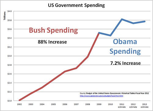
The problems with this chart in no particular order:
Bush was not responsible for all of 2009 spending
These two charts assume that the entirety of the 2009 fiscal situation lies squarely on George W. Bush’s shoulders. I would like to posit that this is unfair. There was a bill that got passed (you may have heard of it) that goes by the popular name “the stimulus”. It started immediately spending vast sums of money starting in the fiscal year 2009. George W. Bush had nothing to do with this bill.
I did a little digging and found that the budget Bush proposed for 2009 was for $3.09 trillion while the amount spent during that fiscal year was $3.52 trillion. Now, this might not matter if these kinds of variations were common. But here is a graph of the difference between the proposed spending and the actual spending for the past 10 years. We’re going to play a game called “one of these things is not like the others”.

We can see that 2009 is a huge outlier… the difference between what was proposed and what was spent is 5 times more than any other year ( $429.1 billion).
Yep… that’s what happens when you propose vast amounts of immediate spending in the middle of a fiscal year. Given that Bush had to sign the budget he was given by a Democratic Congress, I think it’s charitable to say that he is “responsible” for what he proposed: the original $3.09 trillion.
Data is not adjusted for inflation
This is a minor quibble, but it matters because it’s a sign that the person who created the chart doesn’t care about accuracy. Ignoring inflation will always make spending increases look drastic because we’re compounding real increases with inflation increases. It also matters because, if we adjust for inflation and use Bush’s last spending proposal, he increased spending by 39% or about 5% a year.
The chart stops tracking data at a very convenient place
President Obama’s budget proposal basically has us maintaining a stable level of spending until 2014, when it starts increasing drastically. The author chose not to chart this data, even though it was right there in front of him. Why? I assume it’s because he’s a partisan hack, but I’m not altogether prepared to rule out that he is, in fact, just an idiot.
By including these spending targets, we get a much more “apples to apples” comparison where we’re comparing 8 years of “Bush spending” to 7 years of “Obama spending”.
If we take all these problems and put them together, we end up with another chart altogether.

Chart 2
The second chart says that Bush increased the deficit and Obama is decreasing it.
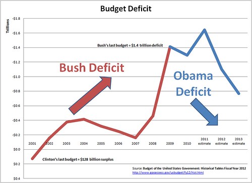
First of all, the same “Bush is responsible for everything in FY2009” thing above applies here too. In addition to that:
The stimulus was front-loaded with tax cuts
I know that right wingers will maintain till their dying breath that tax cuts don’t reduce revenue, they increase revenue. I’m not really in that camp and this is my blog, so I get to do things my way. So there.
According to CNN at the time, the stimulus was going to save the average household $1,179. Using the 2009 Census estimate of 112.6 million households, that comes out to $132.7 billion. If we add that to the $429 billion difference between Bush’s spending proposal and the spending reality and then subtract that from the final deficit, we get a deficit of $894.4 billion.
$132.7 billion in stimulus tax cuts
+ $429.1 billion in un-planned spending
– $1,415.7 billion actual deficit
======================
$836.2 billion of the 2009 deficit that is “Bush’s fault”
All of the reductions are in the future
Notice how the chart goes down in 2012 and 2013? Notice how neither of those years have happened? This is because President Obama’s 2012 budget has made some pretty incredible claims.
To look at these claims with our feet on the ground, let’s first look at a revenue chart.

This is a chart that shows the increase and decrease of federal revenue changes over a 12 month collection period. We can see that recessions mean revenues decrease by as much as 15% year-to-year and that in boom times they can increase by a little over 10% year-to-year. The biggest increase we’ve ever seen was 12% year-to-year increase (from the 2004 fiscal year to the 2005 fiscal year).
Now this is the same chart including the revenue increases that the Obama budget proposal assumes will happen.

Now that is some f***ing audacious hope right there.
The Obama budget assumes for the sake of future budget planning that we will blow 30 years of revenue data out of the water by clocking in a 21% revenue increase in 2012 and a 14% revenue increase in 2013. Then they assume things will “calm down” to a stable 7-8% annual increase, which is merely massive (as opposed to completely insane).
This is a particularly important point because the estimates that the Obama team made were not just optimistic. They assume we are on some kind of federal revenue breakthrough unheard in this generation.
The revenue assumptions in this budget proposal have sped right past optimism and into delusion.
For the sake of fixing this second chart, I am going to be incredibly generous and assume that we see 9% revenue growth over the next 4 years. This would be very good news for our deficit situation and is extremely unlikely. It is not, however, technically impossible, so we’ll give some benefit of the doubt there.
Fixing Chart 2
Accounting for these issues, assuming that we hit the spending targets we’re aiming for (a big if but one I’m willing to let it slide) here is the second chart updated.

Chart 3:
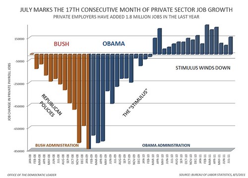
Permutations of this chart have been around for some time. President Obama’s team first started using it in mid 2009 to promote the idea that the stimulus was working. It’s actually the most honest of the charts here, but there are still some problems with it.
Using Only Establishment Private Jobs Data
This makes things look a little better because we’ve been losing public sector jobs over the last year or two. I’m not saying “counting only private sector jobs is an invalid measurement”. What I am saying is that it is a red flag that the person may be cherry-picking data to get the best result.
As for using establishment data instead of household survey data, there’s nothing particularly wrong with that, but it is good to note that the household survey counts about 10 million more jobs and covers people who are employed but not on a payroll, so it will give a somewhat more complete picture of the employment situation. And, unsurprisingly, the data doesn’t look quite as good for Obama. It’s not particularly bad… it’s just “meh”.
It’s Bush’s Fault Only When It’s Bad
But the funniest thing about this chart? The author has spent the last 2 charts convincing us that EVERYTHING that happened in the 2009 fiscal year was Bush’s fault. In this chart, the tune has changed entirely because, if the author gave Bush credit to the end of the 2009 fiscal year, it would look like Bush saved the day. The most drastic reductions in job loss would then fall under the “Bush’s fault” umbrella.
And we can’t have that. When it comes to a choice between honest consistency and making George W. Bush look bad, the author didn’t even blink. So, in a move that is so dishonest is is actually funny, the chart author basically says, “All jobs saved are due to President Obama and his courageous stimulus, but I blame George W. Bush for all the stimulus spending and stimulus tax cuts that created those jobs.”
I created a alternate version of this chart that represents my complaints listed above, but I want to make note that, while I feel the previous “fixes” are a better representation of reality, this chart is not nearly as fair as those were. I personally prefer the BLS household data (which I used in this chart) over the payroll data (which the original chart author used), but I’m not comfortable giving Bush credit for stopping job losses 9 months after he left office. I’m representing it this way only because I want to give an indication of how the author would have done it if he or she maintained an internal consistency.


