Tag Archives: graphs

Debunking the “Republican Congress Creates Jobs” Chart Or “How To Make Numbers Say Anything You Want”

This is a companion piece to the previous post, so please read both of them. Here I’m going to lay out the script I had written for debunking the chart I created that asked the question “Does a Republican Congress Create More Jobs?” and then implied with a chart that this was indeed the case. I’ll walk through some process for creating charts and then talk about why I would create a chart that I was just going to debunk.

I apologize for the similarity to the post where I debunk the Obama stimulus chart. These two scripts were meant to be together.

<Start Script>

How to Make Number Say Anything You Want

Do you want to convince people that your side is right with only the flimsiest proof? Does the idea of tricking people with numbers make you all happy inside? Then come join us as we walk through “How To Use Charts To Say Anything”

Step 1: Massaging the Data

The first step is to grab the data that makes your point the best. Let’s use it to prove that a Democratic Congress is bad for jobs.

“How can we do such a thing” you ask?

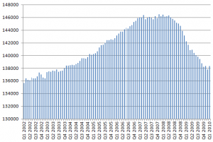
In the first case, the raw jobs data looks like this

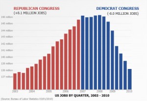
but the final chart looks like this.

How did they do that? Was it magic?

Nope, we simply smoothed the data. The raw data is a little too chaotic and has too many data point to tell the straightforward story that we want. So instead, we’ll average the monthly data so that we have quarterly data. There… now we have some nice smooth straightforward data

Step 2: Pick colors that make you look good

Next, we pick some colors. Let’s make the Democrats blue dark and bold, give it a bit of an angry feel to it. This is our way of getting the audience to look at the democrats in a harsh way. We could try to soften up on the Republicans more, but too soft of a red would look pink and we don’t want that.

Let’s compare our colors to the Excel defaults:

Step 3: Do NOT give any context!

Finally, and this is the most important part, only give information that is helpful.

Let everyone know that we saw 8 million jobs added to the economy while the Republicans were in charge and make a point to show that we lost 8 million jobs while the Democrats were in charge. But don’t mention that the Republicans took Congress only a year after 9/11 at a time when the job market was particularly low. Otherwise people will think it’s a “Well, they can’t fall off the floor” thing.

And make sure you don’t mention anything about the real estate market and how the bubble drove the labor market in a way that was clearly unsustainable. We don’t want the viewers to be confused with all these relevant details. We want them to say “Republicans good, Democrats bad”.

<End Script>

Everyone here was incredibly kind to put up with my bullshit chart for as long as I left it up without explanation. I’d like to say unequivocally: My chart is propaganda… just like the Obama administration’s chart. I was trying to use my chart as a visual talking point that said:

If you have no ethical qualms, data visualizations can be manipulated to say exactly what you want them to say.

My chart implies that the Republicans were responsible for the jobs growth between 2003 and 2007 and that Democrats were responsible for the drastic decline from 2007 to the present. Let me state plainly, I do not think that is the case.

But if we just play around with the data the right way, we get what seems to be a clear picture that portrays a correlation and gets on its hands and knees and begs us to draw causation from it. Most people will do exactly that.

I can spend hours walking patiently through what is wrong with the Obama administration’s chart. Let me recap the high points here:

  • If you look at the data with the context of what President Obama’s team was hoping the stimulus would do, the power of the chart disappears.
  • If you look at the data with the understanding that they’re charting a first derivative, you realize that we haven’t gained jobs, we’re just losing them more slowly and the power of the chart disappears.
  • If you look at the data with the understanding that they didn’t even start spending the stimulus until the job loss had started slowing down, the power of the chart disappears.
  • If you look at the data in the context of other recessions, you’ll realize that, far from showing a drastic improvement, the numbers represent a devastatingly slow jobs recovery compared to other recoveries and the power of the chart disappears.

But this kind of explanatory rebuttal would interest those already convinced. The chart I made had a power that an calm explanatory video wouldn’t have. Quite frankly, I hate that this is the case. Like President Obama’s chart, my chart doesn’t teach people anything about economics or lead people to learn important things about unemployment.

The only valuable thing my chart teaches is that charts can portray accurate data and still be manipulated to coach people along to poor conclusions. The only reason I even put my chart up is because it is the graphical equivalent of drawing out the Obama administration’s argument to its logical conclusion. My chart works with the same data, the same assumptions, and the same implications. And it leads to a completely different conclusion.

I’ve heard people describe President Obama’s chart as “powerful” and “brilliant”. The popular information visualization blog Flowing Data even tossed it up for public discussion among info viz professionals.

My point here is that it isn’t brilliant. It’s juvenile. It’s the chart equivalent of a crass political cartoon with a Snidely Whiplash mustache drawn on the bad guys. It’s a design trick imagined by cynical, self-congratulatory children fresh out of graduate school who pat themselves on the back for their ability to fool people who they think are too stupid to know the difference. They think they are special because they can get powerful people to flatter them for their ability to lie.

But they aren’t special. I can play that same childish game in my free time. The difference if that I want people to know that it’s a trick. They would rather see people fooled.
Not All Money Is Created Equal

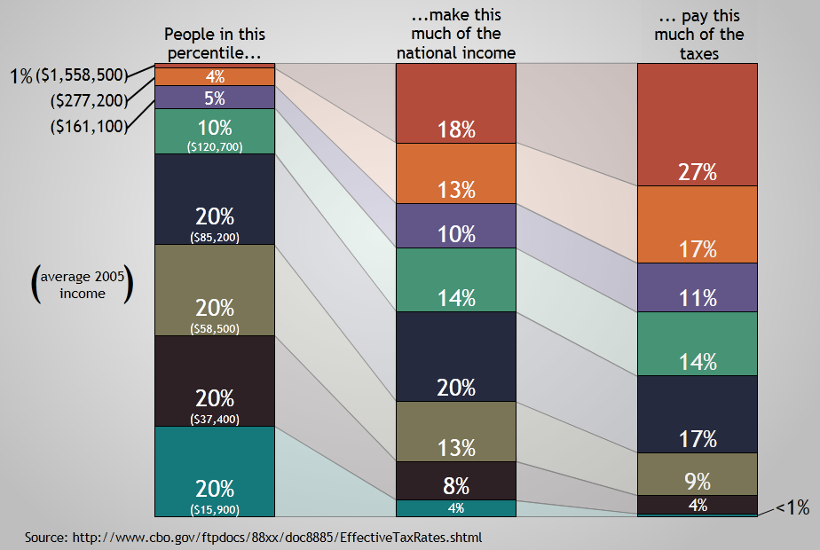
I had a thought last night that, what with tax season coming right on up, it would be fun to do a visualization of income and tax distribution. So I wandered down to the CBO and grabbed this document and turned it into a visualization. Sadly, their latest data is pushing 4 years old, so I’ll probably have to update it sometime soon.

(click for the full resolution image)

If you’d like to use a low res version of this chart in your own blog, this one has just the shapes and very little text, so it scales better smaller more better readability. The information here is kind of blunt… I’m sure there are several variables I haven’t accounted for. But this is a pretty accurate portrayal of the data at the CBO (unless I did a calculation wrong).

I wanted to do this because I get really sick of people who say things like “The top 1% of income earners pay 27% of the taxes.” Unless you believe that someone who makes $15K a year should pay $20K in taxes, that is a very silly statement. If the top 1% of income earners make 27% of all the money, it would be perfectly reasonable for them to pay 27% of all the taxes.

That’s why I wanted to make this chart. I want to be able to communicate in a single image how much the top (and bottom) earners make as well as how much they pay in taxes. The thing I think this chart brings out is that we have a progressive taxation system that does not treat all money equally. (Some may bristle that I just called our taxation system progressive, but I’m going to stick by that description. It may not be as progressive as some wish it was, but it is progressive.)

If you earn between the 80th and 90th percentile, you’re the closest we come purely equitable income taxation. That group makes 14% of all the money and pays 14% of all the income taxes.

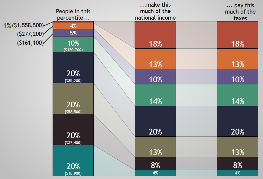
A tax system that treated all money equally (like a flat tax) would look something like this:

In this system, dollar number ten million and one made by a hedge fund manager would be taxed at the same rate that a dollar made by a single mom earning minimum wage at a fast food restaurant. Every new dollar made would be “created equal” under the tax law. Such a system would probably reduce compliance costs as well, although I imagine it wouldn’t be particularly popular. “Let’s tax the poor more so that we can tax the rich less!” doesn’t sound like a winning campaign.

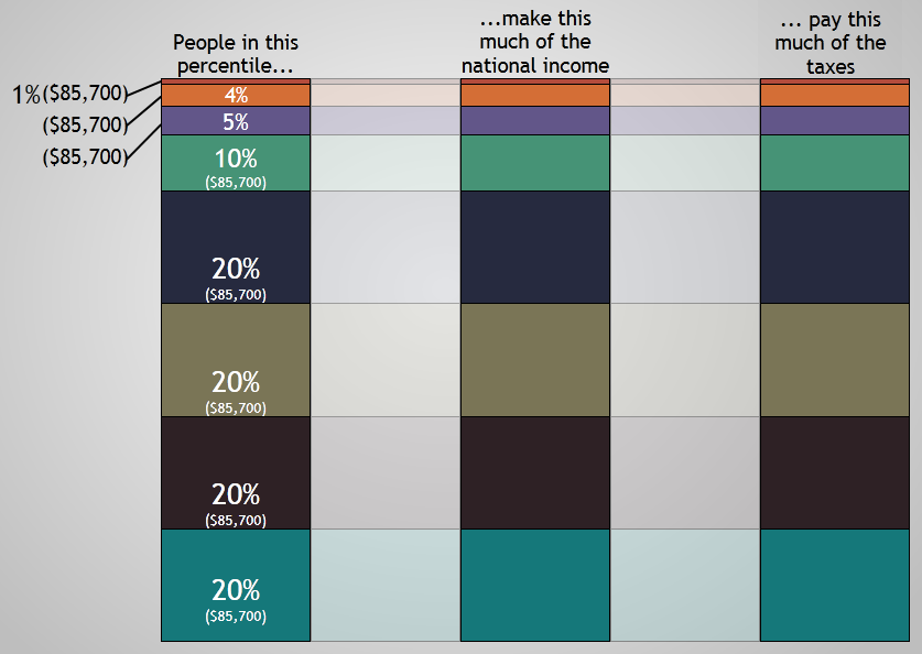
And, just for fun, I created the “pure socialism” model of this chart as well.

Of course, pure socialism is pretty silly, so this would never happen. Reason one is that, if everyone made the same amount of money, we wouldn’t have quintiles or “the top 1%”. It would just be a blob.

And it wouldn’t make any distinction between people who work hard and people who are lazy. As Penn Jillette has stated (I’m paraphrasing), “laziness is a perfectly valid life choice”. Life gives us all sorts of things to trade off with. Some people trade money trough stocktrades.ca (or the potential of earning money) for hanging around the apartment playing video games. Nothing wrong with that. But I don’t mean to get off on a “socialism is really silly” tangent.

I just hope that these charts are helpful and fun. Feel free to steal (with proper attribution).

The Best Paying Undergrad College Degrees

Cool little piece on the best paying undergrad college degrees has this accompanying graph.

(Parts of the graph aren’t showing up very well on wordpress, so feel free to head over there to check it out.)

Degrees Degrees
Methodology
Annual pay for Bachelors graduates without higher degrees. Typical starting graduates have 2 years of experience; mid-career have 15 years. See full methodology for more.

If you’re thinking about choosing your major, my only advice has stayed the same over the years: Go as technical as you think you can handle.

Many employers assume that, if you have a technical degree they can teach you the other stuff. Very few of them assume that if you have a liberal arts degree they can teach you the technical side.

It’s Tough Making Predictions…

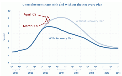
This graph has been going around a good deal in the last week. (Source)

StimulusPrediction

Basically, the light blue line is the unemployement rate the Obama administration predicted would happen if we didn’t pass the stimulus bill back in . The dark blue line is the unemployment rate the Obama administration predicted would happen if we did pass the stimulus bill. (Here’s the raw document.) And the red triangles are the actual unemployment rate as it has panned out. Not only are they worse than the Obama adminstration expected, they’re worse than what they expected even if we didn’t pass the stimulus bill.

I think it is fair to say that the stimulus bill has not been as stimulating as they told us it would be.  Now, it could certainly be the case that the unemployment rate would be even higher than this if we hadn’t passed the stimulus bill, but that is about as non-falsifiable a statement as you can get. 

(UPDATE: The author of this graph explains why he thinks there has been little effect … we’ve spent almost none of the stimulus money yet. I’m trying to figure out where he’s getting his data because I don’t see any infrastructure projects on there. I’m certain that there is infrastructure spending going on right now because there is a stimulus project not 3 miles from my house causing daily traffic jams.

UPDATE 2: Here’s the best I could find on stimulus money currently being spent.)

 I don’t really feel like dogpiling on the adminstration on this particular issue, so I want to hit a broader topic here… the administration’s use of numbers. This graph tells us some simple things that are scary and a complex thing that is scarier. 

The simple thing it tells us is that the Obama administration was completely unable to predict the economic conditions four months into the future. They thought we would be at about 8.0% unemployment if the stimulus bill passed and at 8.5% unemployment if we sat on our hands.

As it turns out, we passed the stimulus bill and we’re at 8.9%. The easy lesson is that they didn’t get that one right. But, as Robert Strom Petersen said, “It’s tough making predictions, especially about the future.” And I probably couldn’t have done any better.

But no one is hanging the weight of hundreds of billions of dollars around my neck, which makes it more OK that I can’t project the future economic conditions. It seems fair to demand a slightly higher level of predictive accuracy from an administration that is using their predictions to push trillion dollar policies. 

The complex thing that this graph tells us is that the Obama administration is comfortable using graphs that don’t really have a basis in reality in order to bolster support for  their decisions. Graphs make us think that something is scientific and studied and therefore more reliable. But reliability is something that has to be earned. The team that put this graph together should be questioned on what they got wrong and what they would do next time to get it right.

Basically, the next time the president uses projected figures to push his policies, I would like to see someone ask the following question:

“Mr President, the last number predictions you threw at us turned out to be pretty far off the mark. What assurances do we have that these new numbers are accurate?”