I’ve been trying to find the time to make a video for this, but the fact of the matter is that I’m simply too slammed with all my work (I have a huge conference in two days). And I’m really kind of sick of my chart that I put up with basically no explanation. I basically created my chart as a rebuttal to this chart put out by the Obama administration. In this post, I debunk the Obama chart. In the next one, I debunk my own.
I’m basically just going to dump the script that I had written. Imagine my voice with some happy visuals that I don’t have time to make. I’ll add some additional comments at the end. Imagine a sing-song snake-oil salesman. That was what I was going for.
<Start Script>
How To Use Charts To Say Anything
Do you want to convince people that your side is right with only the flimsiest proof? Does the idea of tricking people with numbers make you all happy inside? Then come join us as we walk through “How To Use Charts To Say Anything”.
Step 1: Massaging the Data
The first step is to grab the data that makes your point the best. Let’s use it to prove that a Democratic president is good for jobs.
“How can we do such a thing” you ask?
Let’s grab some raw jobs data. We’re going to take this data

and make it look like this:

How did we do that? Was it magic?
Nope, it’s called the first derivative. It works like this. Instead of worrying about how high the line is, we’re only going to worry about how steep the line is. That way, the number will look good even if we keep losing jobs. Instead of charting how many jobs there are, we’re charting how many jobs we’re still losing.
That turns the first chart (which looks bad) into the second chart (which looks good).
Step 2: Pick colors that make you look good
Next, we pick some colors. We could pick the default colors that Excel gives us when we chart two different kinds of numbers. But that’s too neutral. By way of comparison:

As you can see, we’ve taken the default red (for George Bush) and made it darker and richer. This is like drawing a Snidely Whiplash mustache on him so that we know he’s the bad guy. Then, we’ll make the President Obama blue lighter and softer so we know he’s the good guy.
Step 3: Do NOT give any context!
Finally, and this is the most important part, only give information that is helpful. And by helpful, I mean favorable to your side.
It’s OK to mention that President Obama signed the stimulus bill into law in the first quarter of 2009.
It’s not OK to mention that the initial stimulus reports from the first and second quarter were totally blank, which means that they didn’t really start spending the money until July.

Also, you should forget to mention that as of December, we’ve only spent 10% of the stimulus money.

If you give all of this unhelpful information, people might draw the conclusion that the stimulus didn’t really help very much.
And that would be bad.
Remember, we’re not interested in helping people understand the complexities of the economy. We just want them to look at the chart and say, “Bush bad. Obama good.”
<End Script>
I got my numbers for the last part of this from the stimulus reports on recovery.gov. Since I started looking at the data back in late 2009, they’ve changed the way they organize the data. Until a little over a month ago, the reports for 2009, Q1 and 2009, Q2 were blank. Zero data. Nothing. In the 2009 Q3 data they reported giving out about 4% of the stimulus money. By the end of 2009 Q4, they had reported giving out 10% of the simulus money.
Since then, they took the empty Q1, Q2 and the actual Q3 data and relabeled the file so that the Q3 data now says “February 17 – September 30, 2009”. There is no way to tell for certain when the money was sent out, but the amount of money marked as “recieved” ran on a curve that was about 4 months off. (Example: Most of the money that was marked as “recieved” was applied for in March, April and May. Very few places that applied for money after May marked it as recieved by the end of September. So…we see job losses slowing even before the money was making it out the door.
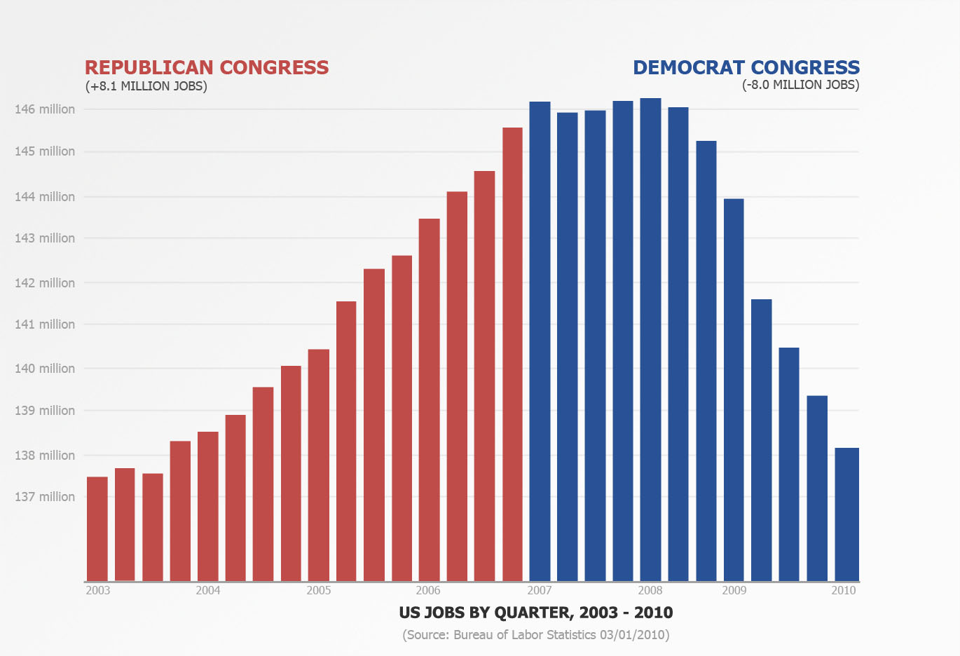
OK. Now to talk about my rebuttal chart and a well deserved explanation. I have the greatest readers of all time and many of you have pointed out that my rebuttal chart (seen here) commits many of the same fallacies that the Obama chart has.
My response to that would be “Yes it does. It was meant to.” I created that chart as the visual equivalent of saying “If your logic is correct, than you would be forced to accept this other conclusion as well since it uses the same logic.”
Both charts use jobs data taken from the same place, displayed the same way, stripped of context and used to push an ideological point using an implicit “correlation mean causation” line of argumentation.
Let me be clear: I do not think that a Republican Congress is the driving factor behind 8 million jobs created and I would NEVER say that. But I would say “Your chart implies that Obama is responsible for the slowing of job loss. If that is your argument, I would like to use the same chart logic to say that we need a Republican Congress to regain those jobs. By your own argument, you should be voting Republican this November.” I meant my chart to be a sort of visual rhetorical trick to be played in the context of the Obama stimulus chart to show that the numbers can be spun in either direction.


