Tag Archives: charts

Religious Outliers Nonsense (or "Atheists Are Richer Than Religious People If You Take All Poor Atheists Out Of Your Sample")

Charles Blow’s most recent New York Times op-ed is something of a boon for visualization enthusiasts. He replaces almost his entire article with a visualization. This illustrates that he recognizes power of visual communication to make and reinforce a point in a way that is self-obvious and can stick with the reader better than words.

Unfortunately, he has decided to use data that misleads his audience to such an extent that I can only conclude that he is unconcerned with the truth insofar as it undermines his desired objective.

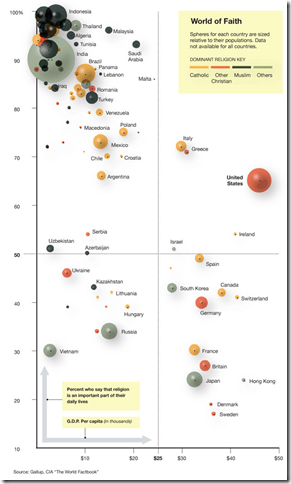
Blow’s main point is that the US is an outlier in the world because we’re religious but also rich while “religiosity was highly correlated to poverty”.

I’ve reproduced the chart in question below. (Click to enlarge)

image

Now, keep in mind that this is not charting religion as it is listed in the CIA World Factbook, but according to the specific question: “Is religion an important part of your daily life?” That will be important in a little bit.

This chart seems to prove his point. Until you realize what isn’t on the map.

Here is a list of the countries that didn’t manage to make their way onto the map due to the fact that Gallup didn’t poll them:

China – 1.33 billion people, heavily non-religious, poor

North Korea – 22 million people, heavily non-religious, unbelievably poor

Cuba – 11 million people, presumed non-religious, poor

Taiwan – 23 million people, 93% Buddist*, rich (comparable to Japan)

Problem number one – Charles Blow has a duty to inform his audience of these omissions. The countries without data represent nearly 25% of the world population and skew heavily toward non-religious. They are too large and too important to the data set and visual reference to simply ignore. Yet Mr. Blow doesn’t seem interested in mentioning them.

Problem number two – Mr. Blow heavily implies that there is a causal relationship between religiosity and wealth. But (as we all know) correlation doesn’t imply causation. Western European countries (and countries filled with people from Western Europe) are richer, as are developed Asian countries. Eastern European and South American countries are less rich. Middle eastern, and African countries tend to be much poorer. There’s a correlation in geo-political histories here that is stronger than religion.

Of course Mr. Blow could always go to rural India and inform them that their poverty is related to their devotion to Hindu and has nothing to do with British imperialism. Or perhaps to the deep south where he can proclaim to the +90% Christian black population that their economic woes are related to their religious tendencies.

Problem number 3 – But the final problem is the worst one because it involves an outright lie:

Singapore is more religious and richer than the United States. And Mr. Blow didn’t map it. At all.

It’s possible that Mr. Blow is actually so numerically illiterate that he didn’t know he was supposed to tell people about key missing data points. But taking out data that doesn’t align with his point is disgusting manipulation. The end result of his deception (conscious or otherwise) is “If you take out all the poor atheists and take out all the rich religious people, then this pattern emerges…”

Mr. Blow should put Singapore back in to the data set and add a correction to his article that announces how his data set has enormous gaping holes. And he should probably never be allowed to touch charting software again.

* The CIA Factbook has Taiwan listed at 93% Buddhist, but I’m not sure how they would answer the specific question that Gallup asked. I’ve heard some atheists claim Buddhism as an “atheistic religion” (no personal god) so it could be that the citizens of Taiwan wouldn’t say that religion plays a big role. I simply don’t know.
Religious Outliers Nonsense (or “Atheists Are Richer Than Religious People If You Take All Poor Atheists Out Of Your Sample”)

Charles Blow’s most recent New York Times op-ed is something of a boon for visualization enthusiasts. He replaces almost his entire article with a visualization. This illustrates that he recognizes power of visual communication to make and reinforce a point in a way that is self-obvious and can stick with the reader better than words.

Unfortunately, he has decided to use data that misleads his audience to such an extent that I can only conclude that he is unconcerned with the truth insofar as it undermines his desired objective.

Blow’s main point is that the US is an outlier in the world because we’re religious but also rich while “religiosity was highly correlated to poverty”.

I’ve reproduced the chart in question below. (Click to enlarge)

image

Now, keep in mind that this is not charting religion as it is listed in the CIA World Factbook, but according to the specific question: “Is religion an important part of your daily life?” That will be important in a little bit.

This chart seems to prove his point. Until you realize what isn’t on the map.

Here is a list of the countries that didn’t manage to make their way onto the map due to the fact that Gallup didn’t poll them:

China – 1.33 billion people, heavily non-religious, poor

North Korea – 22 million people, heavily non-religious, unbelievably poor

Cuba – 11 million people, presumed non-religious, poor

Taiwan – 23 million people, 93% Buddist*, rich (comparable to Japan)

Problem number one – Charles Blow has a duty to inform his audience of these omissions. The countries without data represent nearly 25% of the world population and skew heavily toward non-religious. They are too large and too important to the data set and visual reference to simply ignore. Yet Mr. Blow doesn’t seem interested in mentioning them.

Problem number two – Mr. Blow heavily implies that there is a causal relationship between religiosity and wealth. But (as we all know) correlation doesn’t imply causation. Western European countries (and countries filled with people from Western Europe) are richer, as are developed Asian countries. Eastern European and South American countries are less rich. Middle eastern, and African countries tend to be much poorer. There’s a correlation in geo-political histories here that is stronger than religion.

Of course Mr. Blow could always go to rural India and inform them that their poverty is related to their devotion to Hindu and has nothing to do with British imperialism. Or perhaps to the deep south where he can proclaim to the +90% Christian black population that their economic woes are related to their religious tendencies.

Problem number 3 – But the final problem is the worst one because it involves an outright lie:

Singapore is more religious and richer than the United States. And Mr. Blow didn’t map it. At all.

It’s possible that Mr. Blow is actually so numerically illiterate that he didn’t know he was supposed to tell people about key missing data points. But taking out data that doesn’t align with his point is disgusting manipulation. The end result of his deception (conscious or otherwise) is “If you take out all the poor atheists and take out all the rich religious people, then this pattern emerges…”

Mr. Blow should put Singapore back in to the data set and add a correction to his article that announces how his data set has enormous gaping holes. And he should probably never be allowed to touch charting software again.

* The CIA Factbook has Taiwan listed at 93% Buddhist, but I’m not sure how they would answer the specific question that Gallup asked. I’ve heard some atheists claim Buddhism as an “atheistic religion” (no personal god) so it could be that the citizens of Taiwan wouldn’t say that religion plays a big role. I simply don’t know.
Debunking the Obama Stimulus Chart Or “How To Make Numbers Say Anything You Want”

I’ve been trying to find the time to make a video for this, but the fact of the matter is that I’m simply too slammed with all my work (I have a huge conference in two days). And I’m really kind of sick of my chart that I put up with basically no explanation. I basically created my chart as a rebuttal to this chart put out by the Obama administration. In this post, I debunk the Obama chart. In the next one, I debunk my own.

I’m basically just going to dump the script that I had written. Imagine my voice with some happy visuals that I don’t have time to make. I’ll add some additional comments at the end. Imagine a sing-song snake-oil salesman. That was what I was going for.

<Start Script>

How To Use Charts To Say Anything

Do you want to convince people that your side is right with only the flimsiest proof? Does the idea of tricking people with numbers make you all happy inside? Then come join us as we walk through “How To Use Charts To Say Anything”.

Step 1: Massaging the Data

The first step is to grab the data that makes your point the best. Let’s use it to prove that a Democratic president is good for jobs.

“How can we do such a thing” you ask?

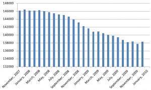
Let’s grab some raw jobs data. We’re going to take this data

and make it look like this:

How did we do that? Was it magic?

Nope, it’s called the first derivative. It works like this. Instead of worrying about how high the line is, we’re only going to worry about how steep the line is. That way, the number will look good even if we keep losing jobs. Instead of charting how many jobs there are, we’re charting how many jobs we’re still losing.

That turns the first chart (which looks bad) into the second chart (which looks good).

Step 2: Pick colors that make you look good

Next, we pick some colors. We could pick the default colors that Excel gives us when we chart two different kinds of numbers. But that’s too neutral. By way of comparison:

As you can see, we’ve taken the default red (for George Bush) and made it darker and richer. This is like drawing a Snidely Whiplash mustache on him so that we know he’s the bad guy. Then, we’ll make the President Obama blue lighter and softer so we know he’s the good guy.

Step 3: Do NOT give any context!

Finally, and this is the most important part, only give information that is helpful. And by helpful, I mean favorable to your side.

It’s OK to mention that President Obama signed the stimulus bill into law in the first quarter of 2009.

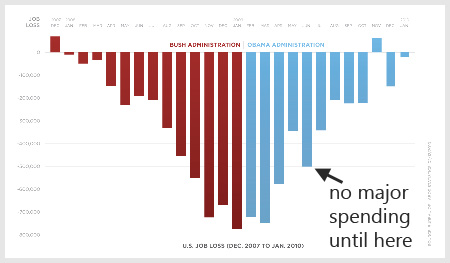
It’s not OK to mention that the initial stimulus reports from the first and second quarter were totally blank, which means that they didn’t really start spending the money until July.

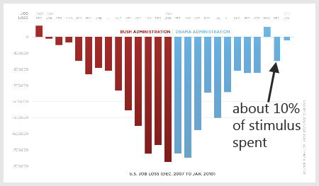
Also, you should forget to mention that as of December, we’ve only spent 10% of the stimulus money.

If you give all of this unhelpful information, people might draw the conclusion that the stimulus didn’t really help very much.

And that would be bad.

Remember, we’re not interested in helping people understand the complexities of the economy. We just want them to look at the chart and say, “Bush bad. Obama good.”

<End Script>

I got my numbers for the last part of this from the stimulus reports on recovery.gov. Since I started looking at the data back in late 2009, they’ve changed the way they organize the data. Until a little over a month ago, the reports for 2009, Q1 and 2009, Q2 were blank. Zero data. Nothing. In the 2009 Q3 data they reported giving out about 4% of the stimulus money. By the end of 2009 Q4, they had reported giving out 10% of the simulus money.

Since then, they took the empty Q1, Q2 and the actual Q3 data and relabeled the file so that the Q3 data now says “February 17 – September 30, 2009”. There is no way to tell for certain when the money was sent out, but the amount of money marked as “recieved” ran on a curve that was about 4 months off. (Example: Most of the money that was marked as “recieved” was applied for in March, April and May. Very few places that applied for money after May marked it as recieved by the end of September. So…we see job losses slowing even before the money was making it out the door.

OK. Now to talk about my rebuttal chart and a well deserved explanation. I have the greatest readers of all time and many of you have pointed out that my rebuttal chart (seen here) commits many of the same fallacies that the Obama chart has.

My response to that would be “Yes it does. It was meant to.” I created that chart as the visual equivalent of saying “If your logic is correct, than you would be forced to accept this other conclusion as well since it uses the same logic.”

Both charts use jobs data taken from the same place, displayed the same way, stripped of context and used to push an ideological point using an implicit “correlation mean causation” line of argumentation.

Let me be clear: I do not think that a Republican Congress is the driving factor behind 8 million jobs created and I would NEVER say that. But I would say “Your chart implies that Obama is responsible for the slowing of job loss. If that is your argument, I would like to use the same chart logic to say that we need a Republican Congress to regain those jobs. By your own argument, you should be voting Republican this November.” I meant my chart to be a sort of visual rhetorical trick to be played in the context of the Obama stimulus chart to show that the numbers can be spun in either direction.

President Obama, I Fixed Your Chart For You

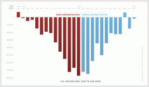
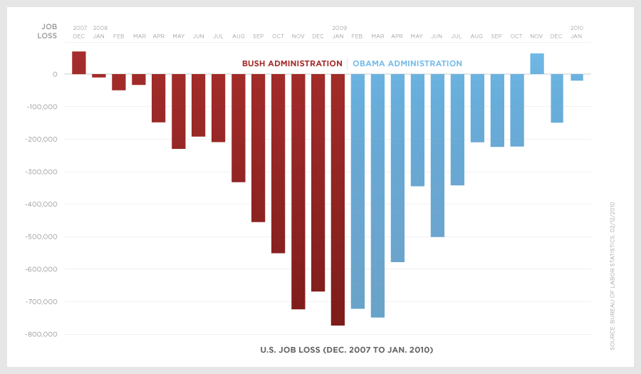
You may have recently seen the new chart put out by the Obama administration pushing the idea that the President’s policies are responsible for the decrease in newly unemployed. It looks something exactly like this:

Now… as a piece of visual political propaganda, this is brilliant. The colors draw sharp contrast, the symmetry is appealing. And the numbers are right.

But keep in mind how carefully I phrased the units being used “decrease in newly unemployed”. This isn’t an increase in jobs or a decrease in unemployment. It just means that we’re losing jobs slower that we were before.

Make no mistake… this is good news. And we can bicker back and forth as to whether President Obama’s policies are responsible for this slowdown in newly lost jobs. He would say yes and point to the stimulus.

But in order to point effectively to the stimulus, we would have to take a look at the expectations of the stimulus. Everyone expected that we would come out of the recession eventually and that job loss would slow. The question was how quickly that would happen.

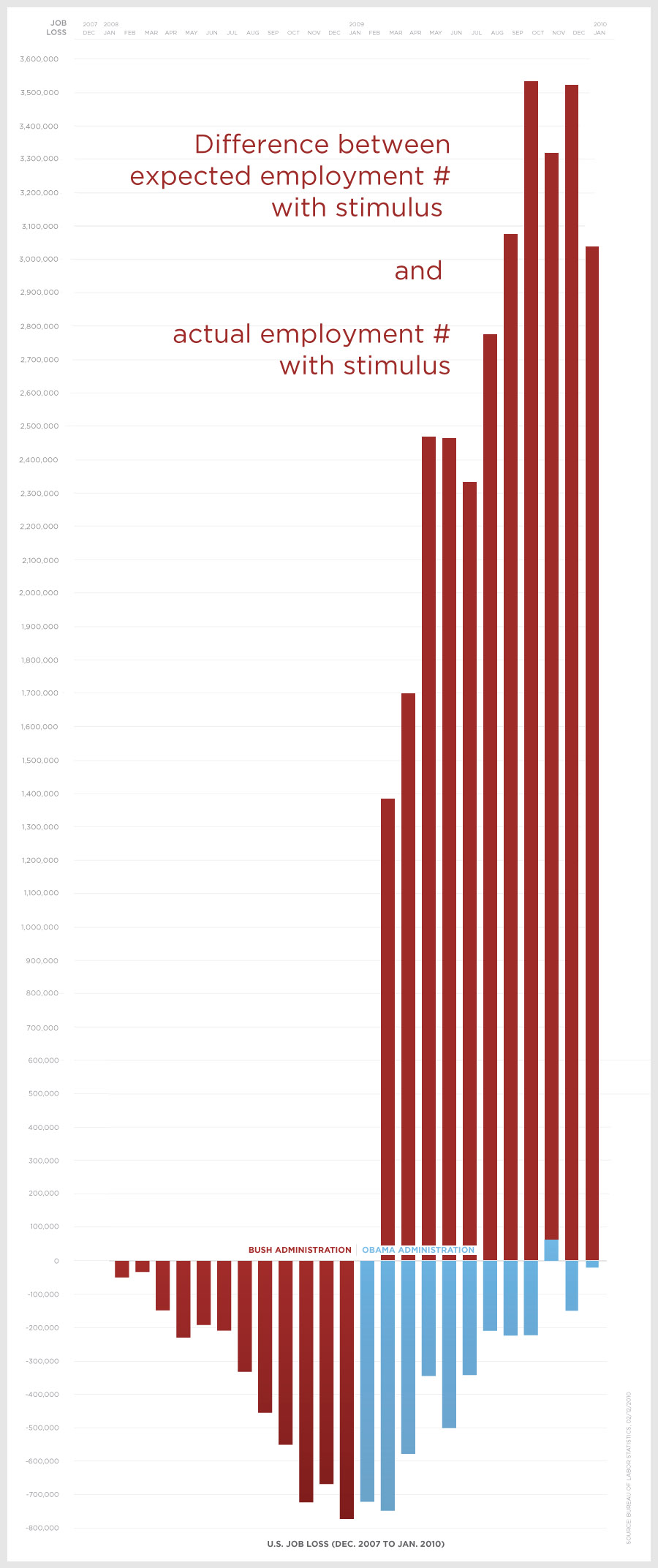
To help us visualize the expectations of the stimulus against the reality of it, I’ve added that piece of context to the graph. See if you can spot it.

I got these numbers by multiplying the labor force by the expected unemployment rate with the stimulus (per this chart) and then subtracting that number from the labor force times the actual unemployment rate.

One may say that this is unfair. I would actually kind of agree. Economic predictions are pretty hard to make. But the original chart is similarly unfair. Keep in mind that it took a few months to get the stimulus money out the door. In fact, they didn’t even release any data on the stimulus funds for second quarter 2009 (the first stimulus report was for third quarter 2009).

Side Note: This data has actually been scrubbed from the website. They’ve re-compiled the data into new categories. But I’m wary about trusting the data since it looks like, according to the official data, about $12 billion of the stimulus was spent before the stimulus was signed with projects being approved as early as 2000.

So the first several months of decline don’t even reflect the impact of the stimulus. The decline in new job losses seems to be just a happy coincidence that looks good on a chart.

Not All Money Is Created Equal

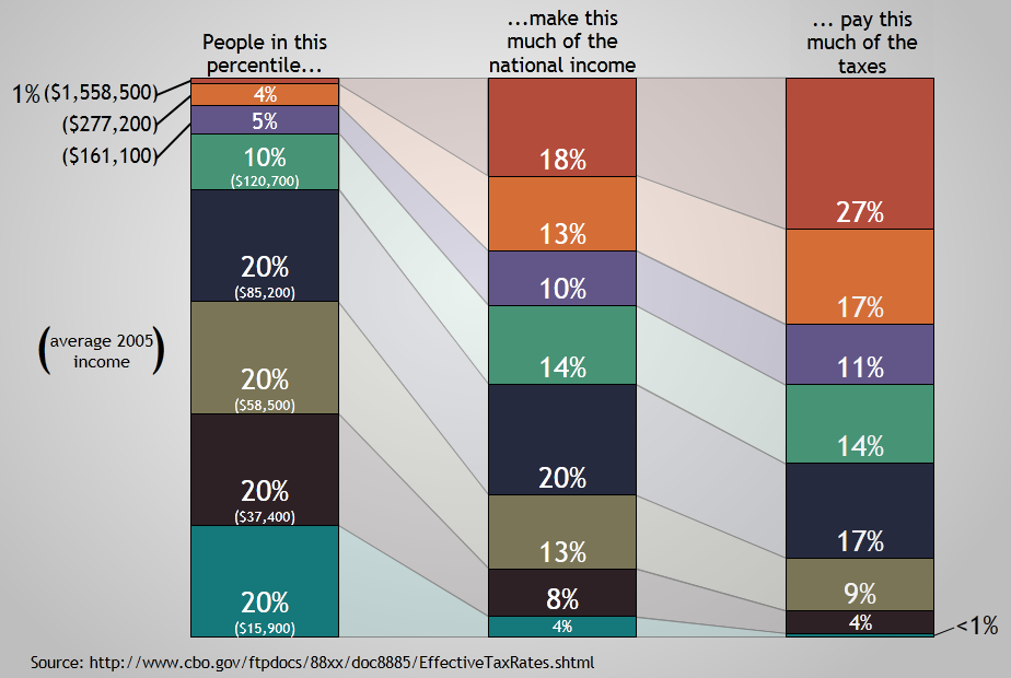
I had a thought last night that, what with tax season coming right on up, it would be fun to do a visualization of income and tax distribution. So I wandered down to the CBO and grabbed this document and turned it into a visualization. Sadly, their latest data is pushing 4 years old, so I’ll probably have to update it sometime soon.

(click for the full resolution image)

If you’d like to use a low res version of this chart in your own blog, this one has just the shapes and very little text, so it scales better smaller more better readability. The information here is kind of blunt… I’m sure there are several variables I haven’t accounted for. But this is a pretty accurate portrayal of the data at the CBO (unless I did a calculation wrong).

I wanted to do this because I get really sick of people who say things like “The top 1% of income earners pay 27% of the taxes.” Unless you believe that someone who makes $15K a year should pay $20K in taxes, that is a very silly statement. If the top 1% of income earners make 27% of all the money, it would be perfectly reasonable for them to pay 27% of all the taxes.

That’s why I wanted to make this chart. I want to be able to communicate in a single image how much the top (and bottom) earners make as well as how much they pay in taxes. The thing I think this chart brings out is that we have a progressive taxation system that does not treat all money equally. (Some may bristle that I just called our taxation system progressive, but I’m going to stick by that description. It may not be as progressive as some wish it was, but it is progressive.)

If you earn between the 80th and 90th percentile, you’re the closest we come purely equitable income taxation. That group makes 14% of all the money and pays 14% of all the income taxes.

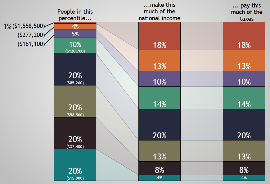
A tax system that treated all money equally (like a flat tax) would look something like this:

In this system, dollar number ten million and one made by a hedge fund manager would be taxed at the same rate that a dollar made by a single mom earning minimum wage at a fast food restaurant. Every new dollar made would be “created equal” under the tax law. Such a system would probably reduce compliance costs as well, although I imagine it wouldn’t be particularly popular. “Let’s tax the poor more so that we can tax the rich less!” doesn’t sound like a winning campaign.

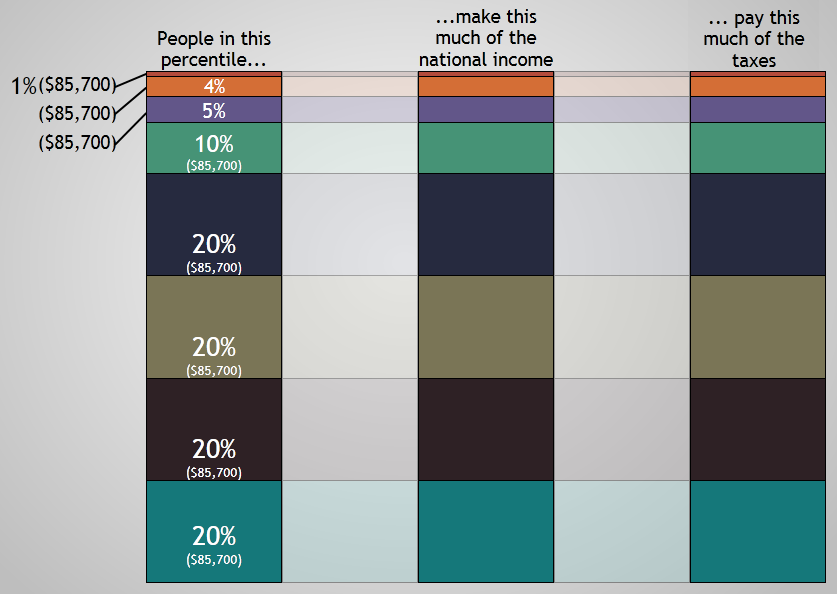
And, just for fun, I created the “pure socialism” model of this chart as well.

Of course, pure socialism is pretty silly, so this would never happen. Reason one is that, if everyone made the same amount of money, we wouldn’t have quintiles or “the top 1%”. It would just be a blob.

And it wouldn’t make any distinction between people who work hard and people who are lazy. As Penn Jillette has stated (I’m paraphrasing), “laziness is a perfectly valid life choice”. Life gives us all sorts of things to trade off with. Some people trade money trough stocktrades.ca (or the potential of earning money) for hanging around the apartment playing video games. Nothing wrong with that. But I don’t mean to get off on a “socialism is really silly” tangent.

I just hope that these charts are helpful and fun. Feel free to steal (with proper attribution).