Does a Republican Congress Create More Jobs?

UPDATE: I discuss this chart in detail in my new posts, “How To Make Numbers Say Anything You Want” Part 1 and Part 2

For your consideration.

Download the large version
Download the small version

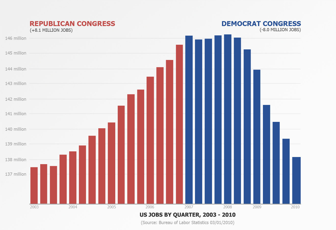
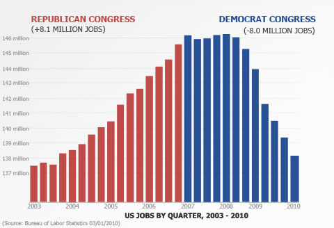
Data gathered from the US Bureau of Labor Statistics. Employment numbers are averaged by quarter and charted from 2003 to the present. (2010 Q1 is just January, 2010) Republicans took control of both houses of Congress in January 2003. Democrats took control of both houses of Congress in January 2007.

I’ve more to say, but it can wait till later.

32 Responses to “Does a Republican Congress Create More Jobs?”

  • Rene:

    Bernanke’s napping on the job crashed the planet towards the end of Bush’s administration and job losses continued into Obama’s administration.

    There’s some lag as to when things take effect.

  • Ryan:

    You know… I often ear that lag explanation, but it’s generally coming from someone trying to vindicate their “team”. I tend to believe it, because it seems common sensical that the government’s actions won’t have an immediate effect on jobs. However, now that I think about it afresh, I’m wondering what (if any) data there is to back up that statement.

    I understand Matthias’ “correlation does not prove causation”, so I don’t want to read too much into the trend in the graph. But am I to assume that the economy skated along on its past strength for 18 months under a Democratic Congress before the policy of the Bush administration / Bernanke resulted in millions of lost jobs? Conversely, how would we explain the upswing 9 months after Republicans gained control?

  • Matt:

    I am curious how this is displayed over time and what other events affect this? For example, every 8 – 12 years there is a recession or depression. We are coming out of one now, there was one around 2002, there was one in the early 90′s, and there was one in the late 70′s – early 80′s.

    This chart also shows the time period coming out of one downturn into an upswing and then back into a downturn. How does that play into these numbers as well?

  • Sarah:

    I’m confused. I don’t understand the point the chart is trying to make. What I see is more blue than red – and that we’re better today than we were during the early GOP-controlled Congress days where your chart begins. Is that your argument – that Dems are better at creating jobs and the Republican talking points of low taxes relieving burdens on businesses to generate job growth is all a hoax?

  • politicalmath:

    Sarah,

    Please don’t be childish in my comments section, it’s insulting to your own intelligence.

  • Sarah:

    I’m very sorry if I offended, but I meant my comment as an honest question. You said you have more to say later, so if you’re not interested in entertaining a serious question, I’ll have to wait until then.

  • politicalmath:

    Sarah,

    If that is the case, I apologize. I read your comment as a snarky attempt to willfully misread the graph.

    The chart is meant to show the number of jobs growing throughout the Republican controlled time in Congress. We then see job growth stall in the first year of Democrat control of Congress and then see nearly all the gains made during the Republican years wiped away.

    I’ll be discussing this chart and what it means in far more detail in the next couple days. Thank you for being patient with me and, again, I apologize for my hard words. They were wholly unwarranted.

  • Sarah:

    Thank you for the kind reply. I’m still not convinced this is a positive visualization for Republicans – which may not be its attempt – but I’m interested to follow what more you say on the subject. Thanks again.

  • I’ve heard many times over the last few years that the jobs that were created over the past ten years were lower-quality jobs. People have been underemployed, working below their experience level, paid less, or only able to find part-time work. So just showing a count of jobs doesn’t tell the full story.

    Though I realize how difficult it would be to quantify underemployment. Perhaps it could be correlated to inflation-adjusted income. Use a stacked graph showing proportion of the population in each multiple of the Federal Poverty Line, over time?

  • Mike:

    I agree with Matt’s belief that the time frame seems a bit selective, picking the bottom of one recession as the starting point. This might be the cause of Sarah’s confusion, since it may look like we’re just returning to a baseline. Sarah, what the graph is showing is the trend, under Republicans jobs grew and under Democrats we have a negative derivative, meaning that jobs are shrinking. I tend to believe that neither party is particularly good at “job creation” and that on a longer time frame you can find jobs being created and lost under both tenures. HOWEVER, the graph works well as a response to the Democrat’s dogmatic instance that Republican policies favored only the rich. After all, how much of that job growth benefited middle and working class families? I would guess a lot.

  • M:

    I wonder what the distribution is between the creation of jobs in the private and government sector.

  • @M: You might find interesting the graph of job growth and ebb shown in this article:
    http://www.tnr.com/blog/jonathan-chait/dishonesty-now-chart-form

    From the article: “There are still fewer people on the government payroll now than there were when George W. Bush left office.”

  • John:

    So, what happens when libertarians control congress? I want to see some data about job creation for that.

  • Erika:

    This is interesting, but it would be more interesting if the data were longer term, e.g., over 28 years instead of 28 quarters.

  • Thomas M. Hermann:

    The basic premise “Does a Republican Congress Create More Jobs?” is flawed. Congress does not create jobs, at least not the kind that actually generate wealth. I second Erika’s comment that a longer term would have been more interesting. Furthermore, I think differentiating between the Democrats and the Republicans is not useful. It would be more interesting to examine ‘Size of Government -vs- Jobs’, ‘Number of Regulations -vs- Jobs’, ‘Level of Taxes -vs- Jobs’, etc. Even then, you have to recognize that the nonlinearity of the economy does not lend itself to teasing out sensitivity to individual parameters.

    I’ve truly enjoyed your blog over the past year, but this line of thought appears to me to be starting out poorly. I’m interested to see if you can salvage it.

  • Al:

    - Graphing a longer term –

    Having data charted over a longer time frame would be nice but, unfortunately, there’s only been a few years within our lifetimes when the Republicans had control of The Congress.

  • And the Dems will ad $5.72 trillion to the National Debt in the process. Dems Progressive Debt

  • Mike:

    ahhh, hadn’t seen this graph yet: http://my.barackobama.com/page/content/recoveryanniversary/

    Frankly, this seems like fighting misleading information with misleading information. But it is useful in the sense that any objection raised by a Democrat against your graph can also be applied to their graph. Nicely played.

  • Al: The Republicans were in charge of Congress 1995-2008. The graph goes from 2003-2010, so there’s twice as many years with a Republican Congress than the graph shows.

    Jobs did rise during the latter Clinton term. Then they dipped during the 2001-2002 recession. Then they started rising again.

    One theory that I’ve heard before is that the economy gets nervous when the White House and both houses of Congress are all controlled by the same party (e.g. 2001-2002). Neither party has better policies than the other (at least as far as the economy reacts to), but without adequate checks and balances, both parties are capable of passing their half-baked pet policies into law.

  • [...] he promised to create by 2010.Well, Matthias Shapiro of 10000Pennies video fame created his own jobs graph showing just how great Speaker Nancy Pelosi’s (D-CA) economic stewardship has been for the [...]

  • [...] Matthias Shapiro of 10000Pennies video fame created his own jobs graph showing just how great Speaker Nancy Pelosi’s (D-CA) economic stewardship has been for the [...]

  • Al:

    Bill:

    The Republicans were in charge of the House of Representatives from Jan 1995 through Jan 2007, not the entire Congress. Democrats controlled the Senate Jun 2001 through Nov 2002, when the Repubs regained control with 50 members plus the vote of President of the Senate Cheney.

  • [...] he promised to create by 2010.Well, Matthias Shapiro of 10000Pennies video fame created his own jobs graph showing just how great Speaker Nancy Pelosi’s (D-CA) economic stewardship has been for the [...]

  • [...] Political Math asks: Does A Republican Congresss Create More Jobs? [...]

  • I like most of your charts/videos (and have done posts on many of them as well) … but the sample section is way to small here. Unless you are trying to say that had the Republicans remained in control we would have avoided the recent bust, you need to go back at least a few decades if not a full century.

  • Eric:

    Hey Matthias,

    Here’s an article that reports similar findings with regard to debt: http://www.investors.com/NewsAndAnalysis/Article.aspx?id=522949

    Here’s the main point:
    “During the most recent seven years that the Democrats have controlled Congress, their deficits have averaged $619 billion a year, or 5.3% of the gross domestic product (GDP). During the most recent seven years that the Republicans have controlled Congress, their deficits have averaged $93 billion a year, or 0.6% of GDP. Over their entire seven-year spans, the Democrats’ deficit spending has totaled $4.3 trillion, the Republicans’ $651 billion.”

  • [...] attempts to paint one party as being better for jobs and the other party as being a jobs killer. Matthias Shapiro has created the third chart to the right, and he makes the same mistake that the other charts have [...]

  • [...] I have the greatest readers of all time and many of you have pointed out that my rebuttal chart (seen here) commits many of the same fallacies that the Obama chart [...]

  • [...] lay out the script I had written for debunking the chart I created that asked the question “Does a Republican Congress Create More Jobs?” and then implied with a chart that this was indeed the case. I’ll walk through some [...]

  • [...] over at politicalmathblog.com digs into data from the US Bureau of Labor Statistics and creates another excellent post. The short version: tweetmeme_style = 'compact'; Email, Print, and [...]

  • [...] Job Creation Graph (Congress) I found the original graph here, while examining PSLarkin’s Bush/Obama job loss graph redux search [...]

  • Your blog and the articles I’ve read here are of great value. Thank you for the time invested in this blog.

Leave a Reply