Tag Archives: visualization

Data Visualization Training in DC – June 29th 2015

If you’re in or near Washington, DC, I’d like to invite you to attend my full day data visualization training hosted by the Leadership Institute.

This session is cheap. $40 for the whole day and they give you food. They give you food! You could probably bring some big ziplock bags, rent a food cart for the day and make out ahead. Think of it as an investment.

You can read the formal description that they let me put up on their site but I wanted to give a more casual explanation here.

Who is this for?

This is the hardest part of the training for me. Who will be there? Programmers? Graphic designers? Journalists? Nobel Prize winning economists? Gender theory majors? I’m not making any promises, I just don’t know. So I’m trying to talk about all the things needed to make great data visualizations starting on the ground floor.

This is not visualization theory training. This is not sitting in a room listening to the sultry tones of my melodious voice all day.

I’m going to give a 1 hour presentation on how to do some stuff that you need to be able to do to make cool data visualizations, then there will be a lab, an hour of time to walk through the the stuff I just showed you. My goal is for everyone who attends to actually build 2 data visualizations during the course of the day.

Does this mean technical people will get nothing out of this? I sure hope not. I’ll be presenting on algorithms that I use, yes. But to make sure this is accessible, I’m also providing to the class a set of Excel helpers that I personally use to build my own visualizations. I’m also building a set of web-based tools to help get your visualizations started. I’ll provide all that code to the class so, if you’re technically minded, you can pull it apart and see how it works. And I’m happy to answer questions on it.

If you attend, you will get:

  • To see my glorious face
  • All the files, presentations, labs, and helper scripts that I present in the class.
  • Membership in a Google Group where we can discuss visualization and you can get help with your visualization projects in the weeks after the class is over.

Things you will NOT need

  • a dinosaur-powered rocket ship
  • a mathematics background
  • programming experience
  • design experience

Things you WILL need

  • clothes, probably
  • a laptop with Microsoft Excel
  • some kind of data manipulation software (Photoshop, Paint.Net, Gimp)
  • the willingness to try something new

I’m excited about this event. You will never find training like this for $40… you’re basically stealing it.

This is like those Groupons that you could get when Groupon was just starting out and they totally ripped off their partners and you could get a dozen cupcakes from that tiny little cupcake store for $3 or whatever and 5000 people would buy them and put the little cupcake store out of business.

I’m the cupcake store. You’re the person who kind of feels a little guilty for taking advantage of this great offer, but, hey, it’s a great deal and you’re not going to pass it up.
The Federal Deficit: A Spending AND Revenue Problem

The past couple days, I’ve been railing against the tax/benefits compromise on Twitter and getting a lot of push-back from the right side of the Twitter-verse. The argument goes something like this:

“The deficit is due to the fact that we’re spending too much, not because we’re not pulling in enough revenue. We have a spending problem, not a revenue problem.”

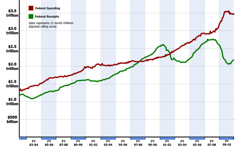
In response to this, I’d like to submit the following into evidence. It is a graph of the federal receipts and federal spending since 1980, taken from the monthly treasury report, which is as non-partisan a source as possible. The gap between the red line and the green line is the deficit.

Technical note: The data here is inflation adjusted by month and represents a rolling 12 month sum. So, for example, the point for October, 2010 (the latest data point) is a sum of the previous 12 months of receipts and outlays, all adjusted for inflation. This is necessary due to the fact that the treasury reports fluctuate drastically from month to month… especially in April, for obvious reasons.

So, what can we learn from this chart?

  1. our current deficit is driven by BOTH a dramatic increase in spending and a devastating decline in revenue.
  2. the Bush tax cuts are not wholly to blame for the deficit. If revenue had held steady at 2007 levels, we’d still be looking at record deficits based only on the spending increases.
  3. spending increases are not wholly to blame for the deficit. If spending had held steady at 2007 levels, we’d still be looking at record deficits.
  4. compared to revenue, spending is relatively stable, increasing more or less steadily year after year.

That last one indicated to me that the federal government has more control over spending then they have over revenue. Because of this (in my humble opinion) it does make more sense to try to cut spending than to raise taxes, since we have more control over the spending side.

However, we need to look at the situation practically. We can’t possibly cut enough out of the federal budget to balance it without additional revenue. Those kinds of budget cuts are not even remotely feasible politically. I’ve little interest in playing fantasy politics where we magically get rid of a fourth of the government without people lighting their Congressmen on fire.We have about enough revenue to balance a budget from 10 years ago.

The rebuttal, of course is that raising taxes will slow economic growth, which will drive revenue down anyway. I believe there is some merit to this, but does that mean we’re going to just tolerate insane deficits while we wait patiently for the economy to improve?

There is no way to have our cake and eat it too. Lower taxes is quickly becoming a luxury of a country whose financial situation is not dire. If we want to close the deficit, we need more revenue and less spending. Period. Full stop.

Religious Outliers Nonsense (or "Atheists Are Richer Than Religious People If You Take All Poor Atheists Out Of Your Sample")

Charles Blow’s most recent New York Times op-ed is something of a boon for visualization enthusiasts. He replaces almost his entire article with a visualization. This illustrates that he recognizes power of visual communication to make and reinforce a point in a way that is self-obvious and can stick with the reader better than words.

Unfortunately, he has decided to use data that misleads his audience to such an extent that I can only conclude that he is unconcerned with the truth insofar as it undermines his desired objective.

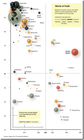
Blow’s main point is that the US is an outlier in the world because we’re religious but also rich while “religiosity was highly correlated to poverty”.

I’ve reproduced the chart in question below. (Click to enlarge)

image

Now, keep in mind that this is not charting religion as it is listed in the CIA World Factbook, but according to the specific question: “Is religion an important part of your daily life?” That will be important in a little bit.

This chart seems to prove his point. Until you realize what isn’t on the map.

Here is a list of the countries that didn’t manage to make their way onto the map due to the fact that Gallup didn’t poll them:

China – 1.33 billion people, heavily non-religious, poor

North Korea – 22 million people, heavily non-religious, unbelievably poor

Cuba – 11 million people, presumed non-religious, poor

Taiwan – 23 million people, 93% Buddist*, rich (comparable to Japan)

Problem number one – Charles Blow has a duty to inform his audience of these omissions. The countries without data represent nearly 25% of the world population and skew heavily toward non-religious. They are too large and too important to the data set and visual reference to simply ignore. Yet Mr. Blow doesn’t seem interested in mentioning them.

Problem number two – Mr. Blow heavily implies that there is a causal relationship between religiosity and wealth. But (as we all know) correlation doesn’t imply causation. Western European countries (and countries filled with people from Western Europe) are richer, as are developed Asian countries. Eastern European and South American countries are less rich. Middle eastern, and African countries tend to be much poorer. There’s a correlation in geo-political histories here that is stronger than religion.

Of course Mr. Blow could always go to rural India and inform them that their poverty is related to their devotion to Hindu and has nothing to do with British imperialism. Or perhaps to the deep south where he can proclaim to the +90% Christian black population that their economic woes are related to their religious tendencies.

Problem number 3 – But the final problem is the worst one because it involves an outright lie:

Singapore is more religious and richer than the United States. And Mr. Blow didn’t map it. At all.

It’s possible that Mr. Blow is actually so numerically illiterate that he didn’t know he was supposed to tell people about key missing data points. But taking out data that doesn’t align with his point is disgusting manipulation. The end result of his deception (conscious or otherwise) is “If you take out all the poor atheists and take out all the rich religious people, then this pattern emerges…”

Mr. Blow should put Singapore back in to the data set and add a correction to his article that announces how his data set has enormous gaping holes. And he should probably never be allowed to touch charting software again.

* The CIA Factbook has Taiwan listed at 93% Buddhist, but I’m not sure how they would answer the specific question that Gallup asked. I’ve heard some atheists claim Buddhism as an “atheistic religion” (no personal god) so it could be that the citizens of Taiwan wouldn’t say that religion plays a big role. I simply don’t know.

Religious Outliers Nonsense (or “Atheists Are Richer Than Religious People If You Take All Poor Atheists Out Of Your Sample”)

Charles Blow’s most recent New York Times op-ed is something of a boon for visualization enthusiasts. He replaces almost his entire article with a visualization. This illustrates that he recognizes power of visual communication to make and reinforce a point in a way that is self-obvious and can stick with the reader better than words.

Unfortunately, he has decided to use data that misleads his audience to such an extent that I can only conclude that he is unconcerned with the truth insofar as it undermines his desired objective.

Blow’s main point is that the US is an outlier in the world because we’re religious but also rich while “religiosity was highly correlated to poverty”.

I’ve reproduced the chart in question below. (Click to enlarge)

image

Now, keep in mind that this is not charting religion as it is listed in the CIA World Factbook, but according to the specific question: “Is religion an important part of your daily life?” That will be important in a little bit.

This chart seems to prove his point. Until you realize what isn’t on the map.

Here is a list of the countries that didn’t manage to make their way onto the map due to the fact that Gallup didn’t poll them:

China – 1.33 billion people, heavily non-religious, poor

North Korea – 22 million people, heavily non-religious, unbelievably poor

Cuba – 11 million people, presumed non-religious, poor

Taiwan – 23 million people, 93% Buddist*, rich (comparable to Japan)

Problem number one – Charles Blow has a duty to inform his audience of these omissions. The countries without data represent nearly 25% of the world population and skew heavily toward non-religious. They are too large and too important to the data set and visual reference to simply ignore. Yet Mr. Blow doesn’t seem interested in mentioning them.

Problem number two – Mr. Blow heavily implies that there is a causal relationship between religiosity and wealth. But (as we all know) correlation doesn’t imply causation. Western European countries (and countries filled with people from Western Europe) are richer, as are developed Asian countries. Eastern European and South American countries are less rich. Middle eastern, and African countries tend to be much poorer. There’s a correlation in geo-political histories here that is stronger than religion.

Of course Mr. Blow could always go to rural India and inform them that their poverty is related to their devotion to Hindu and has nothing to do with British imperialism. Or perhaps to the deep south where he can proclaim to the +90% Christian black population that their economic woes are related to their religious tendencies.

Problem number 3 – But the final problem is the worst one because it involves an outright lie:

Singapore is more religious and richer than the United States. And Mr. Blow didn’t map it. At all.

It’s possible that Mr. Blow is actually so numerically illiterate that he didn’t know he was supposed to tell people about key missing data points. But taking out data that doesn’t align with his point is disgusting manipulation. The end result of his deception (conscious or otherwise) is “If you take out all the poor atheists and take out all the rich religious people, then this pattern emerges…”

Mr. Blow should put Singapore back in to the data set and add a correction to his article that announces how his data set has enormous gaping holes. And he should probably never be allowed to touch charting software again.

* The CIA Factbook has Taiwan listed at 93% Buddhist, but I’m not sure how they would answer the specific question that Gallup asked. I’ve heard some atheists claim Buddhism as an “atheistic religion” (no personal god) so it could be that the citizens of Taiwan wouldn’t say that religion plays a big role. I simply don’t know.

Oil Spill Simulation Shows Super Crappy Independence Day

UPDATE: Check out Bill’s comments below. It seems that this visualization may be taking us for a ride.

Fascinating computer simulation shows the oil slick wrapping around Florida and basically taking a crap all over the eastern seaboard starting about July 4.

I don’t really care about blame on this issue. That being said, I pretty much blame BP.

More seriously, though, it seems to me (as a totally ignorant observer) that we’re quickly coming to a point where containment of what has already leaked out is just as important as stopping the leak. Is it totally impractical to assume that the US naval reserves might be able to take charge of the slick containment work? Is there any plan to do that?

I don’t know, I’m just asking. If you have anything resembling the answer, I’d love to hear it.

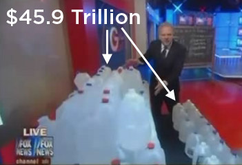
Glenn Beck Tries to Duplicate My Visual, Messes Up The Math

Last week, I posted a new video on the recent budget freeze using colored cups of water (seen here).

The following Wednesday, during the morning Glenn Beck radio show, Glenn was introduced to my work. Apparently he liked it so much that he had his own version by the evening.

I made a lot of noise on Twitter about him taking my video, but that was because I thought he actually took my video as opposed to translating it into a similar idea. Taking my idea… who cares? I’m hardly in this for the money; if people understand something better than they did before and they were true to the data, I’m happy.

But that was the problem: I don’t know who was doing the math for the demonstration, but it was way off.

Let’s assume that the 100 gallons of water represented the spending over the next 10 years.

The reason we’re making this assumption is not because it makes sense but because we’re giving Glenn the benefit of the doubt. (Glenn implies that we’re looking at the budget for 2011, but he never says that so I don’t want to lock his meaning into something he might not have meant.) According to President Obama’s 2011 budget, we expect to spend $45.9 trillion from 2011 to 2020.

Let’s also assume that Glenn is using the “$250 billion saved over 10 years” number to represent the amount of money saved. I assume this because that’s the only number that I’ve seen that is “over the next 10 years”. If this is the case, then Glenn says that what looks like a shot glass (about 2 ounces of water) represents $250 billion.

I don’t know who did the calculations, but they got it pretty far off. If $45.9 Trillion is equal to 100 gallons, then $250 billion is equal to a 2 liter bottle of water.

That’s a lot of water to chug and not nearly as impressive a visual as the little shot glass. But it is accurate.

Like I said before, taking my idea is fine if you think it helps other people understand something better. But maybe next time someone should drop me a line to make sure you get your numbers right.

"Cash for Clunkers" – Clunker by Country Vizualization

I’m currently working on a chapter for the upcoming O’Reilly book “Beautiful Visualization” (a new book in the “Beautiful” series) and one of the things that I do is walk readers step by step through gathering data and sifting through it in order to create a visualization from the Cash for Clunkers data.

As I was looking through the Cash for Clunkers data, I was fascinated by the extent to which it seemed that the clunkers being turned in were disproportionally from companies based in the US. So I dug into the data and found out that it didn’t just seem that way… 85% of the cars “clunked” came from US based manufacturers.

So I decided to create a visualization to identify which countries gained market share due to the Cash for Clunkers program. So… here it is. Click for a larger view. (caveats below).

You can access the raw data here.

Caveats:

  1. Yes, nearly all Toyota and Honda and Hyundai vehicles are built in the US. I used the “where is the parent company headquartered” as my way of determining country size. That made for a more compelling image.
  2. It makes a certain kind of sense that people would dump a lot of old US-made vehicles because US manufacturers were at the forefront of the SUV boom in the early-mid 2000’s (aughts? oughts? naughts? This next decade will be so much easier), so it seems to make sense that people who bought SUV’s would be most eligible for a Cash for Clunkers rebate. If you bought a fuel efficient Toyota Camry in 2002, you’re not going to be eligible to trade your vehicle in, so it seem unlikely that you would do so.

With all that being said, I think it’s obvious that US manufacturers have lost market share on these transactions. I’d need to do a shade more research, but my understanding is that Ford (which didn’t take any bailout cash) didn’t do too badly while Chrysler and GM saw a large number of their vehicles turned in and comparatively very little purchasing.

What does this mean for the future? I don’t know. This was more for fun and for my book chapter than for anything else. And if you want to learn how to do something like this, just buy “Beautiful Visualization” when it comes out.

“Cash for Clunkers” – Clunker by Country Vizualization

I’m currently working on a chapter for the upcoming O’Reilly book “Beautiful Visualization” (a new book in the “Beautiful” series) and one of the things that I do is walk readers step by step through gathering data and sifting through it in order to create a visualization from the Cash for Clunkers data.

As I was looking through the Cash for Clunkers data, I was fascinated by the extent to which it seemed that the clunkers being turned in were disproportionally from companies based in the US. So I dug into the data and found out that it didn’t just seem that way… 85% of the cars “clunked” came from US based manufacturers.

So I decided to create a visualization to identify which countries gained market share due to the Cash for Clunkers program. So… here it is. Click for a larger view. (caveats below).

You can access the raw data here.

Caveats:

  1. Yes, nearly all Toyota and Honda and Hyundai vehicles are built in the US. I used the “where is the parent company headquartered” as my way of determining country size. That made for a more compelling image.
  2. It makes a certain kind of sense that people would dump a lot of old US-made vehicles because US manufacturers were at the forefront of the SUV boom in the early-mid 2000’s (aughts? oughts? naughts? This next decade will be so much easier), so it seems to make sense that people who bought SUV’s would be most eligible for a Cash for Clunkers rebate. If you bought a fuel efficient Toyota Camry in 2002, you’re not going to be eligible to trade your vehicle in, so it seem unlikely that you would do so.

With all that being said, I think it’s obvious that US manufacturers have lost market share on these transactions. I’d need to do a shade more research, but my understanding is that Ford (which didn’t take any bailout cash) didn’t do too badly while Chrysler and GM saw a large number of their vehicles turned in and comparatively very little purchasing.

What does this mean for the future? I don’t know. This was more for fun and for my book chapter than for anything else. And if you want to learn how to do something like this, just buy “Beautiful Visualization” when it comes out.