Rick Perry And Texas Job Numbers

Full disclosure: I don’t like Rick Perry for our next president. I have my reasons that aren’t worth going into here. However, when I was watching the GOP debate and pro-Perry people started bringing up Rick Perry’s job numbers as a cudgel against other candidates, I looked into the BLS data on Texas jobs. Having familiarized myself with the data, I started noticing claims on the Texas jobs data that started popping up that directly contradicted what I was seeing in the data. So I wanted to clear up a couple of these common misconceptions.

Note: If you are going to comment and you want to introduce some new objection to the Texas job numbers, you MUST provide original data. I spent about 4 hours digging through raw data to write this post. I don’t want you to point to some pundit or blog post and take it on their authority, because I’ve already researched several idiot pundits who are talking directly out of their asses when it comes to the data. I want you to point to the raw data that I can examine for myself. This means links. I refuse to waste any more of my time on speculative bullshit or “Well, I’ll wager that the Texas jobs don’t really count because…” If you’re willing to wager, take that money and put it towards finding the actual data. In short, put up or shut up.

I’m not cranky, I swear.

Anyway, let’s deal with the complaints in no particular order:

“Texas has an unemployment rate of 8.2%. That’s hardly exceptional.”

See… that’s what I thought when I started looking at the data. I knew that Utah had a lower unemployment rate than Texas and I kept hearing that Texas was go great at jobs, blah, blah, blah, so I looked up the unemployment rate.

Nothing special.

So I was going to drive my point home that Texas was nothing special by looking at their raw employment numbers and reporting on those. That’s when I saw this:

This may not look like anything special, but I’ve been looking closely at employment data for a couple years now and I’ve become very accustomed to seeing data that looks like this.

In a “normal” employment data set, we can easily look at it and say “Yep, that’s where the recession happened. Sucks to be us.” But not with Texas. With Texas, we say “Damn. Looks like they’ve recovered already.”

(To get to this data, go to this link http://data.bls.gov/cgi-bin/dsrv?la then select the state or states you want, the select “Statewide”, then select the states again, then select the metrics you want to see.)

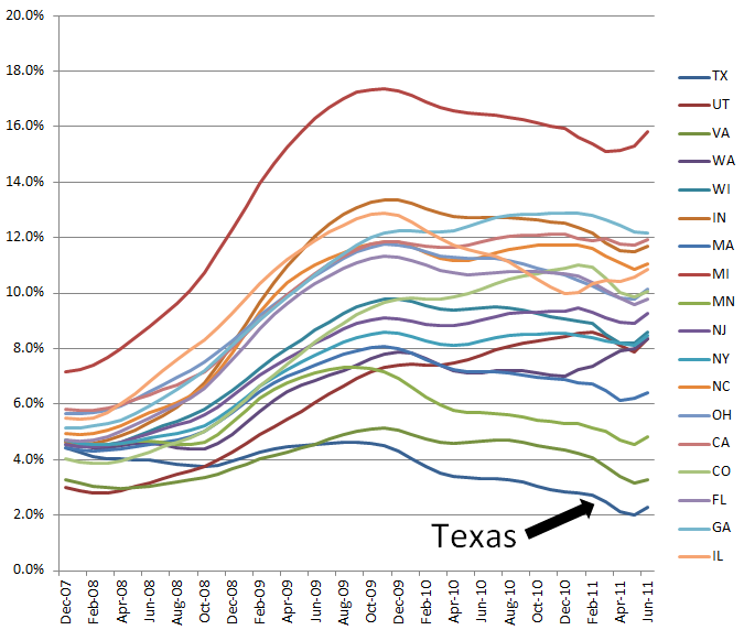
But if Texas has so many jobs, why do they have such a high unemployment rate? Let’s take a closer look at that data.

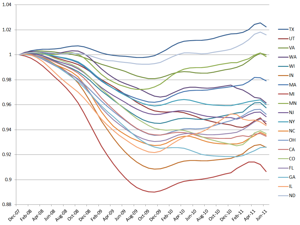
As a percentage of the number of pre-recession jobs, here is a chart of the growth of a selection of states. (For clarity, in this chart I selected a number of the largest states and tried to focus on states that have relatively good economic reputations. I did not chart all 50 states b/c it would have taken me too long.)

We can see that Texas has grown the fastest, having increased jobs by 2.2% since the recession started. I want to take a moment and point out that second place is held by North Dakota. I added North Dakota to my list of states  to show something very important. North Dakota currently has the lowest unemployment rate of any state at 3.2%. And yet Texas is adding jobs at a faster rate than North Dakota. How can this be?

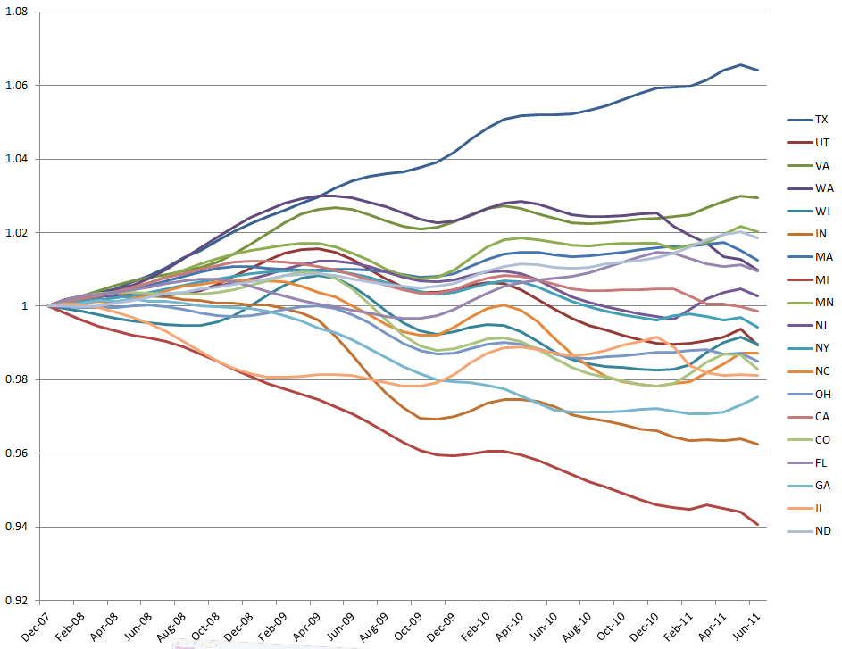
The reason is that people are flocking to Texas in massive numbers. Starting at the beginning of the recession (December 2007), let’s look at how this set of states have grown in their labor force.

As you can see, Texas isn’t just the fastest growing… it’s growing over twice as fast as the second fastest state and three times as fast as the third. Given that Texas is (to borrow a technical term) f***ing huge, this growth is incredible.

People are flocking to Texas in massive numbers. This is speculative, but it *seems* that people are moving to Texas looking for jobs rather than moving to Texas for a job they already have lined up. This would explain why Texas is adding jobs faster than any other state but still has a relatively high unemployment rate.

“Sure, Texas has lots of jobs, but they’re mostly low-paying/minimum wage jobs”

Let’s look at the data. Here’s a link: Occupational Employment and Wage Estimates

Texas median hourly wage is $15.14…  almost exactly in the middle of the pack (28th out of 51 regions). Given that they’ve seen exceptional job growth (and these other states have not) this does not seem exceptionally low.

But the implication here is that the new jobs in Texas, the jobs that Texas seems to stand alone in creating at such a remarkable pace, are low paying jobs and don’t really count.

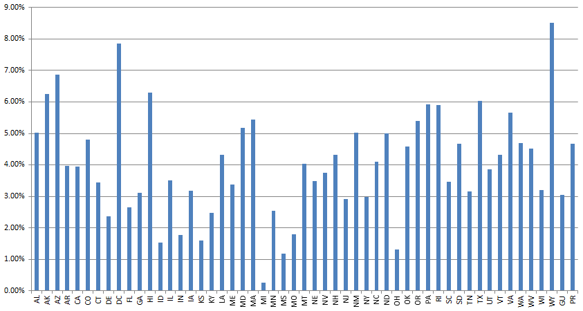
If this were true, all these new low-paying jobs should be dragging down the wages data, right? But if we look at the wages data since the beginning of the recession (click to enlarge, states are listed alphabetically)

And it turns out that the opposite is true. Since the recession started hourly wages in Texas have increased at a 6th fastest pace in the nation.

As a side note, the only blue state that has faster growing wages is Hawaii. Just thought I’d get that jab in since so many people have been making snarky “Yeah, I could get a job in Texas is I wanted to flip burgers!” comments at me on Twitter.

“Texas is oil country and the recent energy boom is responsible for the incredible jobs increase.”

In identifying “energy jobs” I cast as wide a net as possible. If you want to replicate my findings, go to this link: http://www.bls.gov/sae/data.htm, click on “One-Screen Data Search”, then select “Texas”, then select “Statewide”, then in Supersectors select “Mining and Logging”, “Non-Durable Goods” and “Transportation and Utilities” and then in Industries select “Mining and Logging”, “Natural Gas Distribution”, “Electric Power Generation” and “Petroleum and Coal Products Manufacturing”.

Tedious, I know, but transparency is important and this is how you get the data.

When we finally get the data, we discover that energy isn’t really the biggest part of the Texas economy. Increases in jobs in the energy sector (or closely related to it) account for about 25% of the job increases in the last year. Since the energy sector only makes up 3% of all employment, there is some truth to this claim.

However, take the energy sector completely out of the equation and Texas is still growing faster than any other state. This indicates to us that the energy sector is not a single sector saving Texas from the same economic fate as the rest of the states. It’s not hurting, but Texas would still be growing like a weed without it.

“Texas has 100,000 unsustainable public sector jobs that inflate the growth numbers.”

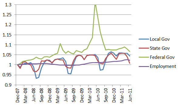
I’m not sure where this one comes from, but the numbers are these (and can be found by selecting government employment from the data wizard at this link http://www.bls.gov/sae/data.htm):

Counting from the beginning of the recession (December 2007) the Texas public sector has grown 3.8%, or a little under 70,000 employees. This is faster than normal employment, but it’s not off the charts.

Given that the Texas economy has grown so much and private sector jobs have grown so much, that doesn’t strike me as an unsustainable growth in the public sector.

But, just in case you’re really worried about it, you can lay your fears to rest because in the last year the Texas public sector has shrunk by 26,000 jobs. In the last 12 months, Texas lost 31,300 federal employees, trimmed 3,800 state jobs, and increased local government jobs by 8,400 jobs.

(To be fair, this was partially driven by the role Texas employees played in the census, which inflated federal job numbers this time last year. Since the census numbers stabilized, federal employment has been at about break-even.)

As you can see, we’re nowhere near the “100,000 unsustainable jobs” number.

My Personal Favorite Chart

I’ll leave you with my personal favorite chart. I mentioned at the beginning that Texas is seeing high unemployment in a large part because they’re growing so damn fast. The problem with this from a charts and graphs perspective is that it leaves worse states off the hook, making them look better than they actually are. Looking at unemployment alone, we would conclude that Wisconsin has a better economy than Texas. But Wisconsin is still 120K short of it’s pre-recession numbers. The only reason they look better than Texas is because 32,000 people fled the state.

During that time, 739,000 people fled into Texas. Anyone who takes that data and pretends that this is somehow bad news for Texas is simply not being honest. At the worst, I’d call it a good problem to have.

So, to give something of a better feeling for the economic situation across states, this chart takes the population of the states I selected above and judges the current job situation against the population as it stood at the beginning of the recession.

Using that metric, Texas would have a very low unemployment rate of 2.3%. But the fact that unemployment in the United States is fluid means that the unemployed flock to a place where there are jobs, which inflates its unemployment rate (at least in the short term). It’s not a bad thing for Texas… it just looks bad when dealing with the isolated “unemployment %” statistic.

UPDATE: @francisgagnon on Twitter felt that this chart was dishonest because it charts Texas as having 2.3% unemployment and (in his words so I don’t get him wrong): “It assumes immigrants create no jobs. But more people = more consumers = more jobs.”

He is absolutely right about this. I tried to be clear above that this chart doesn’t account for the fluid nature of an economy with immigration and departures of hundreds of thousands of people, but I don’t want to leave anyone with the wrong impression. So here it is: This chart doesn’t account for the fluid nature of an economy with immigrations and departures of hundreds of thousands of people. The point of this chart is not to say “Texas should have 2.3% unemployment if only things were fair.” Instead, it is an attempt to chart job growth in such a way that controls for people leaving one job market to enter another. To say “Wisconsin has a better job market than Texas because its unemployment rate is 0.6% lower” is a wholly untrue statement even though it cites accurate numbers. What this chart is meant to do is not posit a counter-factual, but to give a visual representation of the employment reality that is obscured by the way we calculate unemployment numbers.

END UPDATE

And… that’s it.

You may have noticed that I don’t mention Rick Perry very much here. That is because Rick Perry is, in my opinion, ancillary to this entire discussion. He was governor while these these numbers happened, so good for him. Maybe that means these jobs they are his “fault”. Maybe the job situation is the result of his policies. Or maybe Texas is simply the least bad option in a search for a favorable economic climate.

That is not an argument I’m having at this exact moment. My point is to show that most of the “excuses” you will hear about Texas’ job statistics are based in nothing more than a hope that Rick Perry had nothing to do with them and not on a sound understanding of the data.

My advice to anti-Perry advocates is this: Give up talking about Texas jobs. Texas is an incredible outlier among the states when it comes to jobs. Not only are they creating them, they’re creating ones with higher wages.

One can argue that Perry had very little to do with the job situation in Texas, but such a person should be probably prepare themselves for the consequences of that line of reasoning. If Rick Perry had nothing to do with creating jobs in Texas, than why does Obama have something to do with creating jobs anywhere? And why would someone advocate any sort of “job creating” policies if policies don’t seem to matter when it comes to the decade long governor of Texas? In short, it seems to me that this line of reasoning, in addition to sounding desperate and partisan, hogties its adherents into a position where they are simultaneously saying that government doesn’t create jobs while arguing for a set of policies where government will create jobs.

Or, to an uncharitable eye, it seem they are saying “Policies create jobs when they are policies I like. They don’t create jobs when they are policies I dislike.”

People will continue to argue about the data. But hopefully this will be helpful in sorting out reality from wishful and desperate thinking. I mentioned on Twitter that the Texas jobs situation was nothing short of miraculous. This is why I said that and why I’m standing by that statement.
Tim Carney’s Awesomeness Theory of Capitalism

I saw this when it came out and, as an aspiring entrepreneur, it really resonated with me on how entrepreneurs see the world.

For the people who really drive technology and push the world forward, it isn’t about the money (or, at least, it isn’t only about the money). The drive to “be awesome” is a powerful one… one that inspires a great deal of innovation.

I personally think that one of the great things about the internet isn’t simply access to data or information. It allows groups of people to show off their stuff to other people who care, to people who will think they are awesome. This force drives a huge amount of cool things like space tourism and genetics businesses like 23andMe . It’s also the driving force behind the DIY revolution that Johnny Chung Lee wrote about. For me, getting accolades from people I respect is bigger than a big payday. (In fact, if I somehow got a big payday in the millions of dollars, I’d probably change the trajectory of my career to a higher quotient of awesome-to-profit.)

Anyway, I keep wanting to refer to this clip, so I figured I should put it on my blog.

4 Vital Rules For Running an Online Contest

Last month, I submitted content for two contests. The first one was the one seen here on this blog, a video for Know-Y.org as a way of raising awareness for the National Debt. It was goofy, fun, a bit of a departure from my previous work. After being selected as one of the top 5 (and therefore eligible for the $5,000 prize) there was a internet vote to determine the ultimate winner.

The second contest was one for what I jokingly call “my real job” (I’m a software designer and developer working mostly in Microsoft technologies), in Microsoft they have many employees that work remotely, so they use a employees monitoring software so they can be sure the work is being done the right way. That contest was for MIX, Microsoft’s yearly web and design conference. Every year they make an attempt to get speakers “from the community” by having people submit a talk proposal and then having “the community” vote on them.

I lost both contests, which doesn’t really bother me that much. But as I was trying to figure out how to get more votes for my contest, I realized that there isn’t actually a lot out there on how to run an effective online contest. And I’d like to put out my thoughts for whatever poor schmuck decides they want to run an online contest.

1) Have a Clear Objective (Even If It’s Only Internal)

What do you want from your contest? Do you want a low cost alternative to hiring people to make a video or give a talk or build a piece of software? (Ain’t no shame in that.) Are you trying to spread an idea? Are you trying to raise awareness for your organization or are you trying to draw more people to your conference? Are you trying to promote accuracy? Or design?

Write out what you’re aiming at so that you can judge the contestants against it. Which, of course leads us to…

2) Align The Contest So The Winner Hits Your Objective

Let’s say you’re running a video contest and your goal is to spread an idea? Then encourage your entrants to spread their video around. The person with the most views wins.

Or is your contest directed at people who have been to your conference? Restrict voting to people who were at last year’s conference.

Are you trying to raise awareness of your organization? Require that entrants must put up a blog post explaining their entry. Even if they don’t have a blog, setting one up isn’t exactly rocket surgery. And the preponderance of posts will help your search ranking.

3) Avoid Online Votes At All Cost

Online voting sucks. No one likes it. People apologize to their friends when they ask them to vote in an online contest.

I’ve seen people win online contests because they promised to give the money to charity. I went to a conference session that was voted in by online vote and there were fewer than 30 people in a room that could hold 400 (average session attendance for that conference was over 150).

Online votes reward multiple voting, publicity mongering, rude behavior and vote-chasing. They take the focus away from what you’re trying to do and turn it into a numbers game. Your goals become background noise compared to getting my buddy whatever prize he’s trying to win.

If you insist on doing a vote, find a way to restrict voting to match your objectives. If you’re doing a video contest, restrict the number of votes to the number of views the video has.

I confess that part of my frustration on this count stems from the Know-Y contest mentioned above. My video was kicking in at 4200 views, but I couldn’t even break 500 votes. The winner ended up with over 1500 votes, but his video has, at this writing, under 250 views. When you’re running a video contest and the winning video has a 6-1 vote-view ratio, people are probably ignoring the video.

4) Your Contest Will Exist Within a Community. Treat That Community With Respect.

No matter what, your contest will rely upon a community to contribute or participate in the contest or to spread the word about the results and about your organization (or whatever you are trying to promote). If the community isn’t treated with respect, that will be bad news for your goals. Team up with bloggers who share your goals and make them judges in your contest. Ask them to promote it. Get a Twitter account and make sure you connect with the contestants through that account.

Try to get a pulse on your community. In the Microsoft contest I was in, the results of the vote were so out of line with the community that there was a mini-revolt, culminating (happily) in an attempt to explicitly include members of the community who felt like they had been shafted by the contest. You don’t want that to happen to your competition.

Final Thought

I’m going to relate the following story not as a “woe is me” tale, but as an object lesson in how one can alienate people with an online contest.

My community is on YouTube, Twitter and via this blog. I pimped the hell out of the Know-Y contest for the first 4 days of voting. I made explicit requests to people to promote my video. Then I learned that promoting my video wasn’t getting me the votes I needed, so I started promoting just voting part, ignoring the video. Then I went on to Facebook, a place I normally reserve as my “politics free zone” and started pimping it there. I put up a video on my YouTube account to explicitly request that people vote for me (that video, hilariously, got more views than all the other contestants combined).

Then I put up a new visualization video with an annotation explicitly asking people to vote for me. That video took off, currently at over 100K views. I got a call from ABC News about replicating a video of mine for the evening news. No bump in votes. I was a damn pest on Twitter, bugging people throughout the day to get them to vote for me.

After 4 days of this rude behavior, I realized that I was disgusted with how I had been acting. These people aren’t just another mouse click with a distinct IP address. They are my friends. I was harassing my friends over $5,000. What was worse was that I wasn’t even promoting my video anymore. I was just telling people to vote for my name.

I spent time and money on my video. That was the thing I was excited about… the idea and the video, not the vote. But promoting the video was not the best way to get votes. Yelling “Vote For Me!” 50 times a day from every outlet I could think of and coercing my friends to do the same thing was far more effective. Disrespecting my online community was the best way to get votes.

After that, I took down my promotions, deleted the annotations, stopped bothering my Facebook and Twitter friends. I was burning through the respect I had earned over years so I could have some money. That is no way to promote an idea.

Congrats to Know-Y Winner Stephen Byrd

In January, I entered the Y-Care video contest initiated by Know-Y.org, creating a video meant to raise awareness of the National Debt. My video was chosen as one of the five finalists. The final winner, Stephen Byrd, was announced today.

Congrats to Stephen on his win! Here is his video:

And, because I really liked my video, here it is again:

Thanks to everyone who voted!

Vote For “Matthias” Y-Care Video

After months of not putting anything up, I finally made a new video. Created for the Y-Care National Debt video contest, it’s a fairly radical departure from my previous fare, but I think it’s entertaining. Please vote for me (Matthias Shapiro) at the Know-Y.org Y-Care video vote and help me win the $5,000 prize. (I have a very large scale visualization of the national debt that I’m working on, but I really need some capital to pull it off. This would be an awesome way to help me with that.)

Let me field a couple of questions about the production:

  • Do I really owe $45,000 of the National Debt? – No, you do not. I rounded down. Based on the latest estimate, there are 312 million people in the country and the US National Debt stands at $14.1 trillion, so you owe a shade under $45,200 at the time of writing. But it’s probably more than that by the time you read this.
  • Is that really $45,000 dollars in that bag? – No, it is not. I am not insane enough to carry around $45K in a bag and show it to people. Instead, that is $2,250 worth of one dollar bills with $20 bills on the top and bottom for a total of about $2700. For me, that is still a vast amount of capital. I ended up just taking it out of my savings, shooting the video and then quickly putting it back in.
  • Did you catch the guy who tried to steal the money? – Yes. We had sentries surrounding the area.
  • Wait a second… how can a baby owe $45,000 in debt? – The $45,000 number is a per-person estimate. If we were to do a “pre-household” estimate in which the mother and baby are counted together, it would be almost $123,000 per household. I went with the “per-person” estimate because I don’t have enough free cash to fake $123,000 in cash. If I used $20 bills to fake it, that would require $6,100 in ones and 122 $20 bills on the top and bottom, for a total of $8,540.

Think about that last bit for a second.

Most people don’t even have enough cash to fake the amount of money the federal government owes on their behalf.

The scope of the problem is truly staggering. I hope that my video has communicated it well. If you think that is the case, please vote for me (Matthias Shapiro) at the Know-Y.org Y-Care video contest.

The Federal Deficit: A Spending AND Revenue Problem

The past couple days, I’ve been railing against the tax/benefits compromise on Twitter and getting a lot of push-back from the right side of the Twitter-verse. The argument goes something like this:

“The deficit is due to the fact that we’re spending too much, not because we’re not pulling in enough revenue. We have a spending problem, not a revenue problem.”

In response to this, I’d like to submit the following into evidence. It is a graph of the federal receipts and federal spending since 1980, taken from the monthly treasury report, which is as non-partisan a source as possible. The gap between the red line and the green line is the deficit.

Technical note: The data here is inflation adjusted by month and represents a rolling 12 month sum. So, for example, the point for October, 2010 (the latest data point) is a sum of the previous 12 months of receipts and outlays, all adjusted for inflation. This is necessary due to the fact that the treasury reports fluctuate drastically from month to month… especially in April, for obvious reasons.

So, what can we learn from this chart?

  1. our current deficit is driven by BOTH a dramatic increase in spending and a devastating decline in revenue.
  2. the Bush tax cuts are not wholly to blame for the deficit. If revenue had held steady at 2007 levels, we’d still be looking at record deficits based only on the spending increases.
  3. spending increases are not wholly to blame for the deficit. If spending had held steady at 2007 levels, we’d still be looking at record deficits.
  4. compared to revenue, spending is relatively stable, increasing more or less steadily year after year.

That last one indicated to me that the federal government has more control over spending then they have over revenue. Because of this (in my humble opinion) it does make more sense to try to cut spending than to raise taxes, since we have more control over the spending side.

However, we need to look at the situation practically. We can’t possibly cut enough out of the federal budget to balance it without additional revenue. Those kinds of budget cuts are not even remotely feasible politically. I’ve little interest in playing fantasy politics where we magically get rid of a fourth of the government without people lighting their Congressmen on fire.We have about enough revenue to balance a budget from 10 years ago.

The rebuttal, of course is that raising taxes will slow economic growth, which will drive revenue down anyway. I believe there is some merit to this, but does that mean we’re going to just tolerate insane deficits while we wait patiently for the economy to improve?

There is no way to have our cake and eat it too. Lower taxes is quickly becoming a luxury of a country whose financial situation is not dire. If we want to close the deficit, we need more revenue and less spending. Period. Full stop.

2010 Election Live Blogging

12:30 – And… Colorado Senate gets weird. Ken Buck is currently beating Michael Bennet by a hair, but the popular theory at this point is that the Bennet counties (Denver, Arapahoe, Boulder, etc) have yet to report in 50% of their votes or more. As I write, Arapahoe county, which held 128,000+ votes for Obama, is at 10% reporting.

Based on some rough estimates, I’m a little skeptical. Mid-terms almost always result in lower turnout and this one is no exception. I’m looking at between 60 and 85% of the 2008 turnout. It will surprise no one that Republican turnout is slightly higher than Democratic turnout, compared to 2008.

If Arapahoe was only 10% counted, we’d be looking at a county that turned out 400-500% higher in this election than in 2008.

Using a slightly less silly example, if Denver is only 50% counted, we’re looking at a turnout 2% higher than 2008, rather than the 15-40% drops we’re seeing in all other counties.

Clearly this is not going to be settled tonight and I have to wake up in the morning. As such, good night and thank you for reading.

9:42 – I’ve moved mostly to Twitter at this point… follow me here:

.@fivethirtyeight says “G.O.P. Poised to Pick Up 54 to 75 House Seats”

RT @jaketapper: Top Dem emails me: “bloodbath.”

Sestak needs to win the uncounted votes by 20% to win PA-SEN. It’s over. Toomey wins PA.

8:50 – From Twitter: @fivethirtyeight: http://nyti.ms/bFwQdG Our model now projects a 64-65 seat gain for G.O.P.

8:46 – I’m calling South Carolina for Nikki Haley. She’s up 5% with only 19% left. That’s a big deficit to overcome.

8:45 – Brendan Loy ran a prediction contest: Here’s my predictions for Senate: Bold means I was right (so far)

Alaska Senate: Miller (R)
Arkansas Senate: Boozman (R)
California Senate: Boxer (D)
Colorado Senate: Buck (R)
Connecticut Senate: Blumenthal (D)
Delaware Senate: Coons (D)
Florida Senate: Rubio (R)
Illinois Senate: Kirk (R)
Indiana Senate: Coats (R)
Kentucky Senate: Paul (R)
Nevada Senate: Angle (R)
New Hampshire Senate: Ayotte (R)
North Dakota Senate: Hoeven (R)
Pennsylvania Senate: Toomey (R)
Washington Senate: Murray (D)
West Virginia Senate: Manchin (D)
Wisconsin Senate: Johnson (R)

I’m not looking so hot on Colorado, Pennsylvania is a toss-up at the moment, and Illinois is close. But I’m not wrong on anything yet. 🙂

8:30 – Looking at Governors, Florida looks like a Rick Scott (R) win, South Carolina is still running neck and neck, Republicans have Michigan, Pennsylvania, Wisconsin… overall Republicans are doing fairly well in the governors races.

7:50 – From Twitter:

My personal race to watch: South Carolina gov: Nicky Haley vs. Vincent Sheheen… neck and neck

Nikki Haley pulling away! 50% – 48%

7:37 – From Twitter: @andylevy: .@SpeakerPelosi Have you decided what your new twitter name will be yet?

7:25 – Looks like things are starting to pan out more or less as expected by pollsters. 50-55 seats heading the Republican’s way and NONE of the long-shots have panned out.

6:55 – The margins at the moment are looking pretty strange. Todd Young just won Indiana 9 by 10+ points when he was projected by 3. This is similar all over the place, with most congressional districts going 3-4% one way or another. So far, it’s mostly toward Republicans, but (and this is a very early prognostication), it seems like the election results are polarized.

6:30 – Let’s take a look at Florida Congressional districts. There were 4 races that were takeover possibilities, districts 2, 8, 24, 22. District 2 looks like it’s heading toward a solid Democratic win, but the others have Republicans out-performing by 3-7%.

6:20 – OK… now we’re starting to get a better picture. Rubio (Senate) and Scott (Gov) are outperforming the polls in Florida, although Rubio is doing better than Scott. Don’t know what exactly that means, but Rubio is up 5% higher than he polled.

6:10 – Just starting to punch numbers into my spreadsheets. So far, Republicans are underperforming the Senate polls by 1-2%. In Indiana, they’re matching the expectations on House seats with about 20-30% in.

5:12 – my apologies for being so late… as election results come in, I discovered I don’t get CNN any longer. Long story short, this discovery resulted in an emergency trip to the Comcast service location to get the digital converter box. I’ll be up and running as soon as I can. My apologies for the delay.

“Obama = Keynesian?”

A reminder that someone thinking they are smart does not actually make them smart.

(In fairness, it could be that the people in this video just think that the author of the sign simply misspelled “Kenyan”. It’s not like John Maynard Keynes was Abraham Lincoln or something. I’d put “knowing who John Maynard Keynes was” down on my list of things people should know underneath “How many branches are in the US government?”, “What’s the name of your Senator and Congressman?” and “How do you turn a word problem into an algebraic formula?”)

7 Nasty Liberal Lies about 8 Nasty Conservative Lies

This is a response to the Alternet article 8 Nasty Conservative Lies About the Democrats and Obama That Must Be Debunked Before the Election which is about as unbiased as one would expect from the title.

Oh, this is so boring. But smart people I know have been suckered in by it, so I suppose it needs to be rebutted. How tedious.

1) President Obama actually reduced the deficit since George Bush’s last deficit was $1.416 trillion.

In a sleight of hand worthy of a 7-year-old magician wannabe, he notes that, since Bush signed the 2009 budget, he is therefore responsible for all the debt in 2009, which was $1.416 trillion. He does not, however, explain that the stimulus was passed that year and added drastically to the deficit for 2009. Why is there no mention this? Because the author is interested only in political point-scoring, not the truth.

2) Obama actually cut taxes

This one is actually true. President Obama did cut taxes as a part of the stimulus. But apparently those tax cuts had no effect on the deficit described above, being replaced by money from the happiness rainbow tree that the author believes Obama keeps in the back yard. It is entertaining that the author says these tax cuts were “wasted” since he will soon cite the CBO report on the stimulus, which claims that the tax cuts helped stimulate growth. Consistency is apparently not as much fun as throwing poo.

3) President Obama didn’t bail out the banks, George Bush did.

True, but Obama did vote for the bailout, as did John McCain. Perhaps he is claiming that Senators aren’t important and shouldn’t be held responsible for their own actions and that Congress has virtually nothing to do with governing the nation, in which case the whole article seems irrelevant since it’s not a presidential election and changing Congress won’t actually have an effect on anything. It’s hard to tell, he’s short on details.

4) The stimulus totally worked

He cites the CBO report on the stimulus. Whoop-de-do. The CBO report is an estimate based on an algorithm. When the Obama administration went to the CBO before the stimulus, the CBO plugged the numbers into a computer and said “If you spend X money, you will get Y jobs”. Nearly 2 years later, the Obama administration asked the CBO to plug the numbers in again and – surprise! – they got the same result. It is not based on any actual measurement of the job market, it’s based on a model.

A better way of determining if the stimulus worked would be to ask “Did we follow the unemployment curve the administration said we would?” The answer is “hell no”. Unemployment is far worse than the administration predicted with the stimulus. This is a point which the author explains at length. I’m just kidding; he totally ignores it, perhaps imagining that he had addressed it but could no longer make out the words from behind the spittle covering his laptop screen.

5) Businesses don’t hire based on tax cuts

Young, small businesses hire more than big businesses. They will usually work the people they have as much as possible until it becomes clear that they cannot pull in any more business without new people. Fewer taxes means more money. More money could simply mean more profit (as it has recently with larger companies), or it could mean more growth, more employees, even more money. It varies from business to business. But saying “it’s complicated” does not give the author the intellectual political anger management outlet he clearly needs, so I guess we should be glad he’s not biting anyone’s fingers off.

6) Health care reform reduces gov’t deficits

Here, he cites an article from before the health care reform bill was passed. Since then, the estimate has jumped up as things like the 21% cut in Medicare reimbursement was postponed, then postponed again and large companies like McDonald’s got permission to ignore the law when they told the government that they would drop coverage for their employees if they didn’t get a waiver.

Thus, the various cost-savings of the bill have been shown implausible or manipulative (which is exactly what I said would happen to those absurd estimates nearly a year ago). They were nothing but projection manipulation devices and anyone who wasn’t drunk could see that was the case.

7) Social Security is fine. It’s not a Ponzi scheme.

Yes, Social Security has run a surplus… up to this year when it ran a decifit. Projections have it pushing back into surplus for a couple years until, in 2016, it dips back into deficit forever. “No problem,” the increasingly dense author of the article says, “There’s a trust fund”. Yeah… a trust fund held in US debt. The SS trust fund buys up US debt, which the government pays back regularly, so it’s a pretty safe asset. That trust fund should last for a while, but eventually we will be paying Social Security returns to older investors (the elderly) from their own money or money paid by newer investors (the younger generation).

That is the definition of a Ponzi scheme.

8 ) Government spending is good for the economy

Here the author talks about how the government spends so much on infrastructure, roads, airports, schools (in an ideal world these things are all good for the economy) but only a “small part of the government’s budget” is for welfare and foreign aid. I’m kind of funny inasmuch as I think that 60% of our budget is not a “small part”. (I’m counting SS, Medicare/Medicaid, Health and Human Services, Housing and Urban Development, and “other” mandatory programs. But not interest on the debt.)

Roads and schools? (Transportation and Education) They account for 3.3% of the budget. Since welfare and foreign aid are such a “small part” of the budget, the author won’t mind if we get rid of it. I’d be delighted if we reduced the other parts of the budget so that Transportation and Education made the bulk of it.

Overall, the author targets builds up conservative strawmen of “lies” and then uses liberal strawmen (and selective data) to “prove” them wrong. This article is nothing more than red meat for people who already agree and don’t have time to do the research themselves. It’s sloppy, lazy, angry and impotent. And, worst of all, it spreads disinformation. Hopefully this post is something of an antidote.

(Note: There are few links here because this data is so easily available and I’m in a crunch time at work.)