Category Archives: graphs

Read My Chapter From Beautiful Visualization For Free!

OK, Cory Doctorow, let’s see if this works.

I’ve recently written a chapter on storytelling and information visualization for O’Reilly media to publish in the book Beautiful Visualization.

And you can read it for free.

You can buy the e-book or per-order Beautiful Visualization directly from O’Reilly media or pre-order a hard copy of Beautiful Visualization from Amazon.com

Quick Summary

Information visualization is a powerful medium for the communication of data, but one of the things that makes it so powerful is the fact that it plays a part in the larger story of reality. Information visualizations can tell the part of the story that is data heavy in a way that is gripping and memorable. The first half of my chapter walks through the process of creating a visualization and the importance of anchoring that visualization in the context of a larger story (including some thought-experiment examples).

The second half of the chapter walks through the entire process of creating an information visualization, from data gathering to munging (sorting, filtering, re-aligning) a large data set, to visual representation. This visualization is done using Microsoft Excel (you could use Google Docs, which is free) and Adobe Photoshop (you could use GIMP, which is free).

If you like my chapter, you will love the whole book. Beautiful Visualization is twenty chapters of unadulterated awesome visualization tips, tricks, discussions, and lessons from scientists, artists and visualization experts. Once again, your purchase options are to buy the e-book or per-order Beautiful Visualization directly from O’Reilly media or pre-order a hard copy of Beautiful Visualization from Amazon.

Finally, if you’re one of those people who is constantly thinking “I really wish I could financially support someone who is soooooo awesome that they put their professional work online for free”, today is your lucky day. You can donate whatever you would like directly to me as a thank you via PayPal.


But, most of all, read my chapter! Comment on it, tear it to shreds, pick out the good parts, pick out the bad parts, print it out and light it on fire. I hope it will be helpful in whatever you’re doing.

Sunlight Foundation Design For America Winners

The Sunlight Foundation contest “Design for America” has announced their winners. To my disappointment, Recovery Review was not counted among the worthy, but you should check out the winners.


Congratulations to all of the winners!


Redesigning a Government Website WinnerIRS Re-Design

image

How a Bill Becomes Law WinnerHow Our Laws Are Made

image

Senate Rules Visualization WinnerGuide to US Senate Floor Procedures

image


Health Data Visualization WinnerCounty Sin Rankings

image


US Spending Visualization Winner (Tie)Spending vs. Media Coverage and Is Washington Bankrupting America


image

Best Design of Sunlight Data Winner (Tie)Cool Kids at the White House and Who Paid Them

image

image

Recovery.gov Visualization WinnerMaking a Full Recovery

image

The CBPP Economic Downturn Chart is Deeply Dishonest

I was reading Jonathan Chait (who is really smart) the other day and I came across The Stigmatization Of Bush-Blaming.

A quick summary of the post: It’s right and proper to blame Bush for all the economic and federal deficit unhappiness because it’s really and for true all his fault. But if liberals continue to do it, it sounds whiny petty. So liberals can’t say the truth because it is politically non-viable.

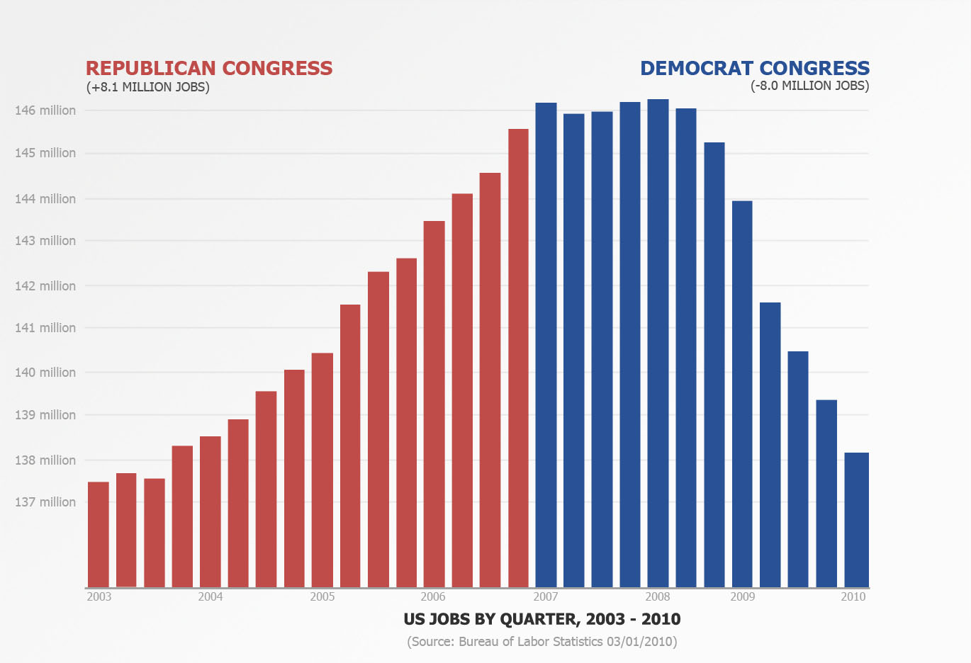
An compelling thesis to be sure, especially when it is supported with this chart that Chait pulled up.

And so, as I am wont to do (and apparently Chait is not wont), I looked for the origin of that chart and found this page from the CBPP (Center on Budget and Policy Priorities) that explains the chart.

<TANGENT>

I would like to decry the practice that I’m am hereby dubbing “source masturbation”. It is when you link to yourself to support your thesis and bury the actual source 2-3 links deep. For example, writing a blog post where you link to a post you wrote that links to a report you put out and the original source is in the footnotes. Media Matters does this kind of thing constantly and I find myself just doing a Google search of what they’re talking about rather than try to follow the links.

This post from the CBPP is actually worse… they link to the footnotes at the bottom of the page which then link to the footnotes inside the report… the ones you just clicked on to get to the bottom of the page! Do they link at any point to anything outside their own website? No. No they do not.

This is the internet, people. Use it.

<End TANGENT>

Moving along.

The problem with this chart is that it implies that:

  • the economic downturn is Bush’s fault and will continue to be Bush’s fault
  • the tax cuts will extent into 2019 and they will be Bush’s fault
  • the Iraq and Afghanistan wars are Bush’s fault.

Let’s start with the last one first. I don’t want to argue the Iraq and Afghanistan wars because it will run something like this. “You’re stupid and a jerk.” “No, you’re the stupid jerk.” “You want to murder babies.” “No, you want to let other people murder babies.” “Why didn’t you go into the Army, you chickenhawk?” “You don’t know anything about me. My sibling/friend is over there right now.” “I hope your sibling/friend is happy killing babies.” (I actually had someone say that last one to me. Dear anti-war people: you may have some valid points, but a lot of the guys on your side are complete a**holes. A**holes don’t persuade very well.)

See how much helpful ground we covered? Let’s just say for the sake of argument that Iraq and Afghanistan is all Bush’s fault and President Obama would get out of there if he could, but he’s trying to be responsible given the situation he found himself in. OK? So 10% of the deficit is due to the wars. What about the remaining 90%?

In this chart, the big item here is the Bush tax cuts. The problem with this analysis is that these tax cuts expire this year. That means President Obama will have to sign them back into law if they are going to continue to be a major factor in the budget deficit. After this year, if they are still in effect, they will be the Obama tax cuts, not the Bush tax cuts.

Furthermore, by the estimates that President Obama’s economic team have come up with, letting these cuts expire will bring in $700 $850 billion over 10 years. (Thanks to John below for pointing out my discrepancy.) Which is like saying that letting these tax cuts expire will pay for the stimulus last year.  By the CBPP analysis, getting rid of the Bush tax cuts would bring in… wait for it… $4.4 trillion over the next 9 years. Which is like paying for the stimulus 6 times over.

But if you look at President Obama’s budget, you see that they assume (with the typical optimism associated with any given administration’s budget report) that, with the tax cuts having expired, we will have a $900 billion deficit in 2019. By contrast, the CBPP assumes that, if we let the tax cuts expire, we would have a deficit of $630 billion.

So, putting aside the tax cuts issue, let’s address the economic downturn issue. CBPP assumes that the downturn is Bush’s fault (naturally) and that President Obama can’t do anything about it. They basically say that the “lingering effects” of the downturn (like interest on the debt we accumulated during that period) should also be blamed on Bush.

This strikes me as uncompelling. This is basically a blame shift game that isn’t appropriate for adults. Imagine if a conservative think-tank created a chart in 2008 which we could see how much of the deficit was due to Medicare/Medicaid/Social Security/Other welfare programs. Or what if we assumed that, if Jimmy Carter had never been president, we would have avoided double digit inflation and the following recession and we extrapolated out those benefits to today?

First, those issues are counter-factual. We can’t know the present based on a theoretical past. (This is the first thing that Chait should have noticed. He’s an editor, not an economist, but he should have seen this very plain logical fallacy for what it is.) The President doesn’t get to pretend that he is dealing with part of the fiscal mess and ignore the rest of it because it’s “not his fault”. The President deals with the reality placed before him. Anything less is juvenile posturing.

Imagine that someone inherits a house. The house is seriously messed up due to the poor management of the previous owner. Cracked walls, rotting floorboards, leaky roof. The new owner comes in and promises to fix it up. It is probably unfair to complain a year later that everything isn’t perfect. But it is childish for the owner to ignore the problems by saying “That was there when I got here.”

Everyone knows there were problems. But by inheriting the house, the problems belong to the owner. The CBPP report is a way of posing a counter-factual scenario and saying “These problems don’t belong to President Obama.” I find the whole process absurd.

But the most egregious error (in my view) is the chart. It seems clear to me that the CBPP would rather build a chart to rest the blame as squarely as possible on Bush’s shoulders instead of building a chart that will increase understanding of the issue. They’ve sadly suckered Chait into this nonsense with a chart that tells him something that he might really like to be true, but that doesn’t very closely tack to fiscal reality.

Can You Spot The Partisan Legislation?

UPDATE: I discuss the issue of partisanship and health care reform more here.

You may or may not know that one of the more entertaining themes running around the media these days is that the almost entirely Democratic passage of the health care reform bill is pretty standard issue for major social legislation. After all, the theory goes, Republicans never really supported any major social legislation and this bill was about as bi-partisan as it could get under the circumstances.

I try so very hard to stay out of name calling on this blog. But hearing people repeat this line is like hearing people talk about that alien they saw. Or, rather, they know this one guy who saw one and he was totally trustworthy. OK, maybe they didn’t so much know that guy, but a guy they know knew that guy and could get you in contact with him if they hadn’t lost his number. Perhaps the aliens stole it off his phone.

Back to the point.

We live in a world of accessible information. Quite frankly, if you’re too lazy to go look up the damn facts your own damn self you should probably make it a practice of just keeping your mouth shut. So when I hear people saying that this kind of narrow, one-party passage of major social legislation is par for the course, I look it up for myself. Guess what I found? Hint: Those people don’t check Wikipedia.

Download the large version, the medium version (seen above) or the small version.

By request I also have a version with the Yay and Nay votes together.

Download the large version, the medium version or the small version (seen above).

The point I’m trying to make here is that this level of partisanship for such huge legislation is, based on my quick sampling, pretty rare. Look at the Iraq war, Social Security, No Child Left Behind, even the 1994 assault weapons ban saw pretty massive aisle crossing.

The funniest thing about health care reform is this: Not only was the the “yes” vote highly partisan, the “no” vote was actually somewhat bi-partisan. Nearly a fifth of the people who voted against health care reform were Democrats. So the “Republican” side of the issue managed to convince a number on the “Democrat” side, but the Democrats convinced exactly zero Republicans.

(Exception to the rule: Medicare Part D had a very close, party-line vote. But you still saw some Democrats crossing the line to vote with the Republicans.)

The reason I’m so riled up about this is because Jim Lehrer, whom I like and respect, basically accused the Republicans of having a history of short term opposition on social legislation.

For those who had not heard, Jim Lehrer, in an interview with Senator Jon Kyl, stated that:

Republicans have opposed things like Social Security, Medicare, even civil rights legislation, but then, once they lost, they took some deep breaths and moved on, and then finally ended up embracing many of these major changes…

Is that going to happen with health care reform?

UPDATE: A commenter below has graciously provided a link to the full transcript here.

Thankfully, Senator Kyl took him to task over that statement, but what would posses a journalist to make such an inaccurate statement? I’m going to go ahead and chalk it up to Lehrer simply not having the facts and not bothering to find out about them. He assumed that Republicans opposed that legislation because… um… I guess because Republicans are poopy doo-doo head who poo in their pants. Or something.

I would love to educate Mr. Lehrer and help him educate his viewers. If you’d like to help me with this, you can download one of the images above or use a link to this post and send it to the complaints department at PBS NewsHour.

Here’s their e-mail: onlineda@newshour.org

Please be polite. I’d rather not be represented by rude people.

Debunking the “Republican Congress Creates Jobs” Chart Or “How To Make Numbers Say Anything You Want”

This is a companion piece to the previous post, so please read both of them. Here I’m going to lay out the script I had written for debunking the chart I created that asked the question “Does a Republican Congress Create More Jobs?” and then implied with a chart that this was indeed the case. I’ll walk through some process for creating charts and then talk about why I would create a chart that I was just going to debunk.

I apologize for the similarity to the post where I debunk the Obama stimulus chart. These two scripts were meant to be together.

<Start Script>

How to Make Number Say Anything You Want

Do you want to convince people that your side is right with only the flimsiest proof? Does the idea of tricking people with numbers make you all happy inside? Then come join us as we walk through “How To Use Charts To Say Anything”

Step 1: Massaging the Data

The first step is to grab the data that makes your point the best. Let’s use it to prove that a Democratic Congress is bad for jobs.

“How can we do such a thing” you ask?

In the first case, the raw jobs data looks like this

but the final chart looks like this.

How did they do that? Was it magic?

Nope, we simply smoothed the data. The raw data is a little too chaotic and has too many data point to tell the straightforward story that we want. So instead, we’ll average the monthly data so that we have quarterly data. There… now we have some nice smooth straightforward data

Step 2: Pick colors that make you look good

Next, we pick some colors. Let’s make the Democrats blue dark and bold, give it a bit of an angry feel to it. This is our way of getting the audience to look at the democrats in a harsh way. We could try to soften up on the Republicans more, but too soft of a red would look pink and we don’t want that.

Let’s compare our colors to the Excel defaults:

Step 3: Do NOT give any context!

Finally, and this is the most important part, only give information that is helpful.

Let everyone know that we saw 8 million jobs added to the economy while the Republicans were in charge and make a point to show that we lost 8 million jobs while the Democrats were in charge. But don’t mention that the Republicans took Congress only a year after 9/11 at a time when the job market was particularly low. Otherwise people will think it’s a “Well, they can’t fall off the floor” thing.

And make sure you don’t mention anything about the real estate market and how the bubble drove the labor market in a way that was clearly unsustainable. We don’t want the viewers to be confused with all these relevant details. We want them to say “Republicans good, Democrats bad”.

<End Script>

Everyone here was incredibly kind to put up with my bullshit chart for as long as I left it up without explanation. I’d like to say unequivocally: My chart is propaganda… just like the Obama administration’s chart. I was trying to use my chart as a visual talking point that said:

If you have no ethical qualms, data visualizations can be manipulated to say exactly what you want them to say.

My chart implies that the Republicans were responsible for the jobs growth between 2003 and 2007 and that Democrats were responsible for the drastic decline from 2007 to the present. Let me state plainly, I do not think that is the case.

But if we just play around with the data the right way, we get what seems to be a clear picture that portrays a correlation and gets on its hands and knees and begs us to draw causation from it. Most people will do exactly that.

I can spend hours walking patiently through what is wrong with the Obama administration’s chart. Let me recap the high points here:

  • If you look at the data with the context of what President Obama’s team was hoping the stimulus would do, the power of the chart disappears.
  • If you look at the data with the understanding that they’re charting a first derivative, you realize that we haven’t gained jobs, we’re just losing them more slowly and the power of the chart disappears.
  • If you look at the data with the understanding that they didn’t even start spending the stimulus until the job loss had started slowing down, the power of the chart disappears.
  • If you look at the data in the context of other recessions, you’ll realize that, far from showing a drastic improvement, the numbers represent a devastatingly slow jobs recovery compared to other recoveries and the power of the chart disappears.

But this kind of explanatory rebuttal would interest those already convinced. The chart I made had a power that an calm explanatory video wouldn’t have. Quite frankly, I hate that this is the case. Like President Obama’s chart, my chart doesn’t teach people anything about economics or lead people to learn important things about unemployment.

The only valuable thing my chart teaches is that charts can portray accurate data and still be manipulated to coach people along to poor conclusions. The only reason I even put my chart up is because it is the graphical equivalent of drawing out the Obama administration’s argument to its logical conclusion. My chart works with the same data, the same assumptions, and the same implications. And it leads to a completely different conclusion.

I’ve heard people describe President Obama’s chart as “powerful” and “brilliant”. The popular information visualization blog Flowing Data even tossed it up for public discussion among info viz professionals.

My point here is that it isn’t brilliant. It’s juvenile. It’s the chart equivalent of a crass political cartoon with a Snidely Whiplash mustache drawn on the bad guys. It’s a design trick imagined by cynical, self-congratulatory children fresh out of graduate school who pat themselves on the back for their ability to fool people who they think are too stupid to know the difference. They think they are special because they can get powerful people to flatter them for their ability to lie.

But they aren’t special. I can play that same childish game in my free time. The difference if that I want people to know that it’s a trick. They would rather see people fooled.

Does a Republican Congress Create More Jobs?

UPDATE: I discuss this chart in detail in my new posts, “How To Make Numbers Say Anything You Want” Part 1 and Part 2

For your consideration.

Download the large version
Download the small version

Data gathered from the US Bureau of Labor Statistics. Employment numbers are averaged by quarter and charted from 2003 to the present. (2010 Q1 is just January, 2010) Republicans took control of both houses of Congress in January 2003. Democrats took control of both houses of Congress in January 2007.

I’ve more to say, but it can wait till later.

January Employment Numbers or How To Lose 1.1 Million Jobs But Keep The Unemployment Rate The Same

It’s that time again! First Friday of the month and job numbers for the previous month are released.

This month’s unemployment rate is (drumroll please…)

9.7%!

That’s a 0.3% decline in unemployment. But, if you’ve been reading this blog long enough you know that we can’t just let that go without caveats.

The Good Stuff

Good news is a matter of context. This news isn’t so much good in the sense that the economy is super awesome so much as it is good in the sense that it isn’t actively bad. But I’ll take “not actively bad” for now.

  • My big “thing” for the last half-year is that the nature of the unemployment rate calculation is hiding a huge story, which is the disappearance of the labor force. This latest report has the labor force increasing for the first time since August.
  • Actual employment increased a little over half a million (although comparing January to December is difficult because the population controls are altered at the beginning of every year). This is the biggest increase in approximately forever (since 2007).
  • The people who want a job but aren’t looking for one declined about 350,000.

The Bad Stuff

The good news on the job numbers is basically that they don’t suck. The bad news is that they really only look good when compared to December. Compare them to further back and they still look like of questionable.

For example, the last time we had 9.7% unemployment (back in August), we had 1394 million jobs. In January, we had the same unemployment rate, but only 138.3 million jobs. In 5 months, the unemployment rate is the same, but we’ve lost 1.1 million jobs. Mathematically stated:

August, 2009:
15.0 million people looking for jobs
divided by
154.43 million people employed or looking for jobs
equals
9.7% unemployment (139.4 million actual jobs)

January, 2010:
14.8 million people looking for jobs
divided by
153.17 million people employed or looking for jobs
equals
9.7% unemployment (138.3 million actual jobs)

Welcome to the world of job statistics. Basically, the unemployment rate is a measurement of people with jobs vs. people who are looking for jobs. If people stop looking for jobs for whatever reason, they move out of the “unemployed” category and even though a new job has not been created, the unemployment rate has gone down. Incidentally, I have a video on this phenomena that I made back in October (aired in November).

The Weird Stuff

You may have seen a headline along the line of “Payrolls Decline 20K as Unemployment Rate Falls to 9.7%” and said, “What the…?” This is basically the messy nature of statistics poking its ugly head up through the facade of mathematical certainty.

More simply stated: These numbers are estimates based on a set of surveys. The surveys are gigantic (tens of thousands of respondents) and employ certain controls to try to give a more accurate picture of what is going on. But there are two different surveys: one for household data and one for establishment data. Usually they show a similar picture. Right now they are showing a different one. The household survey says we have more jobs than last month while the establishment survey says we have fewer.

These numbers are not now, nor have they ever been, exact. But they’re good enough for government work (get it!).

Not All Money Is Created Equal

I had a thought last night that, what with tax season coming right on up, it would be fun to do a visualization of income and tax distribution. So I wandered down to the CBO and grabbed this document and turned it into a visualization. Sadly, their latest data is pushing 4 years old, so I’ll probably have to update it sometime soon.

(click for the full resolution image)

If you’d like to use a low res version of this chart in your own blog, this one has just the shapes and very little text, so it scales better smaller more better readability. The information here is kind of blunt… I’m sure there are several variables I haven’t accounted for. But this is a pretty accurate portrayal of the data at the CBO (unless I did a calculation wrong).

I wanted to do this because I get really sick of people who say things like “The top 1% of income earners pay 27% of the taxes.” Unless you believe that someone who makes $15K a year should pay $20K in taxes, that is a very silly statement. If the top 1% of income earners make 27% of all the money, it would be perfectly reasonable for them to pay 27% of all the taxes.

That’s why I wanted to make this chart. I want to be able to communicate in a single image how much the top (and bottom) earners make as well as how much they pay in taxes. The thing I think this chart brings out is that we have a progressive taxation system that does not treat all money equally. (Some may bristle that I just called our taxation system progressive, but I’m going to stick by that description. It may not be as progressive as some wish it was, but it is progressive.)

If you earn between the 80th and 90th percentile, you’re the closest we come purely equitable income taxation. That group makes 14% of all the money and pays 14% of all the income taxes.

A tax system that treated all money equally (like a flat tax) would look something like this:

In this system, dollar number ten million and one made by a hedge fund manager would be taxed at the same rate that a dollar made by a single mom earning minimum wage at a fast food restaurant. Every new dollar made would be “created equal” under the tax law. Such a system would probably reduce compliance costs as well, although I imagine it wouldn’t be particularly popular. “Let’s tax the poor more so that we can tax the rich less!” doesn’t sound like a winning campaign.

And, just for fun, I created the “pure socialism” model of this chart as well.

Of course, pure socialism is pretty silly, so this would never happen. Reason one is that, if everyone made the same amount of money, we wouldn’t have quintiles or “the top 1%”. It would just be a blob.

And it wouldn’t make any distinction between people who work hard and people who are lazy. As Penn Jillette has stated (I’m paraphrasing), “laziness is a perfectly valid life choice”. Life gives us all sorts of things to trade off with. Some people trade money trough stocktrades.ca (or the potential of earning money) for hanging around the apartment playing video games. Nothing wrong with that. But I don’t mean to get off on a “socialism is really silly” tangent.

I just hope that these charts are helpful and fun. Feel free to steal (with proper attribution).

The Best Paying Undergrad College Degrees

Cool little piece on the best paying undergrad college degrees has this accompanying graph.

(Parts of the graph aren’t showing up very well on wordpress, so feel free to head over there to check it out.)

Degrees Degrees
Methodology
Annual pay for Bachelors graduates without higher degrees. Typical starting graduates have 2 years of experience; mid-career have 15 years. See full methodology for more.

If you’re thinking about choosing your major, my only advice has stayed the same over the years: Go as technical as you think you can handle.

Many employers assume that, if you have a technical degree they can teach you the other stuff. Very few of them assume that if you have a liberal arts degree they can teach you the technical side.

What The July Unemployement Rate Means (And Doesn't Mean)

Today the unemployment rate for July 2009 was released by the Bureau of Labor Statistics. The rate dropped from 9.5% in June to 9.4% in July.

Before I explain why this might not be as awesome as it looks, let me just say “hooray!” for what seems like a slowing in the rise of the unemployment rate. I am ecstatic to see that the economy is not accelerating downward.

Stupid Moralizing (skip if you don’t care)

Some people seem to almost be cheering the decline of the economy for political purposes. Before last November, those people were mostly liberals. After January, those people were mostly conservatives. It is an activity I find creepy and slimy.

The decline of the economy means people losing their jobs, losing businesses that they’ve spent years trying to painstakingly build. This can be devastating on every level, personal and professional. The pain it brings is almost unspeakable. When someone cheers or hopes for a decline in the economy simply so that their political team can come out ahead, they reveal themselves to be without the basic human emotion of sympathy.

I don’t give a crap who is in office… I prefer to have a reduction in human misery if possible.

End of Stupid Moralizing

So… now that I’ve gotten all self-righteous and morally irritating, let’s talk about the numbers. (If you get bored by this discussion, feel free to skip to “The Point” at the bottom)

The unemployment rate is… well, it’s exactly what it says it is: a rate, a percentage based on two numbers. Your average non-economic American might think that the two numbers are as simple as “people employed vs. people unemployed”. Under this definition, you might think that a lower unemployment rate means that there are more jobs.

Sadly, you would be wrong.

The numbers actually start with the US population*. From that number, we take out children under 16, prisoners, those in mental institutions, those who require nursing care and the military and we get the “civilian non-institutional population”. From that number, we take out those who, for whatever reason have not tried to find work for 4 weeks. This is important because you don’t want to count housewives and high school seniors in the unemployment numbers. Remember that, because it’s going to be important in a second.

That brings us to the “civilian labor force”, which consists of the employed and the unemployed. It is from the civilian labor force that we calculate the unemployment rate. Therefore, there is a good way and a bad way to reduce the unemployment rate.

  1. Increase the employment number (good)
  2. Decrease the number of people in the labor force (bad)

The reason decreasing the number of people in the labor force is bad is that it means that people are extracting themselves from the labor force by:

  1. getting arrested in alarmingly huge numbers (unlikely)
  2. joining the army in alarmingly huge numbers (unlikely)
  3. getting younger in alarmingly huge numbers (that would be awesome)
  4. deciding that they’re just not going to look for a job anymore

And among the people in section 4, there are several options:

  1. deciding to stay home due to a lifestyle change (staying home with the kids)
  2. going to school to train for a new job
  3. retirement
  4. despair

So, let’s cut to the chase. We’re not seeing new jobs. The employment number in July continued to decline (though at a much slower rate than it did in June). What we saw instead was a decrease in the labor force. More and more people are just not looking for jobs anymore.

The Point

On the surface the unemployment rate going down seems good, but when you dig into the numbers, we can see that it has nothing to do with an increase in the number of jobs and everything to do with the fact that the labor force is shrinking.

Is this good or bad? I tend to think bad, but the economy also tends to be really complex, so I could be misreading something or I could be just plain old ignorant. I’m not an economist, so I won’t make a pronouncement on that issue. All I can do is show the numbers and wonder what the hell is going on.

IMPORTANT UPDATE:

@D_B_Inman on Twitter pointed out that I was looking at the unadjusted numbers in my analysis and that the unemployment rate is based on the adjusted numbers. When taking that into account, my charts and extra analysis are strikingly ignorant. This is actually comforting, because it means things aren’t as out-of-whack as I thought they were. I’ve adjusted my “Point” accordingly.

* The Bureau of Labor Statistics lays this all out in more detail, if you want to check it out for yourself.

** There is something a little weird in this because the historical data at BLS doesn’t match up with their current press releases. According to their historical data, we saw an increase in the labor force in the last couple months. But according to their historical data, the current unemployment rate is 9.7%, which is not the number being currently reported. I took the numbers from their current press release and I substituted them into the historical data, since I’m assuming that their current press release is more accurate. If you think I’m wrong, please let me know why.