Tag Archives: infographic

Romney, Obama, and Executive Job Records

This is one of the Goose/Gander Visualization Series.

Recently President Obama’s team has felt that attacking Romney’s jobs record in Massachusetts tests well in the sample group.

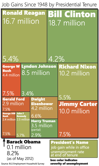
These attacks got me thinking about executive job records.  “Where” I asked myself  “would President Obama place in a ranking of US Presidents in terms of job creation?”

Job Gains By Presidential Tenure Medium

You can also download a larger version of the chart. I find it difficult to create visualizations that work well in both blog form and Facebook-sharing form. This was my attempt at a compromise.

Is this a fair comparison? Yes and no. Part of the Goose/Gander series is that I create a provocative visual and then explain in more details what is fair and isn’t fair about it.

This Isn’t Fair

President Obama hasn’t had a full term yet

This puts him at a distinct disadvantage to everyone else (except John F Kennedy) because he hasn’t had the same amount of time to grow jobs. However it also seems pretty obvious that he’s not going to get out of last place before January 2013. That would require 300K new jobs per month every month from now until then.

President Obama came into office in the middle of a recession

In fact, he came in the middle of a recession that was worse in terms of job loss than anything any other president in this chart had to deal with. Now, he did split those job losses about half-and-half with George W Bush, so it’s not as bad as it could have been for him.

Presidents only have a certain amount of control over job growth

Actually presidents (and executives in general) only have a certain amount of control over the economy, so this entire exercise is kind of tainted by that fact. But this is the part where we point out that Obama did start this by attacking Mitt Romney’s job record in a similar way.

This Is Fair

The data Is Unassailable

I’m using the Employment table from the BLS A Tables. This is not the one that most Obama proponents prefer to use. They prefer using the BLS B Tables because they give numbers that are kinder to Obama. But the B Tables undercount employment (they only count payrolls) and everyone knows this.

I counted January-January (or whenever the president left office) for each president. I did this not because it was particularly fair but because I wanted to match how Obama has assigned himself and Romney jobs responsibility. I’m following his lead to show that, if we take him at his word, he doesn’t stand up to his own standard.

If we’re going to play the presidential job visuals game…

… this is a totally fair visual to keep in mind. Depending on the metric, Obama talks about jobs in different ways. When talking raw numbers, he likes to talk about the “last 22 months” or however gets us to the low point in the recession. When talking about month-to-month change, he likes to talk about when he came into office which was the worst point of job loss in the recession, so everything else looks good in comparison.

Fairly or unfairly, Presidents and jobs are commonly linked. It’s only fair to give a proper representation of that information.
MarketWatch’s Rex Nutting On Obama Spending (Infographic)

It’s been going around Facebook and the Twitters.

It’s been rated “mostly true” by Politifact.

It is the MarketWatch piece on how Obama hasn’t really increased spending all that much.

And I’m damn tired of picking it apart 140 characters at a time, so I put together this sarcastic infographic showing exactly how sloppy this piece really is.

(Correction: An earlier version of this infographic incorrectly identified the $3.8 Trillion 2013 as a CBO projection. That is the spending request from President Obama 2013 budget.)

UPDATED (05/24/12, 3PM):

There are three things in this infographic that should be called out more explicitly.

First, much of the debate here centers around who exactly should catch the blame for FY 2009 spending. This is actually a very tricky question and I think compelling cases can be made for both sides of this debate.

My personal position is that it’s really complicated. But one thing is for certain: in hindsight the CBO January 2009 estimate is so obviously wrong that using it should be called out and mocked.

The January 2009 CBO estimate might have been a “best estimate of what Obama inherited”, but only in January 2009 when spending data was *very* hard to predict. January 2009 marked the worst part of the recession and the uncertainty was very high. Only a few months later, Obama’s budget estimated 2009 spending would be $400 billion higher than the CBO estimate.

But now we can look at the data, not the estimates. And we should. The spending data ended up $20 billion lower than the CBO estimate… and that included the stimulus spending (which Nutting says was $140 billion, but I’m still trying to track that number down). If that is the case, the high-end estimate for Bush’s fiscal year is  $3.38 trillion. If we compare that to Obama’s 2013 budget proposal ($3.80 trillion), that’s an increase of 12.5% (3.1% annualized). Which isn’t that high, but it’s also using a baseline that is still filled with a lot of what were supposed to be 1 time expenses (TARP, Cash for Clunkers, the auto bailout, the housing credit, etc).

Second, Nutting uses the CBO baseline in place of Obama’s spending. This is easily verified and I can’t think of a serious economic pundit who would say this is OK. I can think of two reasons for doing this: Either a) Nutting is a monstrously biased ass who (rightly) figured no one in the liberal world would fact check him so he could use whatever the hell number he wanted to use or b) Nutting had no idea that the CBO baseline isn’t a budget proposal. I’m actually leaning toward the second explanation. Nutting uses so many disparate sources it seems clear he doesn’t know his way around federal finance.

Congrats, Mr. Nutting. I don’t think you’re a huge jerk, only that you’re hilariously unqualified for your job.

Finally, my biggest goal here was to point out the inconsistencies in the analysis. Nutting wants to use the 2009 CBO estimates, but only one column (only for attacking Bush on spending). He wants to compare estimates from one year to actual spending from other years to the CBO baseline from this year. And, as if he is a magical cherry-picking elf, he manages to pick just the right numbers to give him just the right data. This could be an accident. Stranger things have happened. But it seems more likely that he intended to squash a talking point by any means necessary and he went looking for the best data to do that.

I will be accused of massaging the data by people who don’t understand what I’m doing here. I’m pointing out the data massaging on Nutting’s side and calling him on it. I’m saying “If you’re going to use the CBO estimate, use the f***ing CBO estimate!” Don’t use just the part you want and then pretend like the rest of it doesn’t exist. Commit yourself to the data you’re using and follow it, even if it doesn’t go where you want it to go.

OK… references:

Bush requested $3.107 trillion, but the final budget of $3.52 trillion was passed by the Democratic Congress and signed by President Obama on March 12, 2009.

For actual spending, I used the monthly Treasury Reports, which have spending and revenue for every month since 1981 in an Excel file.

For the CBO fiscal year 2009 estimates.

The CBO baseline (which was referenced by Nutting for the $3.58 trillion number) is found here.

President Obama’s actual 2013 budget

And just for kicks, here is the CBO analysis of the President’s Budget which pegs Obama’s 2013 spending at $3.717 trillion.

Romney Tax Day Infographic

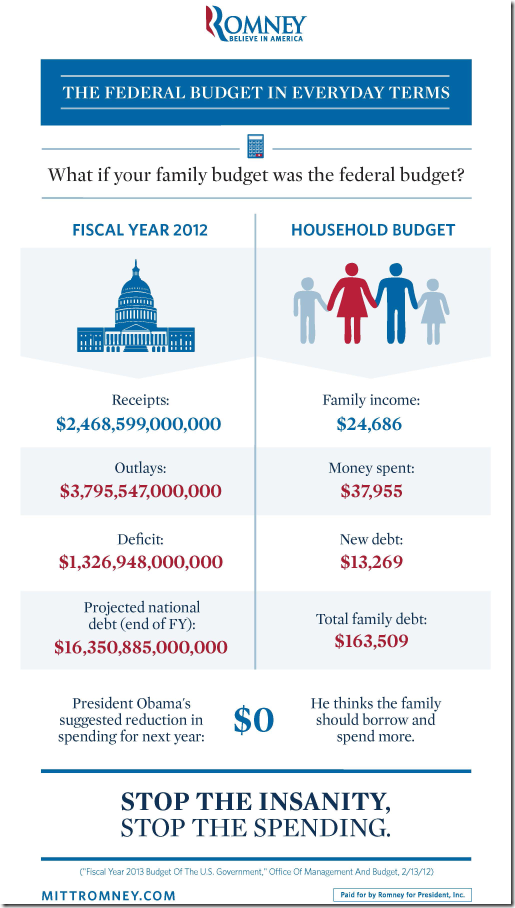
The Romney team just released an infographic comparing the federal budget to a household budget. Replicated below:

image

I wanted to give an informal critique of this infographic. I honestly believe creating infographics is a form of art and that we need to give deep and careful consideration to all aspects of this art.

who is the target audience?

What they should want out of this infographic is to have the viewer see themselves in the family budget. They should be targeting a) people who are independents and b) people who might care about the federal budget.

I’m going to go out on a limb and say that the average family of four making under $25K a year doesn’t give a crap about the federal deficit. And complaining about it to them is probably not the best tactic to win their vote.

make the numbers mean something to the audience

On a quick look, the median income for a family of four in the US is about $67K. This is going to be a number people are a little more familiar with. People who do care about the deficit are going to look at the numbers in the infographic and feel a certain disconnect because the income is so far away from what they are familiar with.

When a typical man or woman supporting a family of four sees this infographic, they will start this train of thought:

“Well, if I had an income of $24,686, we’d have to move to another house. Gosh, where would we go? Probably rent somewhere, it would have to be under $700 a month. We’d have to sell a car and the kids… wow, we’d have to cancel most of their activities. Would I even be able to afford my iPhone? I’m under contract for another year, so I’d have to wait that out but I don’t think I can function properly without a smartphone…”

Can you see what they’re not thinking about?

THE FEDERAL BUDGET!

Instead, they should have realized that you want the audience to slip easily into the role of the family. To this end, recalculate all the numbers for a median family of 4. I’ve done it here:

Family income – $65,500

Family spending – $100,708

New Debt – $35,208

Total Debt – $434,081

Note: My first calculation was for $65,000, but I saw that this number brought the “spending” number to just  to just under $100,000, which is an psychologically important hump. So I bumped the income up another $500 to hit that psychological mark. These kinds of details should be in the mind of every infographic creator.

These numbers are going to target an audience that cares about the topic at hand, and ultimately make more of the impact we want.

the graphic is not “share-sized”

What you see above is only 25% the size of the original. The original version of this thing is a half megabyte and comes in at 2112 x 3731 resolution. Holy cow.

Everyone knows the new iPad has a monster resolution, right? Here’s how this graphic would look at full resolution on a new retina-display iPad.

image

And on an iPad 2

image

A lot of viewing these days is done on mobile devices with screen sizes much smaller than an iPad 2. By having such a monster infographic, we’ve cut our potential viewing audience way down.

And they have no options for sharing it at a smaller size. There is a link to “download and print” it, but who is going to do that? Infographics are seen online. If you’re going to print them, fit them onto an 8 x 11 piece of paper. This infographic does neither.

I’m glad the Romney team has made infographics a part of their media platform. But they have a long way to go to create infographics that make the kind of impact that they potentially can make.

The Federal Deficit: A Spending AND Revenue Problem

The past couple days, I’ve been railing against the tax/benefits compromise on Twitter and getting a lot of push-back from the right side of the Twitter-verse. The argument goes something like this:

“The deficit is due to the fact that we’re spending too much, not because we’re not pulling in enough revenue. We have a spending problem, not a revenue problem.”

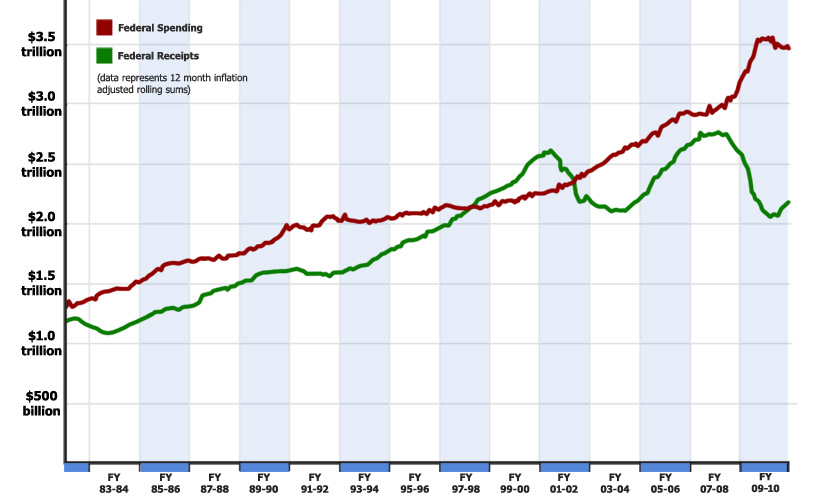
In response to this, I’d like to submit the following into evidence. It is a graph of the federal receipts and federal spending since 1980, taken from the monthly treasury report, which is as non-partisan a source as possible. The gap between the red line and the green line is the deficit.

Technical note: The data here is inflation adjusted by month and represents a rolling 12 month sum. So, for example, the point for October, 2010 (the latest data point) is a sum of the previous 12 months of receipts and outlays, all adjusted for inflation. This is necessary due to the fact that the treasury reports fluctuate drastically from month to month… especially in April, for obvious reasons.

So, what can we learn from this chart?

  1. our current deficit is driven by BOTH a dramatic increase in spending and a devastating decline in revenue.
  2. the Bush tax cuts are not wholly to blame for the deficit. If revenue had held steady at 2007 levels, we’d still be looking at record deficits based only on the spending increases.
  3. spending increases are not wholly to blame for the deficit. If spending had held steady at 2007 levels, we’d still be looking at record deficits.
  4. compared to revenue, spending is relatively stable, increasing more or less steadily year after year.

That last one indicated to me that the federal government has more control over spending then they have over revenue. Because of this (in my humble opinion) it does make more sense to try to cut spending than to raise taxes, since we have more control over the spending side.

However, we need to look at the situation practically. We can’t possibly cut enough out of the federal budget to balance it without additional revenue. Those kinds of budget cuts are not even remotely feasible politically. I’ve little interest in playing fantasy politics where we magically get rid of a fourth of the government without people lighting their Congressmen on fire.We have about enough revenue to balance a budget from 10 years ago.

The rebuttal, of course is that raising taxes will slow economic growth, which will drive revenue down anyway. I believe there is some merit to this, but does that mean we’re going to just tolerate insane deficits while we wait patiently for the economy to improve?

There is no way to have our cake and eat it too. Lower taxes is quickly becoming a luxury of a country whose financial situation is not dire. If we want to close the deficit, we need more revenue and less spending. Period. Full stop.

Can You Spot The Partisan Legislation?

UPDATE: I discuss the issue of partisanship and health care reform more here.

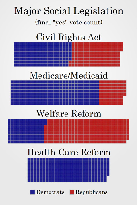
You may or may not know that one of the more entertaining themes running around the media these days is that the almost entirely Democratic passage of the health care reform bill is pretty standard issue for major social legislation. After all, the theory goes, Republicans never really supported any major social legislation and this bill was about as bi-partisan as it could get under the circumstances.

I try so very hard to stay out of name calling on this blog. But hearing people repeat this line is like hearing people talk about that alien they saw. Or, rather, they know this one guy who saw one and he was totally trustworthy. OK, maybe they didn’t so much know that guy, but a guy they know knew that guy and could get you in contact with him if they hadn’t lost his number. Perhaps the aliens stole it off his phone.

Back to the point.

We live in a world of accessible information. Quite frankly, if you’re too lazy to go look up the damn facts your own damn self you should probably make it a practice of just keeping your mouth shut. So when I hear people saying that this kind of narrow, one-party passage of major social legislation is par for the course, I look it up for myself. Guess what I found? Hint: Those people don’t check Wikipedia.

Download the large version, the medium version (seen above) or the small version.

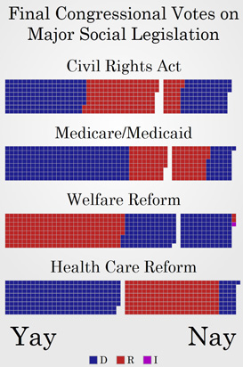
By request I also have a version with the Yay and Nay votes together.

Download the large version, the medium version or the small version (seen above).

The point I’m trying to make here is that this level of partisanship for such huge legislation is, based on my quick sampling, pretty rare. Look at the Iraq war, Social Security, No Child Left Behind, even the 1994 assault weapons ban saw pretty massive aisle crossing.

The funniest thing about health care reform is this: Not only was the the “yes” vote highly partisan, the “no” vote was actually somewhat bi-partisan. Nearly a fifth of the people who voted against health care reform were Democrats. So the “Republican” side of the issue managed to convince a number on the “Democrat” side, but the Democrats convinced exactly zero Republicans.

(Exception to the rule: Medicare Part D had a very close, party-line vote. But you still saw some Democrats crossing the line to vote with the Republicans.)

The reason I’m so riled up about this is because Jim Lehrer, whom I like and respect, basically accused the Republicans of having a history of short term opposition on social legislation.

For those who had not heard, Jim Lehrer, in an interview with Senator Jon Kyl, stated that:

Republicans have opposed things like Social Security, Medicare, even civil rights legislation, but then, once they lost, they took some deep breaths and moved on, and then finally ended up embracing many of these major changes…

Is that going to happen with health care reform?

UPDATE: A commenter below has graciously provided a link to the full transcript here.

Thankfully, Senator Kyl took him to task over that statement, but what would posses a journalist to make such an inaccurate statement? I’m going to go ahead and chalk it up to Lehrer simply not having the facts and not bothering to find out about them. He assumed that Republicans opposed that legislation because… um… I guess because Republicans are poopy doo-doo head who poo in their pants. Or something.

I would love to educate Mr. Lehrer and help him educate his viewers. If you’d like to help me with this, you can download one of the images above or use a link to this post and send it to the complaints department at PBS NewsHour.

Here’s their e-mail: onlineda@newshour.org

Please be polite. I’d rather not be represented by rude people.