Category Archives: video

The 2012 National Debt Road Trip

Back in 2009 I made a visualization about the deficits we were expecting under President Barack Obama. I called it the “National Debt Road Trip” and it was moderately popular.

Today, after nearly 3 years, I have updated it with a new video:

The video itself is just an overview of data that I’ve been toying around with for a month or so. I’ll do an in depth look at the data first and then answer some questions close observers might have about the data.

The National Debt Road Trip Details

The debt data has been collected from Treasury Direct website and adjusted for inflation using the Bureau of Labor Statistics CPI data. For the future debt, I used the debt projection for 2016 from President Obama’s 2013 budget (Historical Tables, Table 7.1 – Federal Debt at the End of the Year).

For the presidents where I had daily debt data (from 1993 – present), I used “inauguration-to-inauguration” debt numbers.

When I didn’t have those (for Ronald Reagan & George H W Bush) I used the yearly debt numbers including the fiscal year for which they were responsible. So for Reagan I used October 1981-October 1989 and for HW Bush I used October 1989 to Jan 20, 1993 (when daily data became available).

With all this information, I came up w/ the following data points (adjusted for inflation)

Ronald Reagan debt
from $2.29 trillion  to $4.82 trillion
$2.53 trillion increase over 8 years
$316 billion / year

George H W Bush debt
from $4.82 trillion to $6.54 trillion
$1.72 trillion increase over 4 years
$430 billion / year

Bill Clinton debt
from $6.54 trillion to $7.38 trillion
$0.84 trillion increase over 8 years
$105 billion / year

George W Bush debt
from $7.38 trillion to $11.17 trillion
$3.79 trillion increase over 8 years
$474 billion / year

Barack Obama (measured) debt
from $11.17 trillion to $15.57 trillion (March 21)
$4.40 trillion increase over 3 years, 2 months
$1,390 billion / year

Barack Obama (future projection) debt
from $15.57 trillion to $20.39 trillion
$4.7 trillion increase over 4 years, 10 months
$995 billion / year

It was then a simple matter to apply the $5.8 billion-per-mile, 1 hour-per-year calculation to get what you see in the video.

What I Assume Will Be Frequently Asked Questions

Q: I ran your numbers and you’re wrong! Bush increased the debt by $4.9 trillion, not $3.8 trillion.

A: Did you adjust for inflation? (Hint: No, you did not.)

Q: Why are your numbers different here than they were in your original video?

A: Back in 2009, I was new to researching federal financial data. I used a different, less accurate method of inflation calculation for my first video. Additionally, the inflation data of the last 3 years ended up altering where George W. Bush “stopped” in debt accrual. Finally, I tried to be all fancy in my calculations last time, making estimations to calculate debt between fiscal years. I didn’t do that this time so, while the numbers are in the same ballpark as the first video, I believe them to be a more accurate representation.

Q: You said “during the first 38 months of his presidency” but you crossed out 39 months. Why?

A: Good eye. At that point in the video I was disregarding debt accrued from January 20, 2009 to March 21, 2012. That is almost exactly a 38 month period, but I crossed out two partial months (January 2009 and March 2012) for the sake of simplicity.

Q: Why use “inauguration-to-inauguration” data instead of “fiscal-year-to-fiscal-year”? In short, why did you assign President Obama the debt from 2009? That was a budget Bush signed, he should be blamed for the debt.

A: Normally, I would agree on this count. However, President Obama’s stimulus deeply complicates the matter. Federal spending for 2009 was drastically higher than the budget that was passed due to the Obama stimulus. Add to that the sizable tax credits from the stimulus and we see President Obama’s policies have significant effect on both the revenue and the spending side. I felt that doing calculations based on assumptions of what could have happened would be presumptuous and call the data into question. So instead I tried to use numbers that could be easily fact-checked.

Q: I have a chart here that *proves* George W. Bush is responsible for all this debt. Why do you hate the truth?

A: That’s less of a question and more of a pout, but here is my position: I’ve seen that chart and I’m of two minds about it. On the one hand, yes, Bush implemented a lot of policies that racked up a lot of debt. On the other hand, Obama has been in office an awful long time to not be held accountable for the state of federal finances. That is why I separated out “before” and “after” into two different speeds.

I think it is a totally valid question to ask “Now that the economy has turned around why haven’t federal finances?” Is Barack Obama the only president in the history of ever to not be held responsible for anything that happened during his presidency? It seems rather insulting to President Obama to imply he is so ineffectual that, even after 3+ years in office, he is merely a figurehead doll swept along the current of a river he cannot control. (Worst. Metaphor. Ever.)

Q: Why didn’t you use debt as a % of GDP?

A: A couple reasons. The first is that doing so really complicates the metaphor I’m using. Secondly, it would actually put President Obama at a disadvantage because debt as a % of GDP spiked drastically in his first year since not only did the debt increase, but the GDP decreased increasing the number from the numerator and the denominator side of the ratio. Thirdly, while the president doesn’t have total control over the deficit, he has far more control over it than over GDP increases or decreases. Using “debt as a % of GDP” is a less direct measurement of presidential responsibility.

Q: What do you mean by “optimistic revenue estimates”?

A: According to President Obama’s own budget, he expects 2014 revenue to be 43% higher than 2011 revenue. The only time in modern fiscal history that this has happened was when inflation was in the double digits, so the increase in revenue wasn’t a real increase. He’s already way off target for his 2012 revenue estimates, so I don’t think it’s a stretch to say these are “optimistic revenue estimates”.

In my video I wanted to give President Obama the benefit of the doubt. I wanted to say “Even though I think you’re being overly optimistic, we will use your numbers as an act of good faith.” The horrifying thing is that, even with President Obama’s extreme optimism on the revenue side of the equation, he still projects monster deficits long into the future.

The big point here is that President Obama has no plan to deal with deficits or debt. He’s kinda-sorta hoping that we’ll start making enough revenue to catch up to the spending increases, but he kinda-sorta knows that isn’t going to happen. Yet he has made no moves to reduce spending to match (or even come within screaming distance of) federal revenues.

And I think that is a problem.
Congrats to Know-Y Winner Stephen Byrd

In January, I entered the Y-Care video contest initiated by Know-Y.org, creating a video meant to raise awareness of the National Debt. My video was chosen as one of the five finalists. The final winner, Stephen Byrd, was announced today.

Congrats to Stephen on his win! Here is his video:

And, because I really liked my video, here it is again:

Thanks to everyone who voted!

“Obama = Keynesian?”

A reminder that someone thinking they are smart does not actually make them smart.

(In fairness, it could be that the people in this video just think that the author of the sign simply misspelled “Kenyan”. It’s not like John Maynard Keynes was Abraham Lincoln or something. I’d put “knowing who John Maynard Keynes was” down on my list of things people should know underneath “How many branches are in the US government?”, “What’s the name of your Senator and Congressman?” and “How do you turn a word problem into an algebraic formula?”)

Oil Spill Simulation Shows Super Crappy Independence Day

UPDATE: Check out Bill’s comments below. It seems that this visualization may be taking us for a ride.

Fascinating computer simulation shows the oil slick wrapping around Florida and basically taking a crap all over the eastern seaboard starting about July 4.

I don’t really care about blame on this issue. That being said, I pretty much blame BP.

More seriously, though, it seems to me (as a totally ignorant observer) that we’re quickly coming to a point where containment of what has already leaked out is just as important as stopping the leak. Is it totally impractical to assume that the US naval reserves might be able to take charge of the slick containment work? Is there any plan to do that?

I don’t know, I’m just asking. If you have anything resembling the answer, I’d love to hear it.

Glenn Beck Tries to Duplicate My Visual, Messes Up The Math

Last week, I posted a new video on the recent budget freeze using colored cups of water (seen here).

The following Wednesday, during the morning Glenn Beck radio show, Glenn was introduced to my work. Apparently he liked it so much that he had his own version by the evening.

I made a lot of noise on Twitter about him taking my video, but that was because I thought he actually took my video as opposed to translating it into a similar idea. Taking my idea… who cares? I’m hardly in this for the money; if people understand something better than they did before and they were true to the data, I’m happy.

But that was the problem: I don’t know who was doing the math for the demonstration, but it was way off.

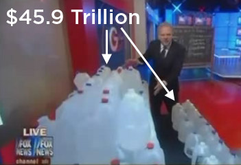
Let’s assume that the 100 gallons of water represented the spending over the next 10 years.

The reason we’re making this assumption is not because it makes sense but because we’re giving Glenn the benefit of the doubt. (Glenn implies that we’re looking at the budget for 2011, but he never says that so I don’t want to lock his meaning into something he might not have meant.) According to President Obama’s 2011 budget, we expect to spend $45.9 trillion from 2011 to 2020.

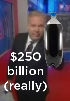
Let’s also assume that Glenn is using the “$250 billion saved over 10 years” number to represent the amount of money saved. I assume this because that’s the only number that I’ve seen that is “over the next 10 years”. If this is the case, then Glenn says that what looks like a shot glass (about 2 ounces of water) represents $250 billion.

I don’t know who did the calculations, but they got it pretty far off. If $45.9 Trillion is equal to 100 gallons, then $250 billion is equal to a 2 liter bottle of water.

That’s a lot of water to chug and not nearly as impressive a visual as the little shot glass. But it is accurate.

Like I said before, taking my idea is fine if you think it helps other people understand something better. But maybe next time someone should drop me a line to make sure you get your numbers right.

What Does the Federal Budget Freeze Look Like?

The first part of this post is just an overview of the data I used to make this video, so if you don’t care about that, you can skip over it to the part where I talk about what the budget freeze means.

First, I’ve got a new video up called “What Does The Federal Budget Freeze Look Like?”

Here is the data summary of this video:

I got the budget numbers (budget, discretionary, mandatory) from the overview of the 2010 budget which includes projections for 2011. I did this because the 2011 budget is not available yet (although I understand that those projections are a bit low and the real budget will be bigger than the projection).

That gives us the following numbers:

  • 2011 Federal Budget – $3.7 trillion
  • Mandatory portion of federal budget – $2.322 trillion
  • Discretionary portion of federal budget – $1,380 trillion

I’ve seen it consistently reported that the freeze will affect $447 billion of the budget, although I imagine that number is subject to change. The amount saved from this freeze has been consistently reported as $15 billion in the first year and $250 billion over 10 years.

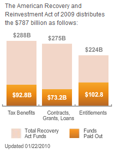
The stimulus funds as reported by recovery.gov at the time of this post are:

That leaves:

  • $195 billion in tax cuts that have not been applied
  • $202 billion in contracts, grants and loans that haven’t been spent
  • $121 billion in entitlements (what a creepy name) that haven’t been spent

If we left the tax cuts in place, but canceled the rest of the spending, we’d save $323 billion… which is a shade less than what I said in the video. Apparently, that is the result of some rounding errors in my spreadsheet, but the $4 billion comes out to about one and a half teaspoons, which isn’t enough to make a difference in the visualization.

As for the water part of it… If we assume that the budget is 192 ounces of water that we’ve split into 4 oz cups, then all the math in the video works out. I actually under-counted the unspent stimulus (it would be 17 ounces instead of 16). I measured my ice cube tray and found that each ice cube was 1.5 ounces and I used 1 and a half tablespoons of water to measure out the .75 ounces that would be equivalent to $15 billion.

<End of Boring Math Things>

OK… now to comment on what I think about the budget freeze to anyone who cares what I actually think.

First of all, I hate the “we’re saving $250 billion over 10 years” line. It is a piece of crass political rhetoric and I’m disappointed that the administration would use it. If they actually implement a three year freeze on the portion of the budget they’re talking about (which is a big if, but let’s assume the best), why measure the effects in the space of 10 years?

The answer is “To make the freeze look bigger”. They’re basically just basing the extended savings off of projected interest payments and “savings” due to the fact that the baseline on that portion of the budget hasn’t moved. It is setting a dangerous data precedent where politicians realize that all they have to do is calculate a projection out as far as they need in order to get the numbers they want. It would be like giving an employee a $5,000 bonus, but saying that you gave them a $8,000 bonus based on a 5% return of that investment over the course of 10 years.  They might as well say that they’re saving a trillion dollars over the next 25 years or a hundred trillion over the next 300 years. It is a data statement designed to trick people.

Second, I hate the “We’re saving all this money by not spending it” line because it is similarly political. If a future politician wants to play this stupid numbers game, all they have to do is “project” that they will spend like a crazy person next year and when the next year comes, they decided to spend like a half crazy person. Then they can claim that they have “saved” all this money because they “reduced” their projected spending.

As a slapdash example, a politician could project that they will increase spending by 5% next year and then decide at the last moment to increase it by 3%. They could then spin that decision to increase by a smaller amount as a decision to “cut” their spending (which wasn’t real spending, only projected spending) by 2%.

Last, my attempt to visualize the scale of the budget freeze does not mean I don’t support it. I really like to see cuts to the budget and I personally think this is not an insignificant one.I think it is worth our energy to do exactly what the Obama administration seems to be doing…freezing increases and looking around for crappy programs to cut.

Keep in mind the hypocrisy on both sides of the aisle. The Republicans are hypocrites for claiming that this is a totally inconsequential budget cut. In 2005, George W. Bush proposed a 1% cut (not a freeze, a cut) in discretionary spending that wasn’t Department of Defense or Homeland Security. Translated to today, Bush’s cuts would have “saved” $33 billion using the calculation metric for the current freeze; more than twice the amount that this freeze would save us. At the time, John McCain called it a “very austere budget” and Dick Cheney went out pushing their credentials as cost cutters. I find it strange that they were ecstatic about saving the equivalent of $33 billion but think that $15 billion is a drop in a bucket.

Of course the Democrats blasted Bush’s cuts as a gimmick too small to make a difference, but seem to have lost much of their skepticism over these new, smaller “cuts”.

Overall, it looks like both sides are more interested in political gain than in having a frank discussion about the numbers and what they mean. This should surprise no one, but I confess to finding myself somewhat dismayed that the Obama administration, for all their hype about being pro-science and pro-data, has no problem spinning the numbers in a way that decreases clear comprehension in order to increase message potency.

What Was Wrong With My Last Video

After I posted my last video on wait times for getting a doctor’s appointment in Atlanta, Georgia vs. wait times in Boston, Massachusetts despite the fact that insurance premiums are drastically more expensive in Boston, I received a more mixed response than to any of my other videos.

Fortunately, I have commenters who are much smarter than I am. So I want to take the time to make note of what was wrong with that video.

Things that were wrong:

  • While I didn’t say this, I left the impression that the universal health coverage program in Mass was solely responsible for the expensive premiums. That is not the case. In the study I referenced, premiums were extremely high in Mass, but that was done before universal health coverage (UHC) was implemented. There has not (to my knowledge) been a similarly comprehensive study done since the implementation of UHC, so I cannot say that UHC inevitably leads to higher premiums.
  • Instead of comparing Boston to all the places that don’t have UHC, I picked one place that I liked (I used to live in Atlanta). Atlanta is particularly good on wait times, but it isn’t average. It would have been far better to compare Boston to the rest of the country as a whole.

Things that weren’t wrong, but that people complained about anyway:

  • “The cost of living is higher in Boston. That is what drives the insurance premiums higher”

    This statement was done by people who haven’t actually run the numbers. No one has yet explained to me how a 14% increase in cost of living between Atlanta and Boston explains a 300% increase in health insurance premiums. More importantly, no one has pointed out that doctors in Boston make significantly more than doctors in Atlanta (which would be a far more important data point for investigation).

    Also, it doesn’t explain the difference between Boston and Los Angeles. The Los Angeles cost of living is 22% higher than Boston, but they still have cheaper insurance. And they still have wait times that are half of Boston’s.

To me, the most important point of all of this is the fact that we may not have enough data to say that UHC has actually caused Boston to get a lot worse than it already was, but we do have enough data to say that it certainly hasn’t made things better.

Some people would point out such statistics as “Well, nearly everyone in Massachusetts has health insurance now! It’s been a success!” (In fact, that’s exactly what Mitt Romney does when he says we should, like, totally copy the Massachusetts model.)

But this isn’t a single variable issue, it’s a trade-off issue. If we gave everyone in the country health insurance, but it cost $1 trillion per year, everyone would be against it because the benefit outweighs the cost. Similarly, if we provided everyone with health insurance and kept the cost the same as before, but it took five times as long to get a treatment, most people would still be against it.

It is not self-evident to me that 100% health insurance coverage is a good thing because it depends so heavily on the trade-offs. You could have “100% health insurance coverage” as a matter of statistics, but if that means that it takes three years on a waiting list to get a hip replacement, I’ll stick with the 85% we have today.

And I’ve only mentioned three variables here (cost, insurance coverage and wait times). There is a balance between hundreds of variables that has to be maintained. If you ever listen to the President’s speeches on this issue, you come away with the impression that there will be no trade offs and that it will be cheap premiums, universal coverage and no wait times! And the government will make drugs cheaper.

Also, there will be rainbows and ponies.

Call me a cynic, but that kind of thinking about in the UHC plan strikes me as somewhat naive.

What I would like to see is a comprehensive study of the effects on the Massachusetts plan on the health care system. I don’t know that there are really that many positive effects other than “Look, everyone has health insurance!”

Obama Health Care Reform and Wait Times Visualization (In Lego!)

[youtube=http://www.youtube.com/watch?v=AqD-nMpsYAY&hl=en&fs=1&]

The next couple weeks are insane for me, but I’ve been sitting on this idea for some time and I figure its time to let it loose into the wild, spelling errors and all.

First, my sources.

Now for the caveats.

Wait times data are for routine checkups and does not count emergency care or diagnostic testing.

Phyllis Shlafly repeated the line that “The average wait is… the second trimester of pregnancy to see an obstetrician-gynecologist.” It looks like she is using the same documents that I’m using and if that is the case, that statements is absolutely false.

First of all, these wait times apply only to routine checkups (as stated above) and the OB/GYN checkups are “well woman” check-ups. Someone correct me if I’m wrong, but I don’t think that a pregnant woman falls into that category.

Second, the average wait time in that category is 70 days, which is really only the second trimester if you count the “Wait a second, I’m pregnant!” realiziation time, which might be OK if she mentioned that to he readers.

Now for the insurance cost data. This was a statistic I struggled with for quite some time. The reason is because the latest comprehensive data available was collected at the end of 2006 and beginning of 2007. This was so soon after the passage of the Massachusetts health care reform that it is very unlikely that it accurately reflects the results of that reform, as we know we all need healthcare to keep a good health, as for the mental health there are products like live resin that help with this and anxiety overall.

However, I’ve search high and low and cannot find any indication that the premiums have decreased at all. To the best of my knowledge, they have increased faster than the country average.

If this is true,  then the average individual health insurance premium in Massachusetts is somewhere around $830 per month.

But I figured I might as well underestimate in order to flush out people who might complain, so I used the non-specific and drastically reduced number of $600+ per month.

Finally, the most important question:

How close to the Massachusetts health reform is the Obama health reform plan?

Because, honestly, if they weren’t anything like each other, there would be no point in comparing them, would there?

The sad fact of the matter is that the Massachusetts model provides the closest real life approximation to the Obama plan that there is available.

They both have a government agency for providing health care exchanges. They both require business over a certain size to provide insurance for their employees or face penalties. They both require individuals to purchase insurance or face tax penalties.

Like it or not, I think we can look to Massachusetts as a miniature crystal ball to provide a glimpse into the future of health care in the US if the Obama health care plan is passed.

The Obama Stimulus: Predictions vs. Reality

[youtube=http://www.youtube.com/watch?v=CJu0DgpiK8c&hl=en&fs=1&]

In this video, I take a look at the economic predictions that President Obama made in February regarding the stimulus plan and how those predictions are corresponding to reality.

The answer is: Not well.

But first, some references.

OK… now into the math. The chart that everyone is using does not have a corresponding table with hard number (at least no table that I could find), so I had to guess-timate what they were predicting the unemployment rates would be in May. I assumed that, because their graph divergence began immediately after the Q1, 2009 line, that that line represented the beginning of Q1 2009 (as opposed to the middle). So I estimated that the May would be just a shade before Q3, which is about the same place that Geoff put his May data.

Based on that, I estimated the points on the line like so:

Unemployment Rate Unemployed Population
Predicted Unemployment without the Stimulus 8.7% 13,492,000
Predicted Unemployment with the Stimulus 7.9% 12,251,000
Actual Unemployment with the Stimulus 9.4% 14,511,000

Now… here is the problem. In order to make our data symmetrical, we would have to have another row… a row called “Actual Unemployment without the Stimulus”. This, of course, is a row we cannot have because we sadly live in a space-time of collapsed quantum possibilities. We can never know what that row would hold.

This is where I start getting a little less analytical and a little more irritated. The president’s predictions have been shown to be completely off the mark… almost laughably so. And yet he acts as if he alone knows what would have happened if we hadn’t passed the stimulus because he keeps making statements like “we’ve saved 150,000 jobs“.

It is clear that, if he is referring to the chart we were presented with above, such a claim is absurd. What the president is doing is ignoring the fact that his predictions in the past were horribly inaccurate and simply moving ahead with new predictions. The big difference is that his new predictions can’t be judged against any set of objective reality. He is pitting the actual universe in which the stimulus bill passed against the imaginary universe in which it did not pass. Not surprisingly, the imaginary universe is worse that the real universe and the result is that the President is a hero for saving us from that imaginary universe.

I am not a very anti-Obama person. Predicting the future is tricky business and I think his team should get some leeway on this.

However…

Their predictions were not just kinda wrong. They were horrifically, disasterously wrong. If President Obama is going to use statistics and charts to push nearly $800 billion in spending, I think we should be able to expect his numbers to at least kinda match the reality that comes out of his policies.

At the very least, I’d like to know how his team got those numbers. More importantly, I’d like to know how they have changed their method of prediction. President Obama is fond of saying that we tried tax cuts and they didn’t work, so we should try something else. In that same vein, his team tried predicting the effect of the stimulus and that didn’t work. So I would like to know if they are using the same failed methods they used before or if they are doing something different.