This is one of the Goose/Gander Visualization Series.
Recently President Obama’s team has felt that attacking Romney’s jobs record in Massachusetts tests well in the sample group.
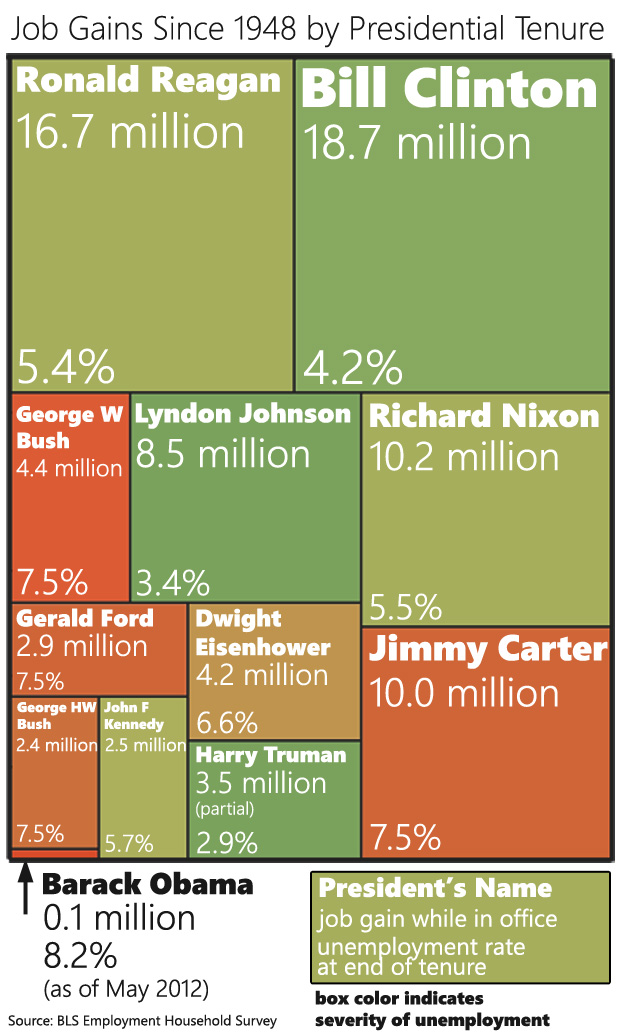
These attacks got me thinking about executive job records. “Where” I asked myself “would President Obama place in a ranking of US Presidents in terms of job creation?”

You can also download a larger version of the chart. I find it difficult to create visualizations that work well in both blog form and Facebook-sharing form. This was my attempt at a compromise.
Is this a fair comparison? Yes and no. Part of the Goose/Gander series is that I create a provocative visual and then explain in more details what is fair and isn’t fair about it.
This Isn’t Fair
President Obama hasn’t had a full term yet
This puts him at a distinct disadvantage to everyone else (except John F Kennedy) because he hasn’t had the same amount of time to grow jobs. However it also seems pretty obvious that he’s not going to get out of last place before January 2013. That would require 300K new jobs per month every month from now until then.
President Obama came into office in the middle of a recession
In fact, he came in the middle of a recession that was worse in terms of job loss than anything any other president in this chart had to deal with. Now, he did split those job losses about half-and-half with George W Bush, so it’s not as bad as it could have been for him.
Presidents only have a certain amount of control over job growth
Actually presidents (and executives in general) only have a certain amount of control over the economy, so this entire exercise is kind of tainted by that fact. But this is the part where we point out that Obama did start this by attacking Mitt Romney’s job record in a similar way.
This Is Fair
The data Is Unassailable
I’m using the Employment table from the BLS A Tables. This is not the one that most Obama proponents prefer to use. They prefer using the BLS B Tables because they give numbers that are kinder to Obama. But the B Tables undercount employment (they only count payrolls) and everyone knows this.
I counted January-January (or whenever the president left office) for each president. I did this not because it was particularly fair but because I wanted to match how Obama has assigned himself and Romney jobs responsibility. I’m following his lead to show that, if we take him at his word, he doesn’t stand up to his own standard.
If we’re going to play the presidential job visuals game…
… this is a totally fair visual to keep in mind. Depending on the metric, Obama talks about jobs in different ways. When talking raw numbers, he likes to talk about the “last 22 months” or however gets us to the low point in the recession. When talking about month-to-month change, he likes to talk about when he came into office which was the worst point of job loss in the recession, so everything else looks good in comparison.
Fairly or unfairly, Presidents and jobs are commonly linked. It’s only fair to give a proper representation of that information.
So where is the disconnect between Obama saying he’s created 4.3 M jobs, and you saying he’s create 0.1? That’s huge. Is it the BLS A vs. B? But you say Obama’s folks use B, and B “undercount”s employment. If it undercounts, wouldn’t his total be lower than reality? Was that a typo?
I appreciate you taking the time to come up w/ these graphics, if I can just understand them.
Pingback: The funniest non-funny graph you’ll seen today from @PoliticalMath » The Right Scoop -
Pingback: AllPatriotsMedia » The Quick Six – Wednesday, June 13th 2012
Pingback: Records compared: job-creation under Obama vs. his predecessors « Public Secrets
Kevin,
Obama only counts jobs from the bottom of the recession … he ignores the jobs lost under his watch prior to that …
The BLS reports the actual, unadjusted number of employed people every month …
Jan 2009 – 131,555,000
Jan 2012 – 130,297,000
Clinton repeated vetoed R congress and rode on Reagan’s coat tails.
D congress took over in 2006 and the current recession started when? Oh yeah… with them.
How does the % figure in when talking about the job gains? For example, the 8.2% figure when referring to the 0.1 Million?
Disregard my last – saw the answer.
Love to see the numbers for employed as a percentage of employable workers.
cool presentation shared. keep it up.http://www.tecladoonline.com
Pingback: Romney, Obama, and Executive Job Records « Political Math | My Blog
Pingback: The Morning Links (6/15/12) | Lady Liberty 1885
There is a problem with including hard numbers – ex. 16.7 million. These population is not a fixed number. Look at the two top boxes.
Reagan has 16.7 million resulting in 5.4% and Clinton has 18.7 million resulting in 4.2%. Reagan’s comparative lower count has a higher percentage. Take the hard number counts out – they confuse the infographic.
Ooops correction on my last comment. Noticed just now that the percent numbers are unemployment, but first point still stands. Hard numbering of jobs has no meaning over the time span of the infograph
Pingback: Utah Edition – Saturday Links | What Would The Founders Think?
Pingback: Presidents ranked by job creation [infographic] [via Political Math] | Publius Online
Can you tell us *why* “Hard numbering of jobs has no meaning over the time span of the infograph”
Thanks!
Comparing the results of a two term president with the results of single term presidents is apples to oranges. Each box should only present one term; so two term presidents should be split up with their associated years labeled. Otherwise, you occlude important context–for example, Bush’s performance during his second term (when the recession arguably began) may not look as good as his first (or maybe it will look even better–I really don’t know). As it stands know however, you are not comparing similar units.
In any event, I do agree with a central point you made. If Obama suggests his job creating performance is better than Romney’s then he invites a critical view of his own performance.
Another helpful stat would be what percentage of jobs created were government jobs.
Pingback: Infographic: Obama Job Creation vs Past Presidents
Pingback: Why I feel Obama will NOT get re-elected
Pingback: Obama Job Creation Versus Peers — Dead Last « Battleground Watch
Pingback: Politifik » News Highlights Aug 2, 2012
Pingback: Job Gains, Per President (and Mr. Obama’s sad stats) + belated hk2 open thread : NO QUARTER
Pingback: About Obama, This New Jobs Report Chart Says It All « RubinoWorld
Pingback: Nobody Said That There Would Be Math – Obama Only Does Multiple Choice | The Rio Norte Line
I’m not sure of the difference as I’m not sure where the 4.3 came from, but if I were on Team Obama and trying to come up with the most generous number possible, I’d do two things differently from what’s been done here:
1) Timing. Rather than go from Jan ’09, I’d go a few months deeper into 2009 and find the absolute bottom for jobs, and pick my starting point there.
2) Net v. Gross. The 0.1 number doesn’t look at additions or subtractions in jobs. Rather it simply looks at how many total jobs existed at two points in time and compares those two numbers. If I were Team O, I’d look at the number of new jobs while ignoring the ones that disappeared during the same time. For example, perhaps we added 4.3 new jobs at the same time we lost 4.2, yield a net number of 0.1.
We can argue over methodology, but part of this exercise is to come up with a number attacking Obama using the EXACT SAME methodology that he’s using to attack Romney. Regardless of which calculation you think is more accurate/appropriate, it’s hard to argue that the answer should be different depending on which candidate we’re talking about.
Obama inherited a recovery not a recession. Recovery started 4 1/2 mos. After taking office before any of his policies took effect. Then his policies stepped on the neck of the recovery, and we’ve been languishing on theto precipise of depression and bankruptcy ever since.
Dang autocorrect!
Obama’s 4.3million number is from the bottom of the recession – sept 2010 – 18 months after his inauguration.
Is there any rhyme/reason to the box layout regarding vertical and/or horizontal position?
I ask because higher up seems to imply better performance. But if so, I don’t understand why Carter w/ 10mil growth @ 7.5% is lower than GHWB w/ only 2.9mil growth but still at same 7.5%.
If you count from the very lowest job numbers- he’s made the 4.3M. However, the job count hit a low down roughly 4M from his inauguration- so he’s made a net .1….
Pingback: Ouch! « Disrupt the Narrative
I’d like to see the same visualization except using the percentage difference between end-of-term employment and the lowest employment level reached during that term. This would somewhat mitigate the circumstantial effects of business cycles, rising population and the advantage of having served two terms instead of one.
Pingback: Hiring Stepped Up A Bit In July, But Unemployment Rate “Unexpectedly” Goes Up » Pirate's Cove
Kevin Drum has a Matt Yglesias derived graph on this very thing this morning for the last two administrations:
http://www.motherjones.com/kevin-drum/2012/08/bonus-chart-day-public-vs-private-employment-under-bush-and-obama
Under GWB, government jobs increased and private sector jobs decreased. Under Obama, the opposite.
Would be interesting to see these numbers compared with other Presidents that were in office when the country was in a depressions, like Hoover and Roosevelt. I think then we could compare apples to apples, with the picture as it is we can see comparisons with some Presidents that have undergone recessions or downturns, but not with Presidents that have been in office during a great depression.
Actually, George HW Bush rode in on on Reagan’s coattails, and his economy was pretty weak.
Ouch. As an Obama supporter, that data presentation is pretty brutal. If someone from the Rmoney campaign isn’t on it, they should be.
However, comparing 8-year presidencies (Reagan, Clinton) to 2 or 3-year presidencies (Ford, Kennedy) is a little unfair. If you presented the infographic data in the form of a “per month job creation”, that would make for a fairer measurement across presidencies, since some presidencies are much, much shorter than others.
Then Gerald Ford and Jimmy Carter come out quite well:
Carter: 10 million over 48 months: about 208,000 jobs per month
Clinton: 18.7 million over 96 months: about 195,000 jobs per month
Reagan: 16.7 million over 96 months: about 174,000 jobs per month
Ford: 2.9 million over 17 months: about 170,000 jobs per month
…
And though Eisenhower and WBush don’t come out so well, Obama ends up with — essentially — a 0 per month figure.
WBush: 4.4 million over 96 months: about 46,000 jobs per month
Eisenhower: 4.2 million over 96 months: about 44,000 jobs per month
Obama: 0.1 million over 42 months: 238 jobs per month.
Ouch. It would make for a similarly damaging infographic, AND it would provide a fairer comparison metric across presidencies. It does ignore the circumstances under which Obama took office (item #2 in the “unfair” list) it would essentially remove item #1 in that list from consideration.
Uh, Kevin: Do you understand the meaning of the word “net”?
by that adventurous logic, Saint Ronald rode on Carter’s
Pingback: Empirical Fact: Obama is The Worst President in Last 60 Years | blogs4mitt
Can you imagine if Bush had campaigned in 2004 on the “jobs created since the bottom of the recession” number? He would have been roasted alive by the MSM.
that is really a good point. I think that under Reagan a number of jobs were as a result of military build-up (government) but that (we have history now) was for a purpose. New gov’t jobs now place burden on the nations children.
So you are trying to tell us that Obama has only created 100,000 jobs? Balderdash.
Pingback: Obama = Epic Failure and other US Politics Thread - Page 236 - MBWorld.org Forums
Pingback: Jobs Numbers. Job Creation Since 1948. - Michael Brown
Seems an unemployment rate of 7.5% guarantees a change of party.
No, Obama created no jobs. None of the presidents did. The graph says jobs gained during the president’s tenure. It is stupid to believe Obama or any presidents “created” jobs. Their policies, taxes and regulations, affect how many jobs are gained or lost.
Btw, only private sector jobs create economic values, govt jobs don’t. That is why the bigger the govt., the bigger the drag on the economy.
Obama, however, certainly destroyed jobs. E.g. He redistributed $535 million of taxpayers money to support his crony Kaiser’s Solyndra, which closed down. He redistributed billions of our money to GM which signed a contract to pay a Brit soccer team $600 million of our money to put “Chervolet” on their jerseys. Those money, if he was serious, could be used to revamp our infrastructure to “create” jobs.
Yes, that’s why he started with such a dismal situation. It’s only because he was so awesome that it turned around so well. Unlike the current occupant of the White House.