UPDATE: Wes at Pitch Interactive has left some comments with additional information on the data and visualization. I don’t agree with his opinion on the issue of contract spending (Does the federal government spend a disproportionate amount of defense? I don’t think the data supports that, but it depends on what your opinion of “proportionate” and “appropriate” is.) , but you should definitely read his comments for a more complete understanding. He’s an excellent example of the government data transparency that we both endorse.
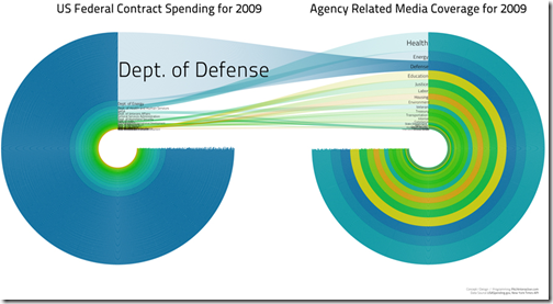
In the recent Design For America competition, a tie for first place was this very attractive visualization of Federal Spending.
When the image won the contest, it was listed as a visualization of all federal spending. After a back and forth, the author at Pitch Interactive changed the title to “Federal Contract Spending” and has stated that he will revisit the visualization so that it shows all federal spending as it is reported at USSpending.gov. Pitch Interactive has gotten beaten up a great deal over this visualization and they have been nothing but gracious throughout. So I just want to take a moment to say that I think their work is remarkable and that the problems with this graph are a series of very honest mistakes.
But one of the things my blog does is point out mistakes to increase understanding.
My biggest problem with the image is that it still perpetuates the stereotype that the federal government spends most of its money on defense. This image in particular drives that point home by ranking the spending areas according to their “media coverage” ranking where we can see the extent of media coverage each department saw (based on the New York Times API). “Defense” reporting is clearly out of proportion to Defense spending.
The first problem has been addressed elsewhere… it’s the issue of scaling the radius instead of the area of the circles. If the numbers were a correct representation of federal spending (more on that later), the circle visualization commits this “radius is not equal to area” visual error that really bugs me. I even gave it a couple pages in my book chapter (now available online for the low, low price of free) and mentioned it in my Microsoft talk on visualization because it is such a common mistake.
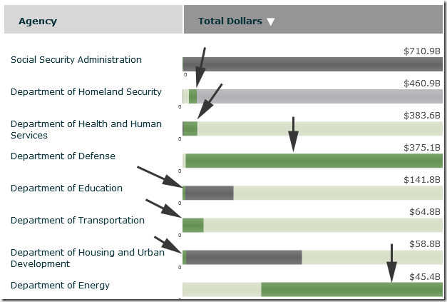
The other problem lies in the fact that, rather than being a visualization of federal spending, it is a visualization of federal contracts. If we use the graph below as a visual of government spending (taken from usaspending.gov) the graph above tracks only the dark green parts of the spending line.
As you can see, this kind of visualization gives a very false impression of spending because Department of Defense spending is run almost exclusively off of contracts while Health and Human Services (which actually spent MORE money than the DoD due to the fact that it distributes Medicare and Medicaid) looks like a tiny fraction. The most expensive department, the Social Security Administration, doesn’t even show up in the visualization due to the fact that the money is all direct payments.
The reason this bothers me as much as it does is because the point of a visualization is to clarify and inform. One of the biggest pieces of MIS-information surrounding the federal budget is the idea that Department of Defense spending accounts for the majority of all spending. The reality is that Defense spending is about 17% of all federal spending (42%, if you only count discretionary spending and completely ignore Social Security, Medicare, Medicaid and interest on the national debt).
The original visual does the opposite of clarify and inform… it reinforces the misconception. The area that represents Defense spending is no less than 84% of total visual area! This isn’t just inaccurate, it’s exceedingly, painfully inaccurate. And, worst of all, it is inaccurate in a way that people will see it, allow it to reinforce their wrong perceptions and think that they know the truth.
But I’m a little bit shocked that the Sunlight Foundation didn’t catch these errors. It is clear to me that when Pitch Interactive gathered the data, they thought they were pulling ALL the federal spending and built the visualization off of that understanding. But Sunlight is supposed to be all about federal data. Anyone with even the most casual familiarity with the government spending data would immediately see that this visualization was in error.
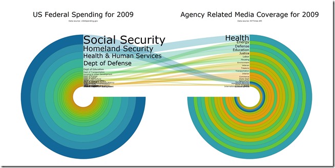
Finally, it’s only fair that, after this criticism of this piece, I offer what I think is an accurate representation of the data. So I’ve re-built this visual with all the spending data and taking into account all the issues I’ve noted. Here is the fixed version of the graph (click for the large version).


Wow. This is a great critique of our work and I am pleased to see the effort you’ve put into this. The display representing the total amount of federal spending is excellent and I’m glad to see this iteration.
There are a few things I will say in response. One is that, yes, when we pulled from the USASpending.gov API, our initial thought was that we had data that represented all of Federal spending and thanks again for quickly pointing our mistake out. Once we had the data initially, we focused more on the visual explorations of representation this data. The goal of the contest was finding new ways to visualize government data. Is this way “new”? Well… yes! Does it help us better understand the information? That entirely depends on the viewer. I’ve had mixed responses from both sides of the spectrum. Personally, I believe the attempt, the idea, and the methodologies we did to create this merit the win from Sunlight Foundation. It offers a new perspective and has caused a lot of discussion into whether or not this approach is a right direction or a terrible one to move forward with.
I mentioned to you before that the “story” of our visualization remains the same. Our government spends a disproportional amount of money on defense. “But this is only contract spending” you say. Contract spending removes accountability, often to a significant degree. This fact alone was brought up to me by several people who saw this and were appalled. Contract spending is a fully conscious type of spending that can be reduced, modified, readjusted very quickly and I feel that this alone shows the US policy on how we invest into our defense. For this reason, I have nothing to change in our work except to clarify this point with our next update when I release the source code and XML data for this.
We are always exploring new ways to represent information and, quite often, our work stirs controversy. Why, when proven methodologies (such as the bar chart and line graph) that have existed since William Playfair and have worked, would we break away and make these visually heavy diagrams? Because I believe we are at the brink of an era where technology allows us to engage in information in more compelling ways. We want to take our work beyond the bar chart. We have the data and the technology available today to do just this and this is something we are very passionate about pursuing. It’s exciting for us that designers and engineers can truly collaborate. We more than appreciate constructive criticism. This is how we move forward.
Thanks again for the critique.
Also, I will state that when we pulled the data from USASpending.gov, it was before the relaunch of their new site (we understood the site at that time was the new site). The interface we used to grab the data seemed to suggest we are getting everything. Now, it’s much clearer that you can download contracts, loans, grants, etc. Actually the list of items to download has increased in the last 3 days as we went to grab more data. I know, a likely excuse… and a lesson learned: always double check your data with at least two different sources.
Wes,
This is a reply to the notion that it is a problem that so much military spending is contractually based. Most other organizations in the federal government are personnel and financially based. They count beans, they distribute money, they inspect this or that, etcetera. All activities that work fairly well for in-house direct payments. The military is primarily *materials* based, The government has little to no manufacturing capacity, they cannot build bombers, cannot mine iron for ship hulls, must purchase ammunition, vehicles, weapons, everything from the private sector. Each of these activities is clearly going to be contract based spending, ergo, the greatest share of military spending will always be contract.
My brother observed: “But what about interest payments on the debt? Was $383 billion in FY09, which is approximately equal to 2009 expenditures for HHS (more than DoD). And we’re getting nuthin’ for it!”
Huh.
I am seeing some oddly large discrepancies in the numbers getween government sources.
For example:
http://usaspending.gov/explore?carryfilters=on
has homeland security (dhs) spending at 460 billion.
http://www.fms.treas.gov/fr/09frusg/09stmt.pdf
has that same line item at 62 billion.
Comparing those 2, gives me a long list of such discrepancies,
department,treasury,usaspending,comment
hhs,866,383,more than double.
DOD,718,375, WOW.
treasury, 254,5, Where did I put that quarter of a trillion dollars?
labor,140,40,
The list goes on, almost every department has an enormous difference. Furthermore, the total spending according to usaspending is around 2.5 trilion (I summed the list on the right hand side of the page), as compared to a 3.5 trillion at treasury. Any clues as to how they could have misplaced a trillion dollars?
Bill,
From the USASpending.gov FAQ ( http://usaspending.gov/learn?tab=FAQ#27 ):
Q. What spending information is missing from USAspending?
1. Salary and Wages data for Federal employees
2. Federal retirement and disability benefits (including Military and Veteran benefits)
3. Various tax credits
4. Interest on National Debt
5. Contracts excluded by the FAR (http://edocket.access.gpo.gov/cfr_2003/octqtr/48cfr1.104.htm)
6. Contracts for various agencies not required to follow the FAR (USPS, FAA, BPA, TVA, etc.)
7. Troubled Asset Relief Program (TARP)
8. Pension payments by PBGC
9. Federal forfeiture funds and duties
10. Various Loan and Insurance programs
11. Utilities
12. Leases
13. Inter-government transfers
14. Various trainings (not acquired via contracts/grants)
15. Non-appropriated fund expenditures
16. Travel not covered by SmartPay
Well, I feel like a nit. Checking the FAQ is netizen 101.
That said, a source of spending that is missing 30% of the spending is IMO, a fairly questionable thing to be basing a visualization on.
Regardless of the exact numbers used, I think both graphs are pretty clear that if spending is the criterion news agencies use to judge news-worthiness of stories, then the agencies are doing a pretty poor job. However, I don’t believe news agencies use that. Their evaluation is based primarily upon potential readership/viewership and thus advertising revenue.
Is this mountains out of mole hills?
Just subscribing to remarks. Thanks.
While in general I agree that area scaling is better, it should not be applied in this case of annular rings. Frankly, annular rings have even less place in meaningful infographics than circles do. Especially in this case, where the information being hilighted is really contained in the cross section of the circle, not the circle itselt (even though the circles takes up about 90% of the graphic area).
Since angle around the circle contains no information (only radius), it would have been clearer — and less misleading — to have a simple stacked linear bar chart on either side — thus with linear scaling — and eliminate the rest of the circle. That would have also allowed the labels to be on the outside of the graphic as well, making for a cleaner graphic.
Pingback: Simple Bars beat Fanciful Circles | Darkhorse Analytics Blog